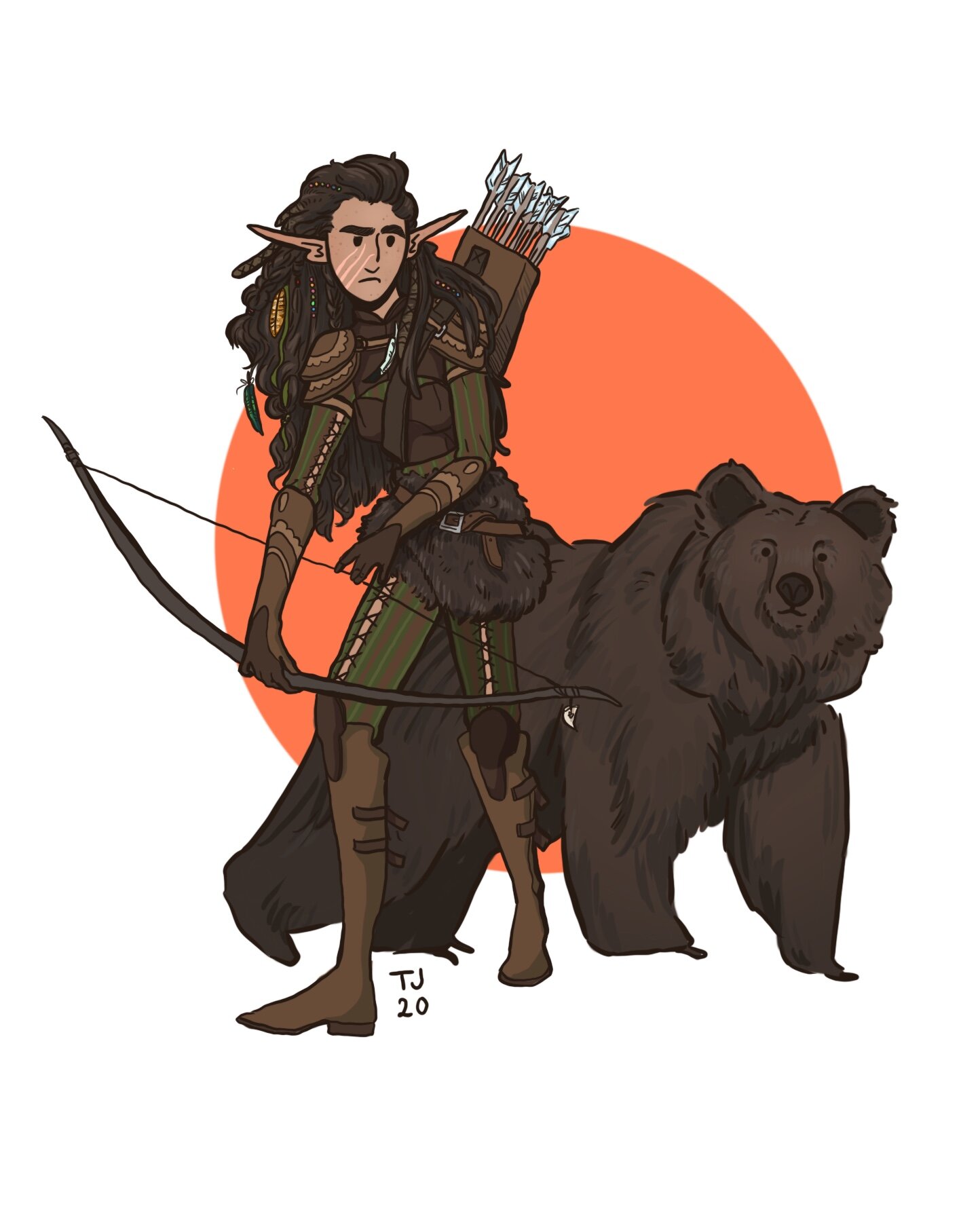
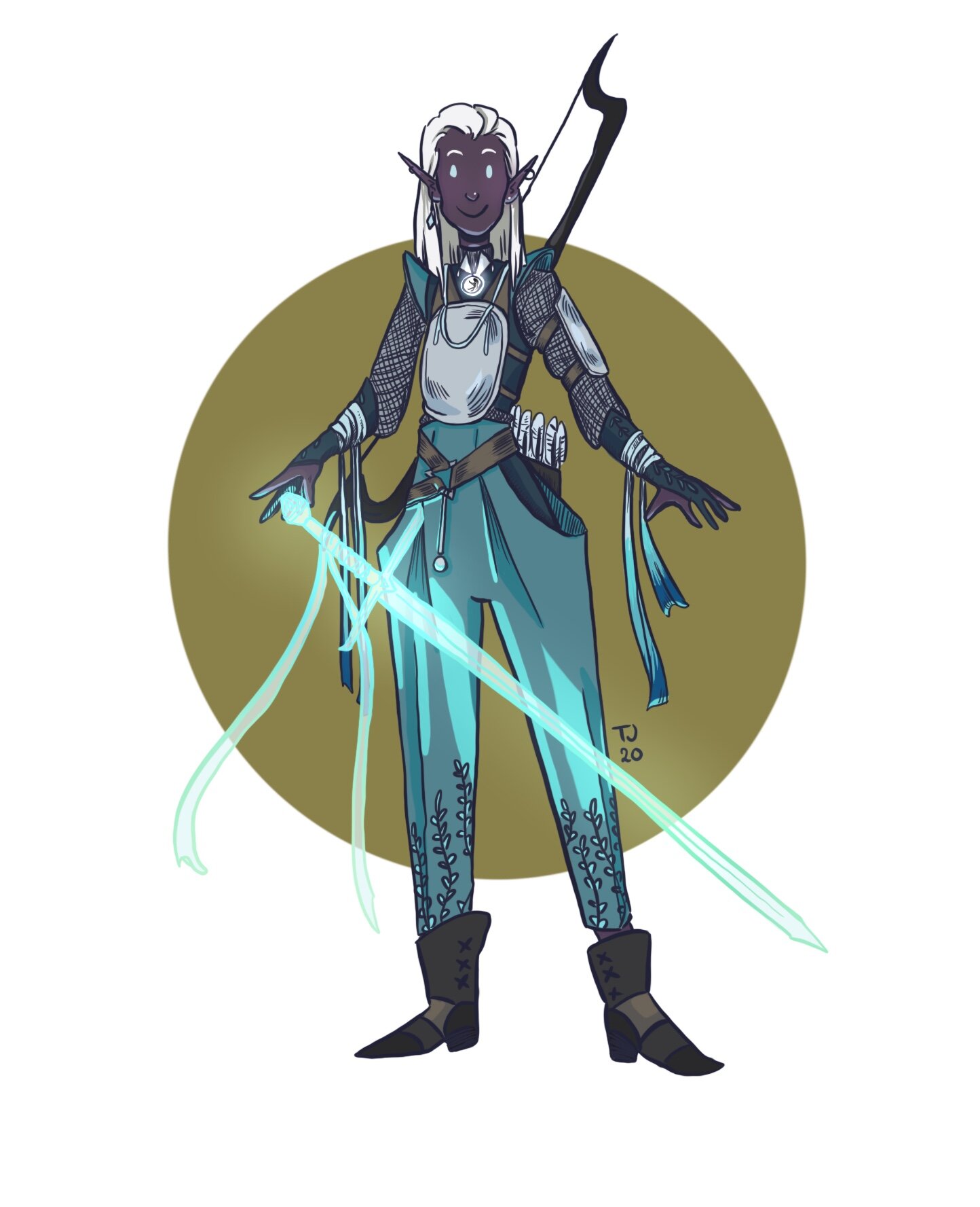
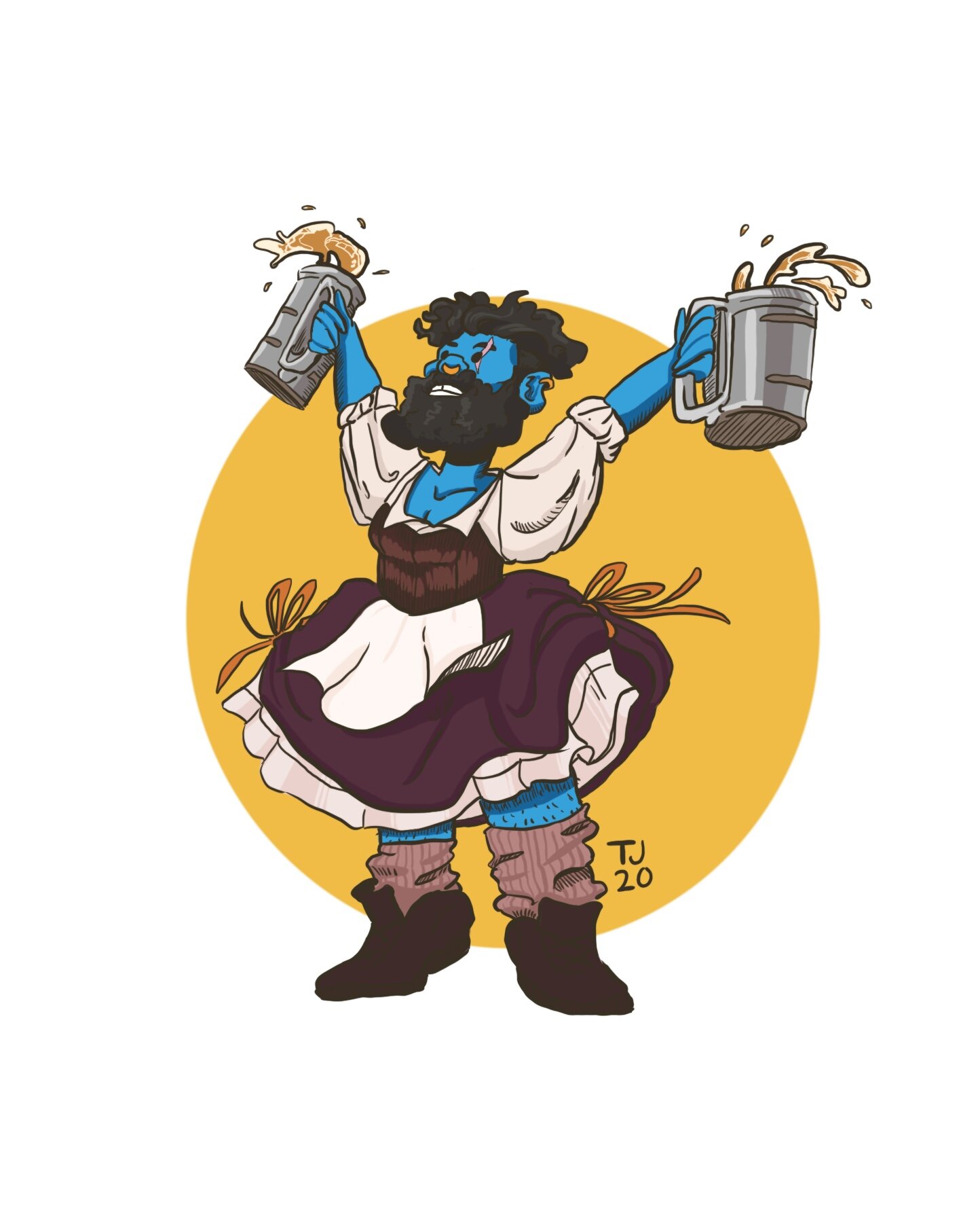
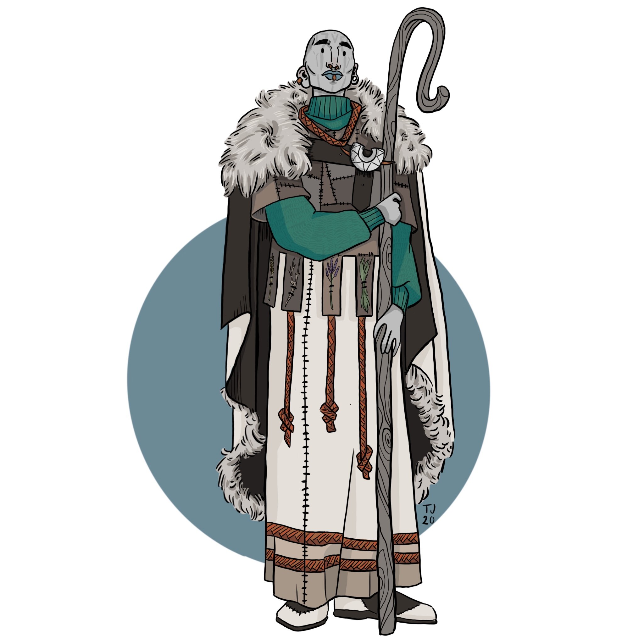
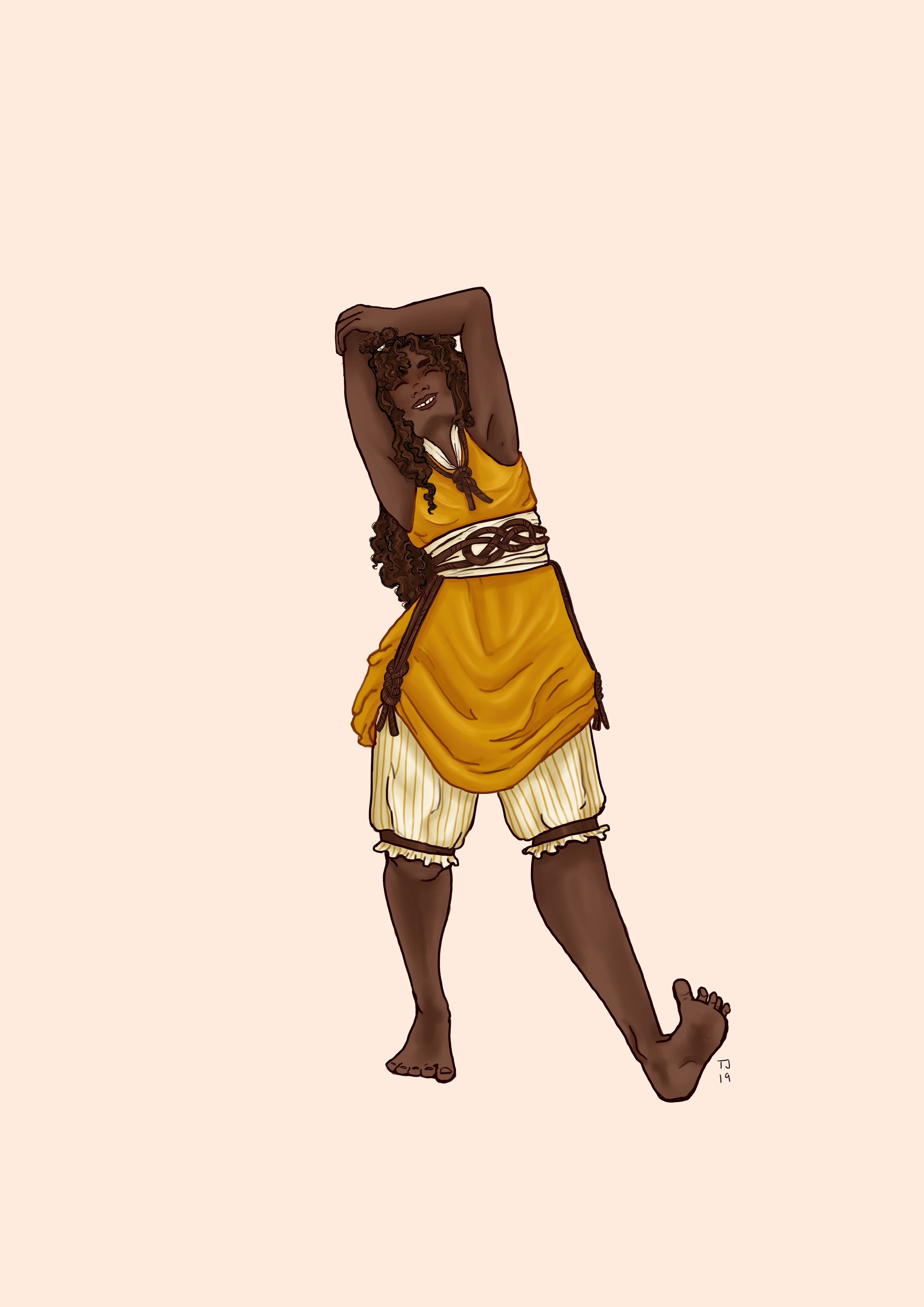
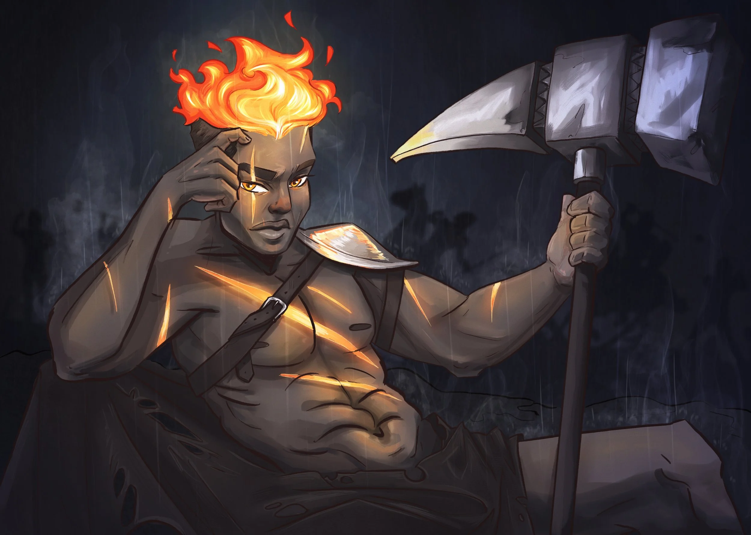
I started 2024 by drawing a sexy calendar based on all the characters in my D&D group. Below are the final drawings for each month listed in order!


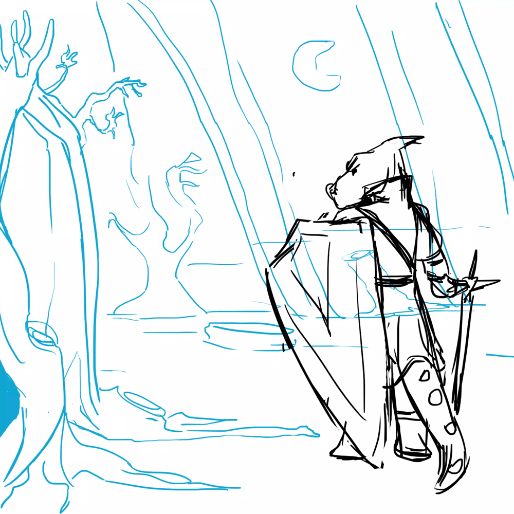
Some sketches show the process in figuring out poses and atmosphere for the pages.