Final Major Project
DESIGN
Children’s Book: The Pirate Captain and The Sea
This page deals with the development of the art. Discussing potential art styles and how they would work for the project. However, the main thing I focus on is the concept art and design process for the characters and environment.
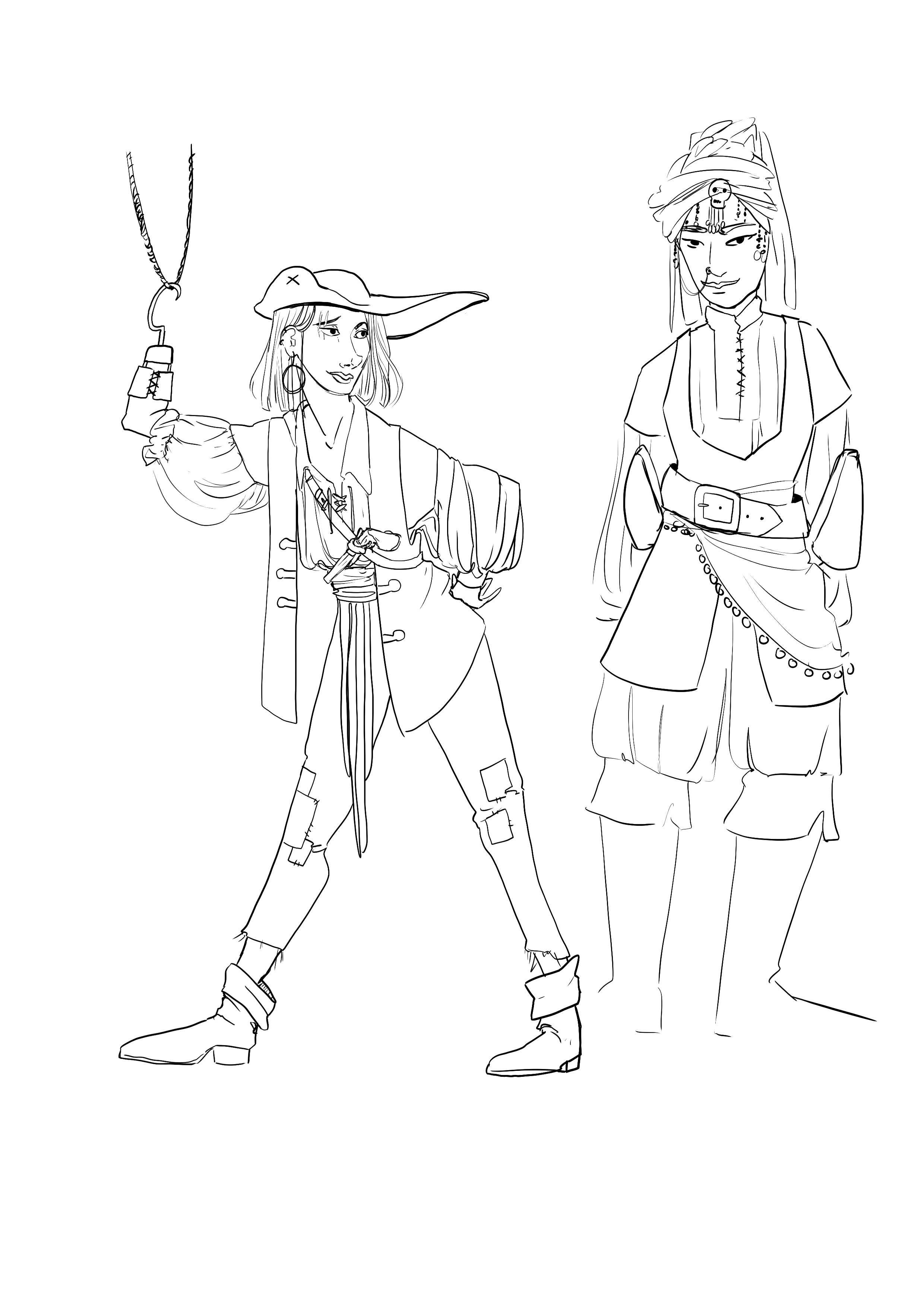
Please note that the concept drawings are annotated with the thoughts behind the design choices, just click on the image and hover over it so see the text.
Table of Contents:
Visual Research
Concept Art
Visual Research
Visual Identity and Style Choices
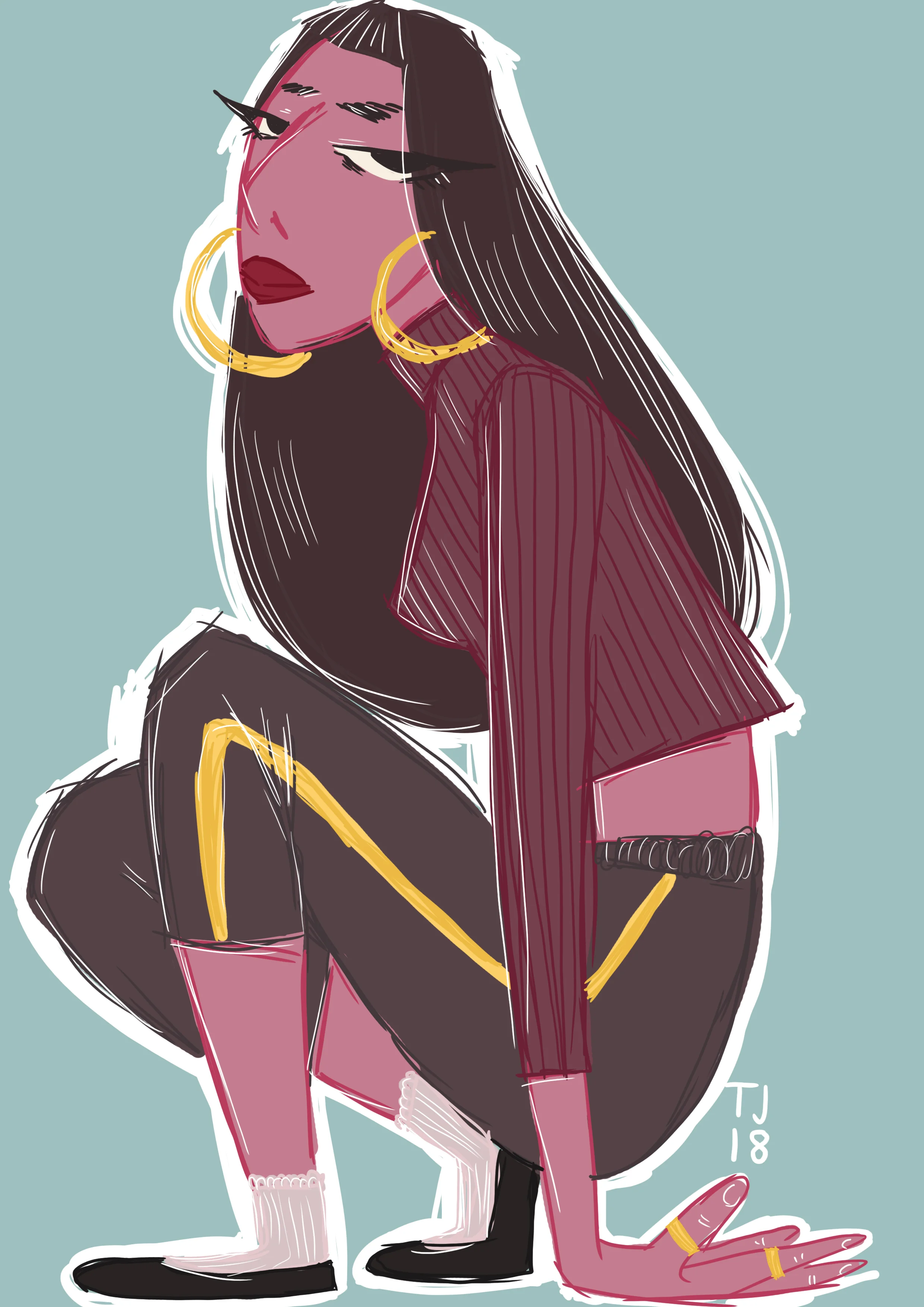
As with all of my work I strive to never make the obvious choice. Especially in terms of representation. My biggest concern is always “How can I best represent this character?”
As a female artist one of my main concerns is always the representation of women. I am tired of seeing female characters wearing skimpy costumes with extra ruffles and thigh high boots. I always approach my designs from a practical standpoint, is this design choice practical for the character in their situation, and how does it reflect their personal history and personality. And I can say with full certainty that stiletto heels is never practical for ANY pirate. However, with this project I also need to consider the target group, children, how will children interact with the design. Thus, I need to find a balance between good representational design, and the whimsical fun of a child’s imagination. My favourite piece of character design advice I ever read was “You should design your character with the idea of how children would draw them. Will you child be recognizable even when filtered down into a children’s drawing. You need to make sure your character have enough trademark features so that it will always resemble the original design, no matter what format it is in.” Beginner's Guide to Digital Painting in Photoshop: Characters
As I was looking at pictures for inspiration it became violently clear to me what I didn’t want to do. In the beginning it was actually easier to pick out the things I didn’t like, so that I could figure out the things I did like.

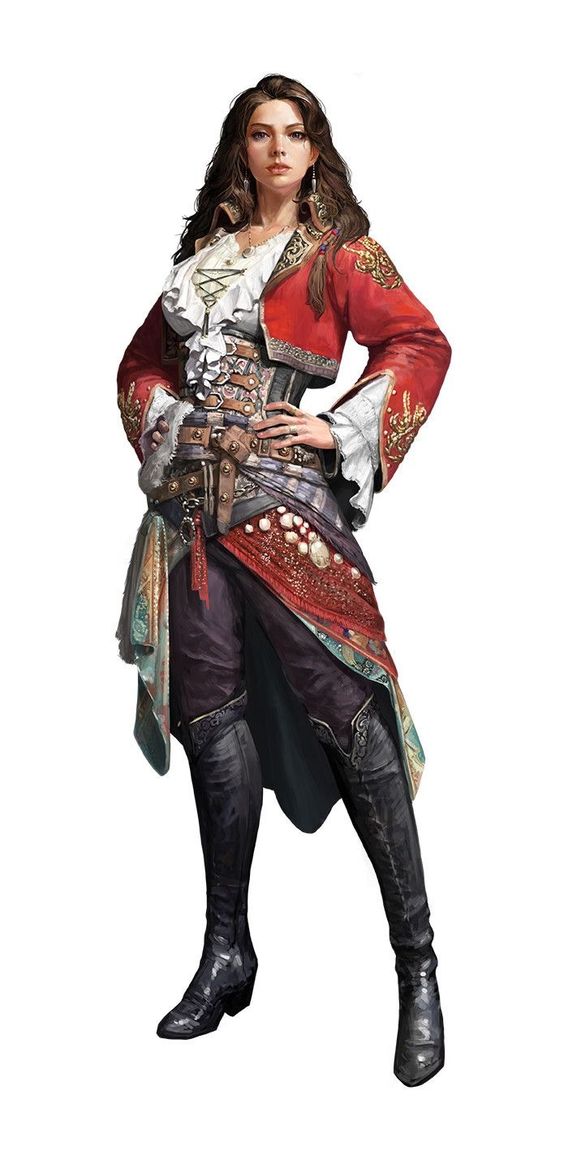
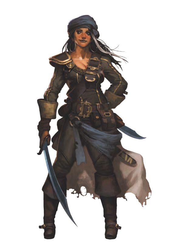
This might look like a decent design, and it is by far not the worst, but there are still some issues with it that I would like to avoid. The most obvious thing might be the cleavage, but i am writing a children’s book so that would not be possible regardless. My real peeve about this design, and most other female pirate designs, is the corset. The corset was used for women to appear more slender and was very in fashion at the time. However, the corset severely limits a person’s movement and breathing ability, thus I can’t understand why on earth a pirate would want to wear one. They are constantly either working on the ship or working on capturing other ships, wearing a corset would be violently impractical. Additionally, if she was a female pirate she would already be breaking gender conventions, since women weren’t supposed to be sailors, so then why would she choose to conform to this extremely impractical fashion choice?
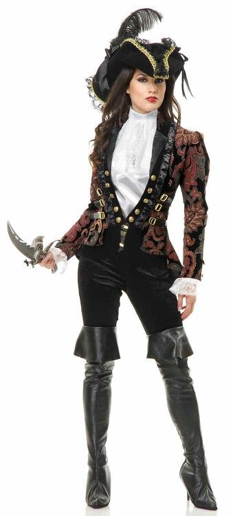
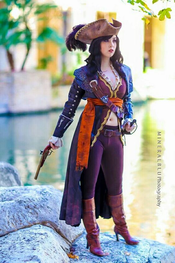
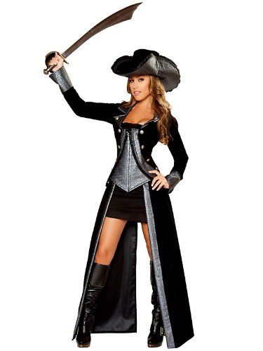
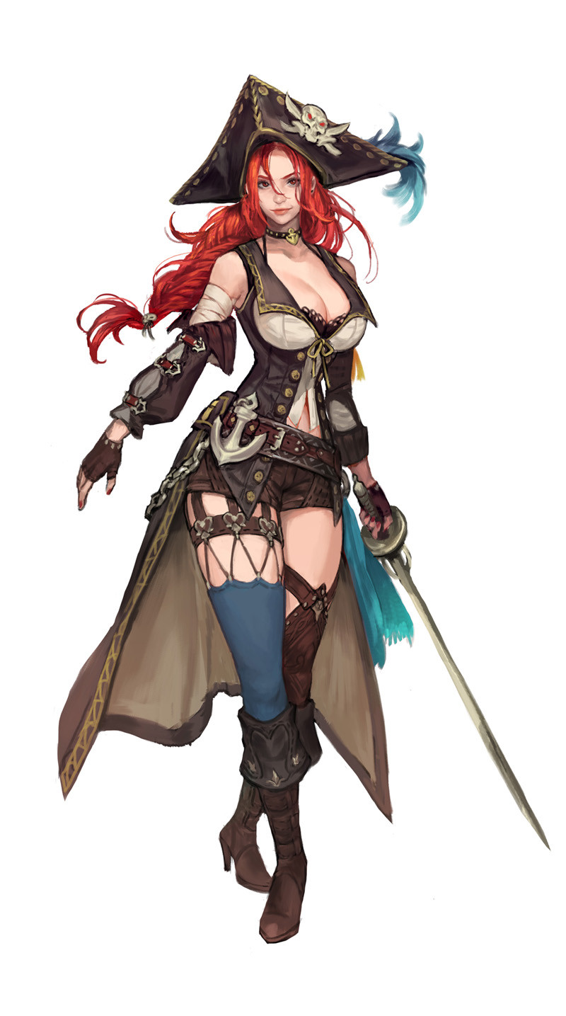
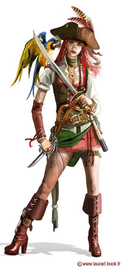
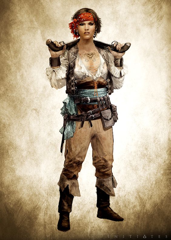
The outfits above are problematic for various reasons. Mostly because of their consistent use of high heels, tight sleek pants and huge amounts of exposed skin, be it thigh or stomach. The clothing choices seem to have been made to emphasize the woman’s body, which is fine to some degree, but it becomes an issue when the sexulization becomes the focal point of the design, rather than the actual clothes. Additionally none of these designs tell me anything about the character. Whilst the examples I added below have a personality to them, each character feels like they have a history and you can gather something about them from their design.
But what bothers me the most about these designs is the lack of authority they have, the ruffles, the colors, the cut of the coats does not invoke any respect. And a pirate captain is nothing without respect.
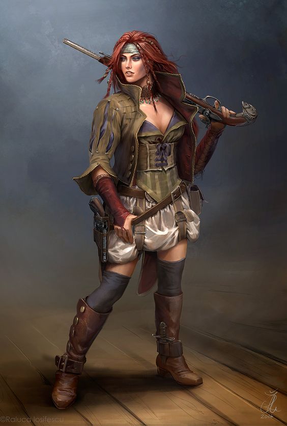
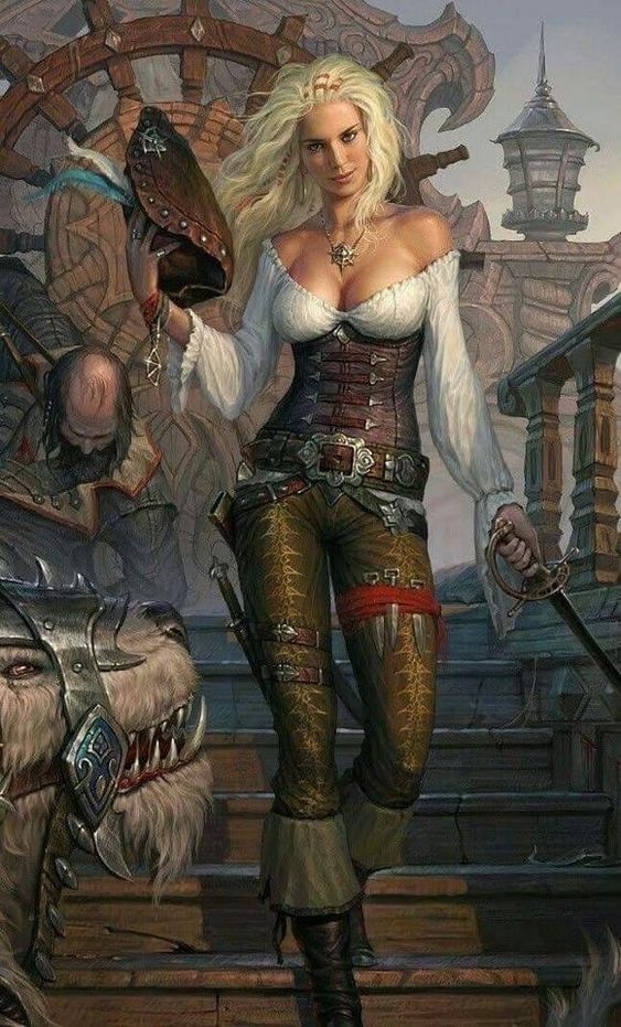
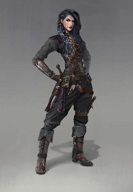
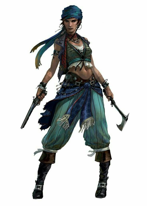
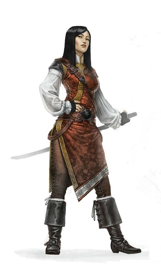
Below is some concept art that I feel evokes this sense of respect that the previous images lacked. I do need to note though that a lot of these still feature corsets, which I still think is a ridiculous choice.
Art Styles
These are some of the styles that I feel inspired by. I want something that is stylized and fluid, but still with enough detail to not feel too childish.
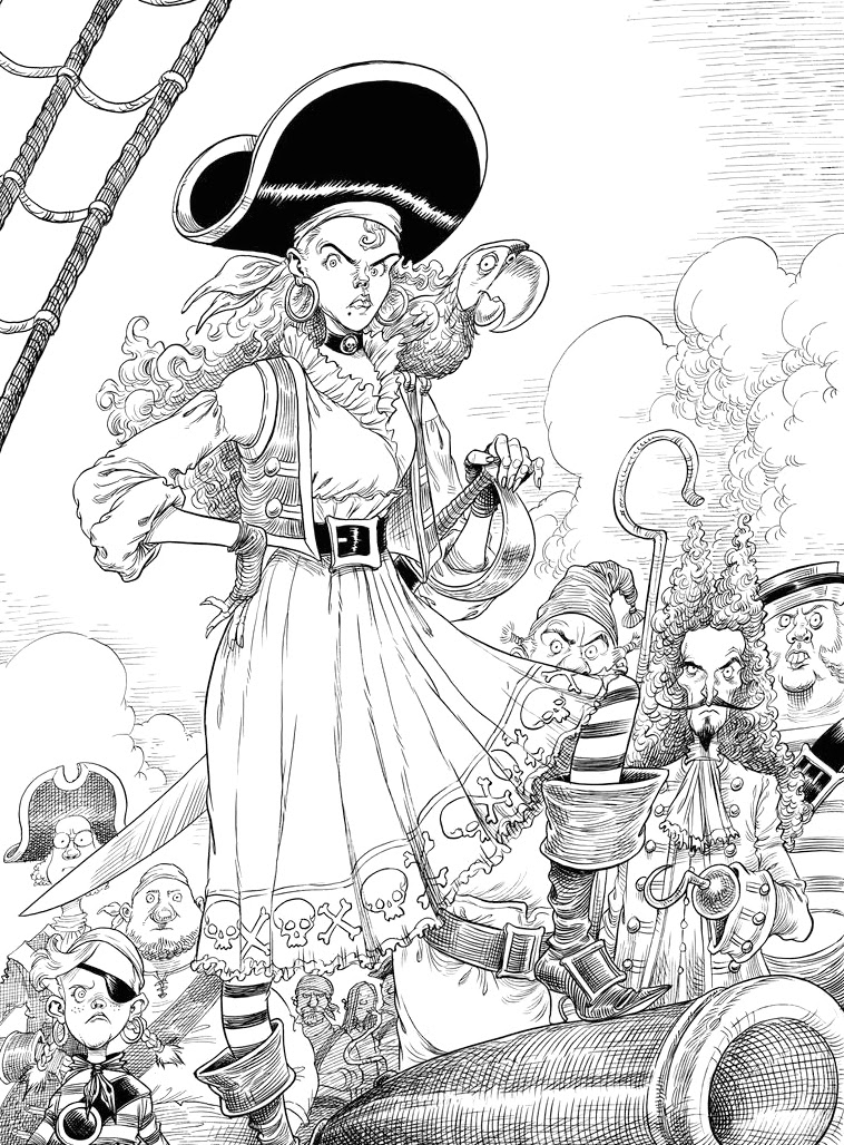
Chris Riddell is a well known illustrator who has worked with a lot of famous authors and has written and illustrated his own work as well. He has a very whimsical style with a lot of line detail. The drawings feel very organic and fluid and most of the time has a textured pencil quality to it. I admire his detailed line art, this isn’t my preferred drawing style so I will likely not recreate this. However, what I do love is how wacky a lot of the costume and hair choices are, which I love. Especially in regards to the pirate drawing. The pirate girl in the foreground has a very simple costume, but it is still very impactful. I think this is a great reference in how to create a clean design that conveys character. What really makes it stand out is the skull and crossbone design pattern around the trim of the dress. I really love this idea and definitely want to create interesting patterns for their clothing, because I tend to forget the impact that patterns can have on a design. I sometimes get distracted and focus more on the items themselves.
Cassandra Jean is an illustrator and what I love about her work is the way she uses colour. She only uses flat colour, but the way she segments her line art still gives it a lot of atmosphere. I think this approach is very interesting because it saves a lot of time in shading, but on the other hand it makes it even more important to have a solid colour palette. I like the idea of working in this way and using the line art and tactfully placed flat colours to create depth and shading. I also really like her line art because it is very clean, but still feels fluid, I think it is because she doesn’t use solid black and like Chris Riddell she also has a lot of extra notches and sketch marks in her line art, which makes it feel more hand drawn and less mechanical/digital. I also like the way she frames her images, they convey a narrative very well and is something I want to study and replicate as well.
Rachel Matile
These two drawings are of pirates, so they feel very relevant to what I am doing. What I love here is the expressiveness in the face. I also love the fluidity of the lines, the close up of the two is very sketch like, thus is a little bit too messy for a whole book, but the wide shot has very beautiful line work. I love this style as it feels very alive and fun. This is more similar to how I draw and is likely how I am going to end up approaching the art for the book. I also enjoy the use of colour here, it is simple but effective. It is not as detailed as Cassandra’s work but is still very beautiful and easy to replicate. I am envisioning a mix between Rachel’s expressiveness, Cassandra’s framing and maybe coloring and Chris’s whimsicality.
My own styles
I have looked at other people’s styles, but I feel like it is equally important to look at my own styles. As with any artist I have a style that I default to, but I have the ability to adapt and mold my style to the specifics of a project. However, since here it is I who decides the style I have more freedom than usual.
I think my character design will largely drive the style I choose, but I think it is useful to look at what I produce myself to get some insight into what I do that works, and what doesn’t.
Working from left to right. The first image “Anonymity” is a simplistic drawing with cell shading. The line art is a clean black outline and the colour palette is simple. What I like about it is the clean lines. While I was drawing this I focused on making the line art very strong and accurate because I knew I wanted minimalistic colouring. I also like the proportions of the body, they are semi realistic, but with longer feet and legs. However, I think this drawing is a bit too angular, for this I want more flow in the lines so that it feels organic and windswept in the ocean breeze. I am unsure about whether I want to use pure blacks to the extent that I have here or if I want to offset my black and either use deep grays or browns as my blacks to make the palette feel less harsh, the same goes for white. I also don’t know if I want cell shading that is this hard cut or if I want a softer shading.
The next image doesn’t have any shading, but has very expressive lines. In this drawing the outlines almost function as shading a they are what gives depth to the image. I do like this style, but I feel it can quickly become messy when used as a full illustration. In terms of body I like the long arms and big hands, but the feet are too small and I don’t think I want to stylize the face to this extent. However, I do want to keep it more stylized than some of the other drawings here.
The middle drawing has very fantastical lighting. What I really like about this image is the combination between hard and soft shadows, this is something I think I will try to use for the book, but in a cleaner way than this, because I feel this drawing is a bit messy. There is a lack of focus in the image and the viewer doesn’t really know where to look. However, I do like the line art, although it might be too detailed to use for the entire book. Also the background in this image is very bad, because I drew it as an afterthought, in this book I will focus more on making the background fit the character.
The next image has a very different use of colour, and it has one base colour and then the shading applied through hard brush strokes. This is not a technique I use a lot, but it turned out pretty well for this image. I don’t think I would apply this colouring technique for an entire image, but it is something I would use for parts the environment. I think this would work well for pats of the image that aren’t in focus, because it is quick and easy, but still creates a nice effect.
What I like about the last image is the face and the body proportions. The larger head and the long legs looks pretty good. However, I hate the shading. What I like about the face is the large eyes and soft lines, I think the smooth lines work, but they might be too messy. But I think a combination between this and the middle image might work.


Children’s Drawings
Since this is a children’s book, I was very curious at how a child would draw a pirate. The reason I find children’s drawings particularly interesting is because they are such a pure expression of what children envision. It is an uninhibited drawing, unladen with expectation or pressure to perform. I want to use this as a source of inspiration and visual reference, but also as a way to find out what children associate/expect when they think about pirates. This is particularly important to me because I want to create pirates who feel kind of fresh and modern, but are still distinctly pirate. So I want to implicate the elements that children draw when they think about pirates so that the character are recognizable as pirates. Below Is my small collection of drawings.
1
5
6
2
3
Pirates
I love this design and with only small changes be made into a final design. I especially like the vest and the pendant. I also think the amount of patches is really great and the way the pant leg feels frayed. This gives me the idea to make sure the pirate clothes feel dirty and ragged.
This baggy shirt is very “piratey” and I love the belt. I can’t tell exactly what it is, but I see it as either shells or two gold hands as a belt buckle. I also think it is really cool to see how most of these drawings have scars.
My favourite bit about this outfit is the pants and I think I have to find a way to include those, because they are incredible.
My favourite part of this drawing is the hat. The sad skull and crossbones is absolutely amazing. I also think that this drawing itself is a great representation of all thinks pirate, the hook, the peg leg, the gold ring and the hat. They are all staples of what a “cliche” pirates look like and a great reference to me to see what children associate with pirates.
This was what the children in the first class I went to made. They weren’t able to draw, but the teachers asked them to describe a pirate and then wrote down their answers. For this one I just love the idea of a ripped cardigan. The softness and innocence of a cardigan combined with the ruggedness of a pirate creates such a fun contrast. It gives me the idea of a really gentle pirate that wears an old cardigan as is just nice to everyone, I would love to try out this design, but it is not very “piratey” so I will have to see if It works or not. However, my favourite thing about this drawing are the feelings he wrote down on the left. “Worried, Frustrated, Scared, Happy” - the teacher explained that this is the progression of the character’s emotions throughout the story. The best part is that they match up pretty accurately in relation to the script.
Here I love the orange coat and purple shorts. These are vibrant and high contrast colours just like Bernadette and the other teachers recommended.
4
The Sea
“Her eyebrows are made of coral.
Her hair is the waves.
Her eyes are pebbles.
Her body has the land, ships and animals on it.
Her bracelets are caves.
Her hands are seaweed.“
I love this descriptive poem about the sea’s appearance. I do like the idea of a ship wrecks incorporate in her design, however, I had decided to not have human made elements in her design because I want her to feel very pure and natural. Additionally I don’t really want to make references to ocean pollution or over fishing in her design. Mostly because I don’t want to just throw in such heavy topics without focusing the story on it, additionally the book is already "political” enough with having a gay couple in the lead, so I don’t think I need more heated topics to be included.
Concept Art
Each drawing is annotated with the thoughts behind the design choices, just click on the image and hover over it so see the text.
The concept stage for this book is vitally important. Sorting out the designs for the Captain and the Sea is my main focus, then for the rest of the crew I will have more fun and be more whimsical in their designs. But for the Captain and Sea I need to make sure they are visually appealing, the challenge here is designing something that will resonate with children. I fear that I have put an artistic limitation on myself because I am trying to hard to please children, but I feel it is important to consider the implications my design will have. In terms of inspiration I work mostly from historic references, but since The Sea is a fantasy creature I don’t have many specific visual references. With her I am focusing more on portraying the right attitude and creating something that kids will respond to.
For this project it is important to me to balance my original ideas and the cliche ideas, I want the designs to be innovative, but still be easily recognizable. But most of all i want to have fun with these characters.
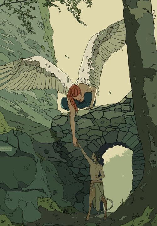
The Sea
Here you see the board dedicated to The Sea. When I started putting it together I was looking at a lot of references of water, the way it moves and its colours. I also looked different mythological representations of the sea or sea gods. I also tried to find dresses or outfits that fashion designer had made that were inspired by the ocean to see how they portrayed this, these are too modern to directly copy, but I hoped they could functioned as inspiration. Then I also progressed to look at different dresses from different countries such as India and Japan. There are also a handful of pictures of coral and jellyfish as I am looking at their structure for inspiration for the outfit.
Inspiration
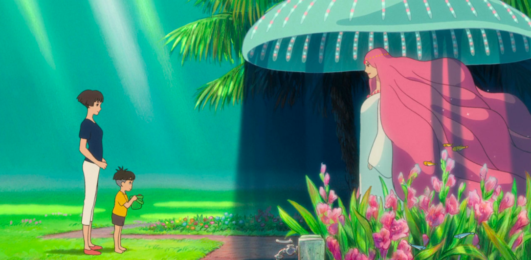
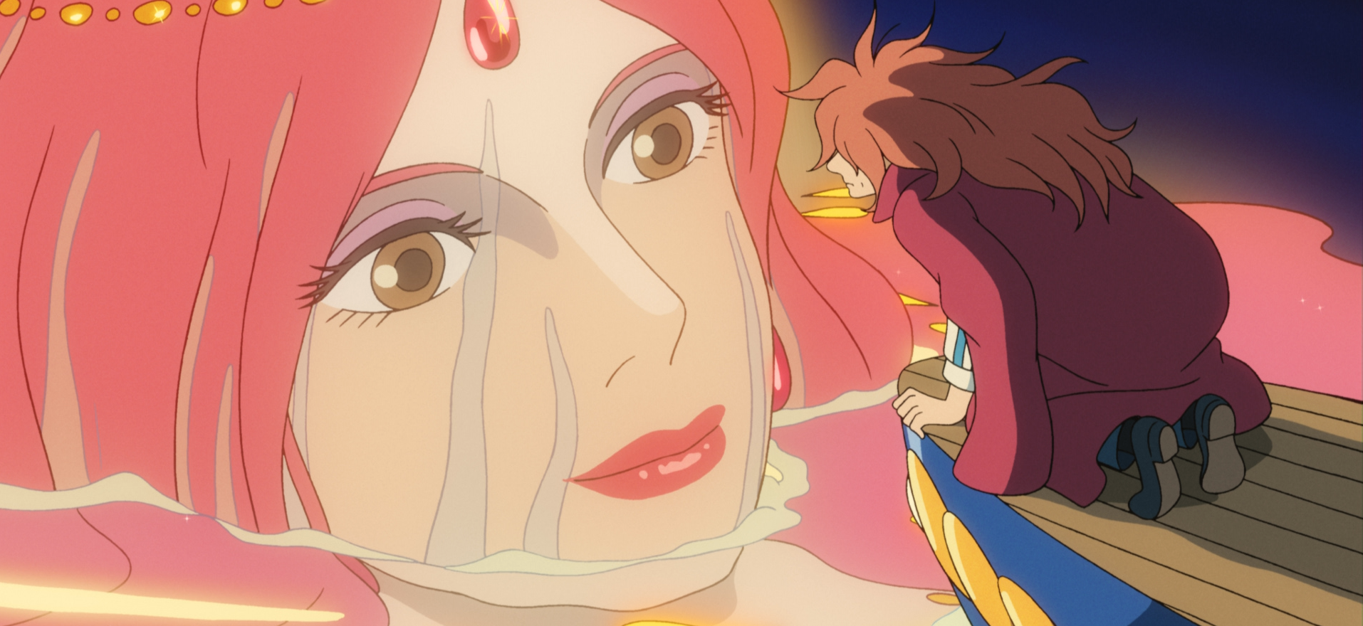
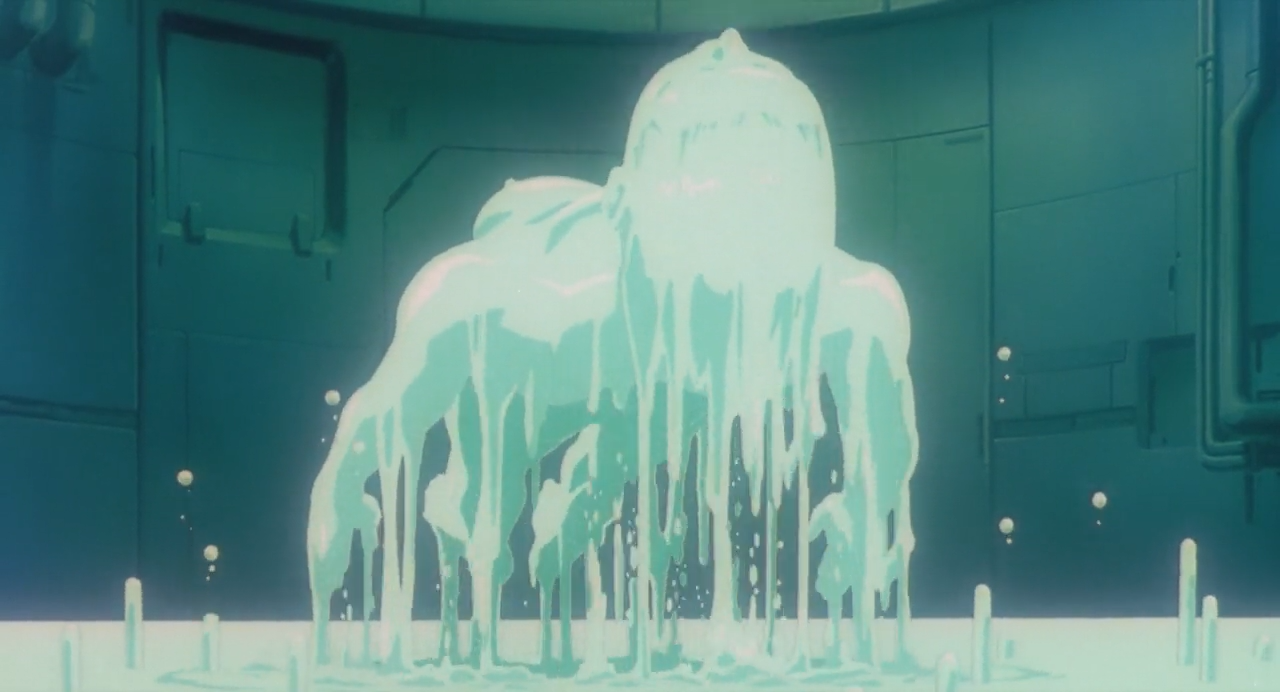
The Deep Sea Mother from Studio Ghibli’s “Ponyo” is a good example of the sea as a woman. However, her colour palette is very different from what I imagine for my character, but what I do like is how large she is. I also imagined The Sea to have the ability to be any size, much like water itself that can be everything from a drop to an ocean. I like her coral coloured hair and the way it flows likes water. This aspect is very similar to my own idea for The Sea’s hair, however hers would be blue. I also think she looks a bit too much like a normal person, I would want her to feel more fantastical. In terms of costume I really like the colour choice, especially in the first GIF of her, the way it waves in the water and the bright blue colour contrasted with the dark blue water around makes it look like moonlight shining on water. However, in terms of the design of the dress it is a little bit boring, it is very plain as you can see in the picture on the right. This is likely because this is for a 2D animation and needs to have a simple enough design to replicate again and again. In short, there are a lot of beautiful elements to this design and I definitely think they have captured that serene grace that I want to portray, but I do want her to be a little bit more authoritative and changeable. They are also using a very different colour palette than I am. However, I do think the contrast between the hair and the dress is something I want to look into doing myself.
Next there is Te Fiti from Disney’s “Moana”, she is the goddess of life and nature. An embodiment of nature itself. This design is more literal in its interpretation, essentially just making a woman made of grass and flowers. I debated doing this with water, however, decided not to simply because drawing water is very challenging. I want to work on my water drawing skills and will implicate this into her design, but not as the focal point, because I don’t want to risk that it looks ugly. What I like here is the monochromatic colour palette, she is almost completely green, but with a contrasting flower crown. This is very similar to a lot of the ideas I have drafted. I like the idea here to have the dress be a part of her body, I have briefly looked at doing something like this and I think it is an idea that I want to explore further.
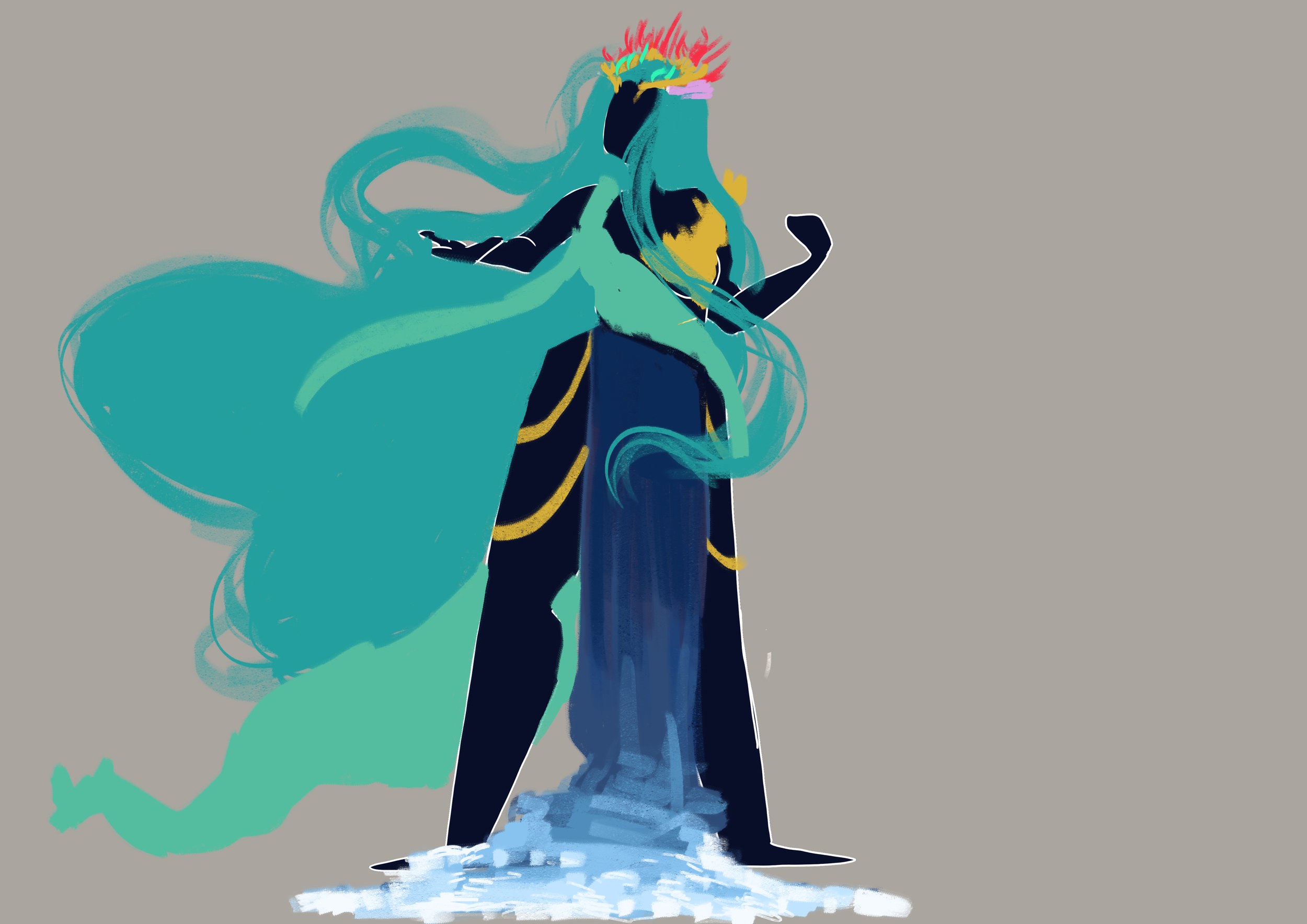
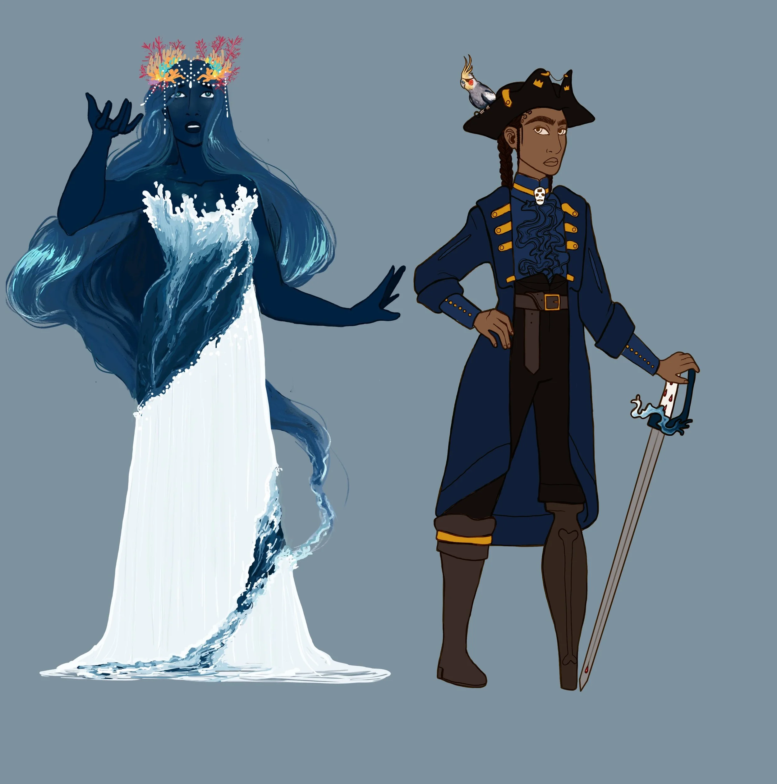
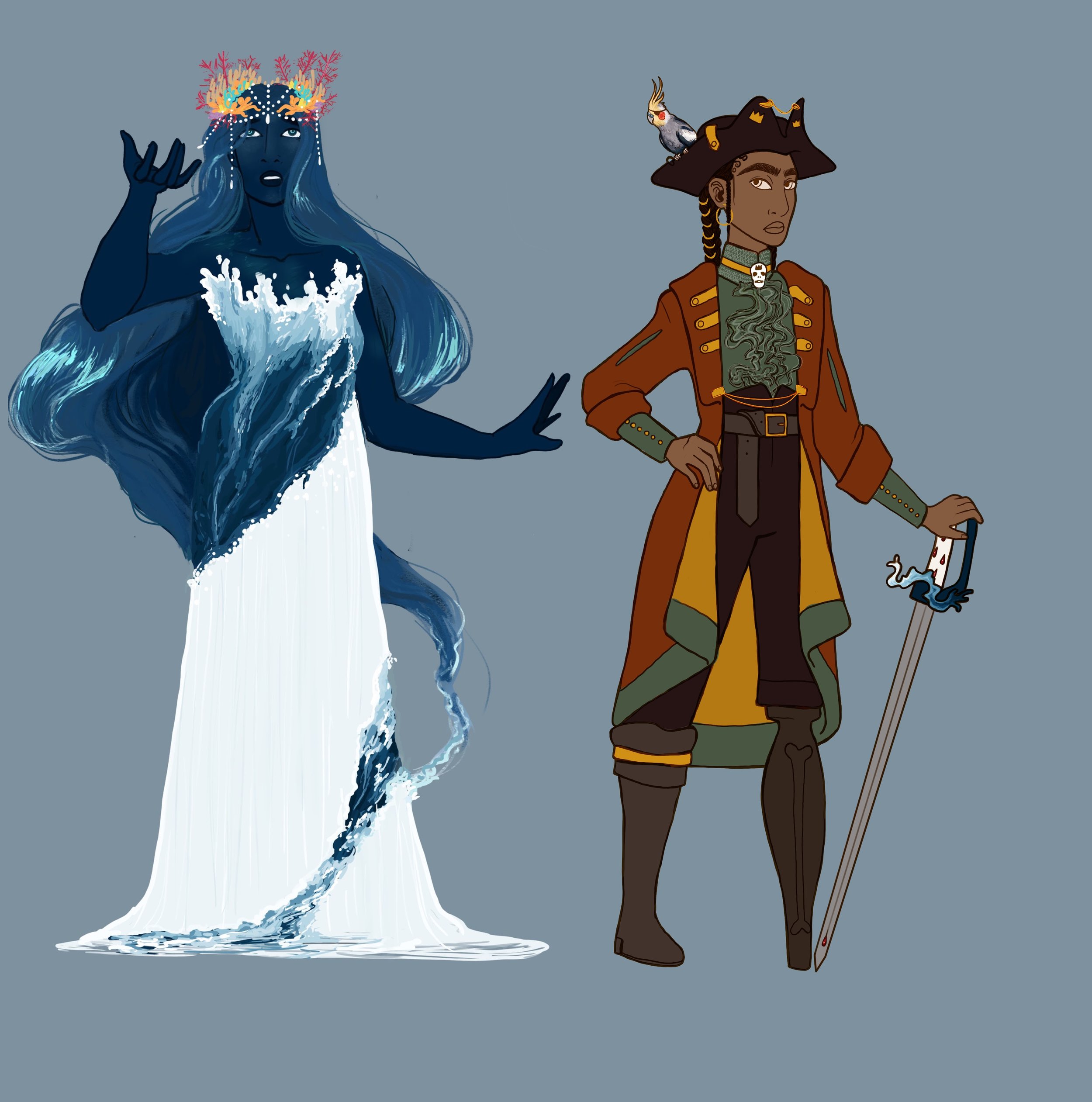
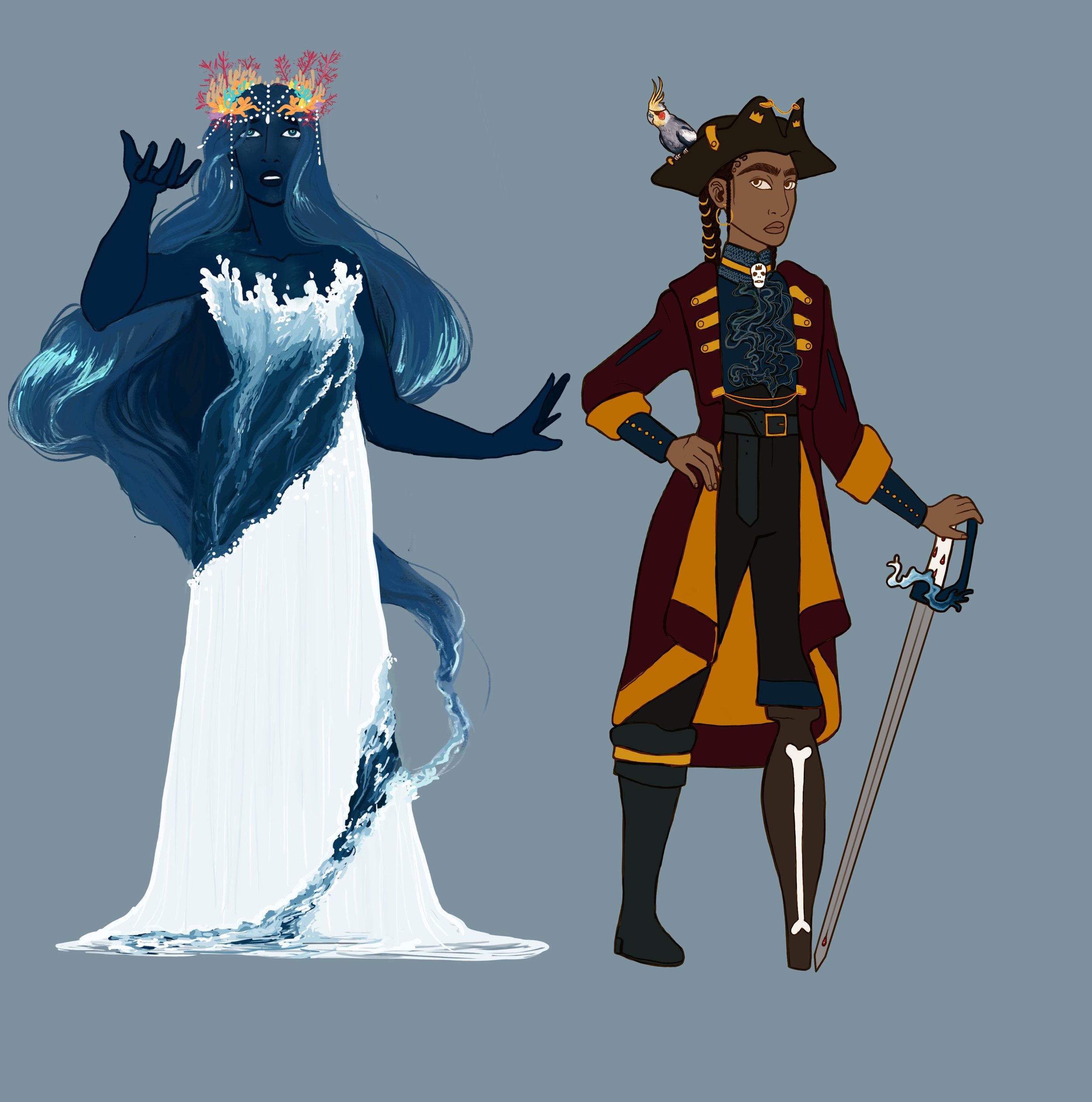
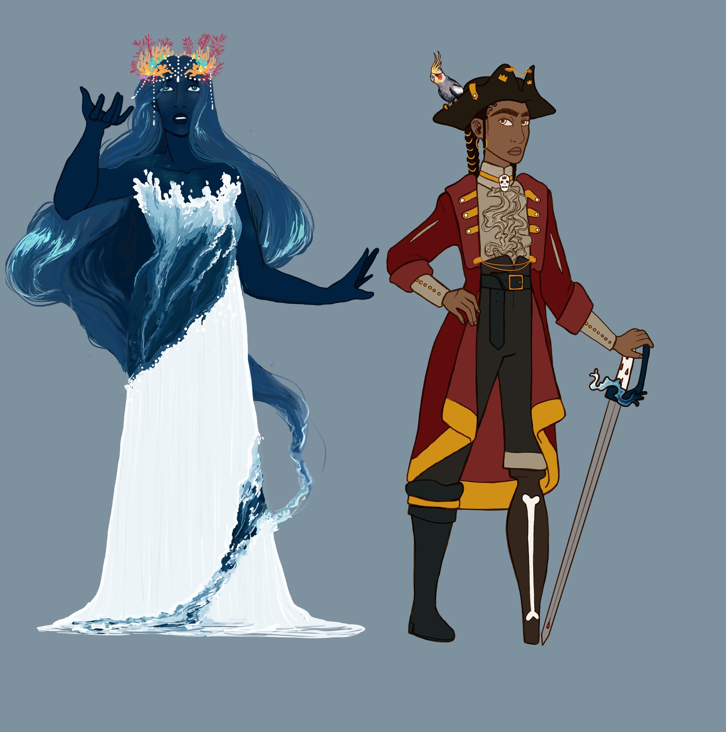
The Sea is the embodiment of The Ocean’s spirit portrayed as a woman. She has proved to be a huge design challenge. My biggest issue lies in figuring out what clothes she wears, as I had originally envisioned her in the nude, which, for obvious reasons, isn’t a good idea for a children’s book. Thus I am currently stuck trying to figure out, why she would wear clothes, and if she did, what would she wear. My problem is that any dress that looks tailored immediately feels wrong, because why would she have a tailored and designed dress when she is flowy and natural.
As a character I want her to appear strong, but feminine, with curves like the ocean. She is powerful, but beautiful and demands respect.


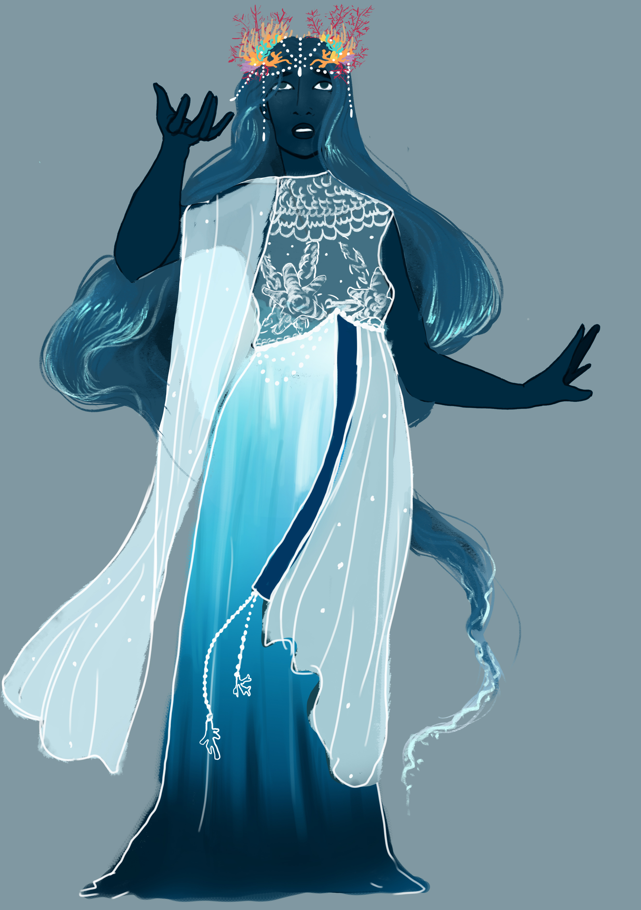

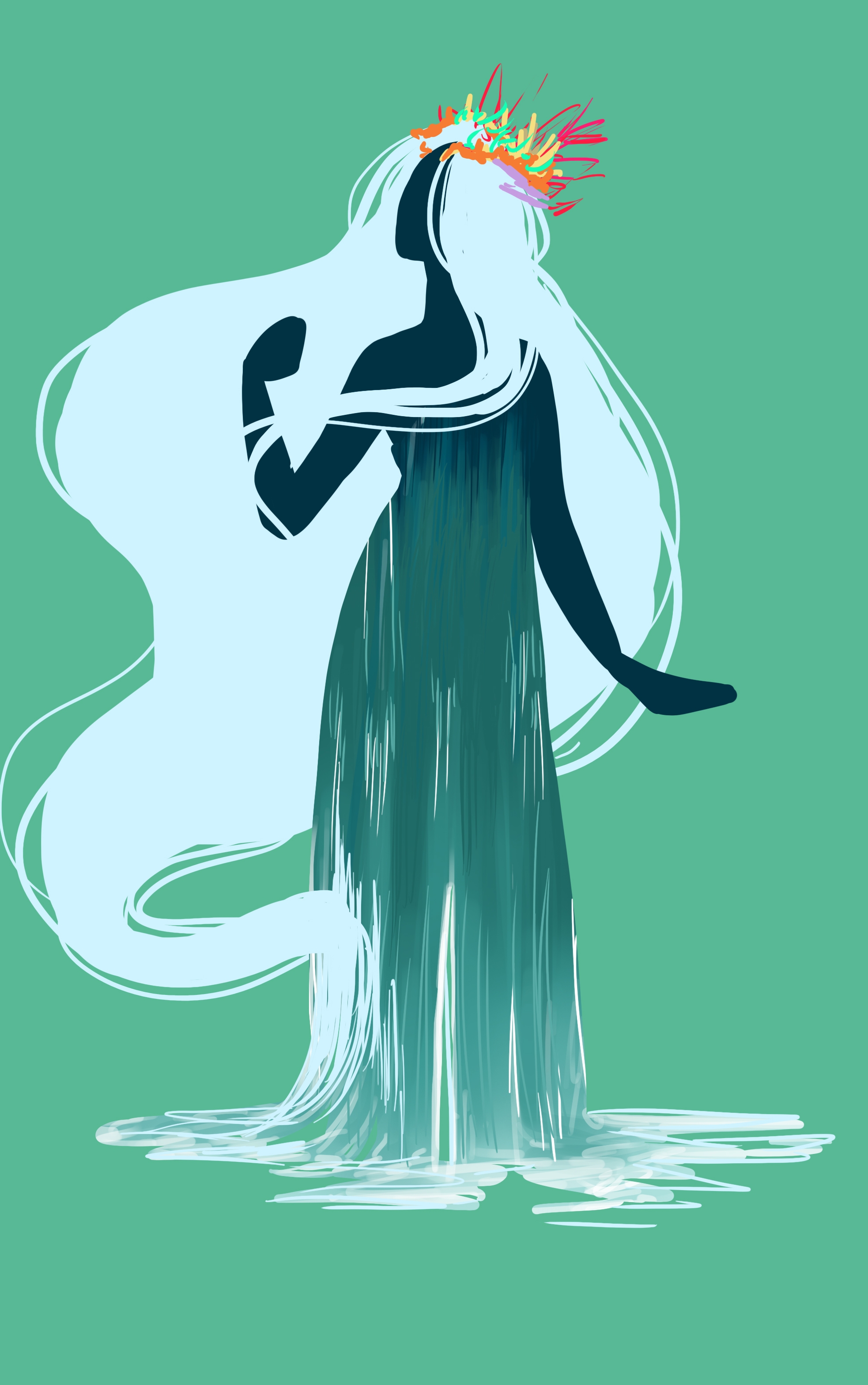


As a way of working around my original idea of having her hair be a gradient, I instead decided to have the hair flow and change with her temper.
Angry = Storm with dark crashing waves
Sad = Dull murky waters
Happy = Calm Sees with vibrant blues
I am not sure how this will work in static image, but it would look great in animation. However, I do love that it gives me another object to emote with. Her her will have almost a mind of its own and thus have the ability to float and fill spaces.
Captain
The Captain’s board is for finding clothing references that I like for her in particular. Especially hats and coats. I also looked at some prosthetic leg “designs” and some pictures of parakeets.
Please note that some of the pins in this boards are there are references to “what not to do”. Thus is you see a sexualized design it is likely there as an example of what I want to avoid in her design.
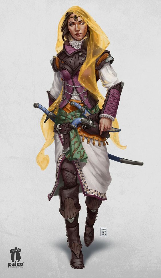
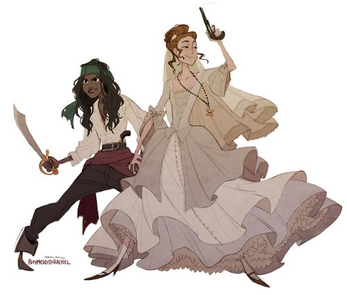
The captain is a strong and fierce woman, she is the fiercest pirate in the world. She commands her crew with respect and skill. They are the richest and most infamous pirates, no plunder is too big or small for them.
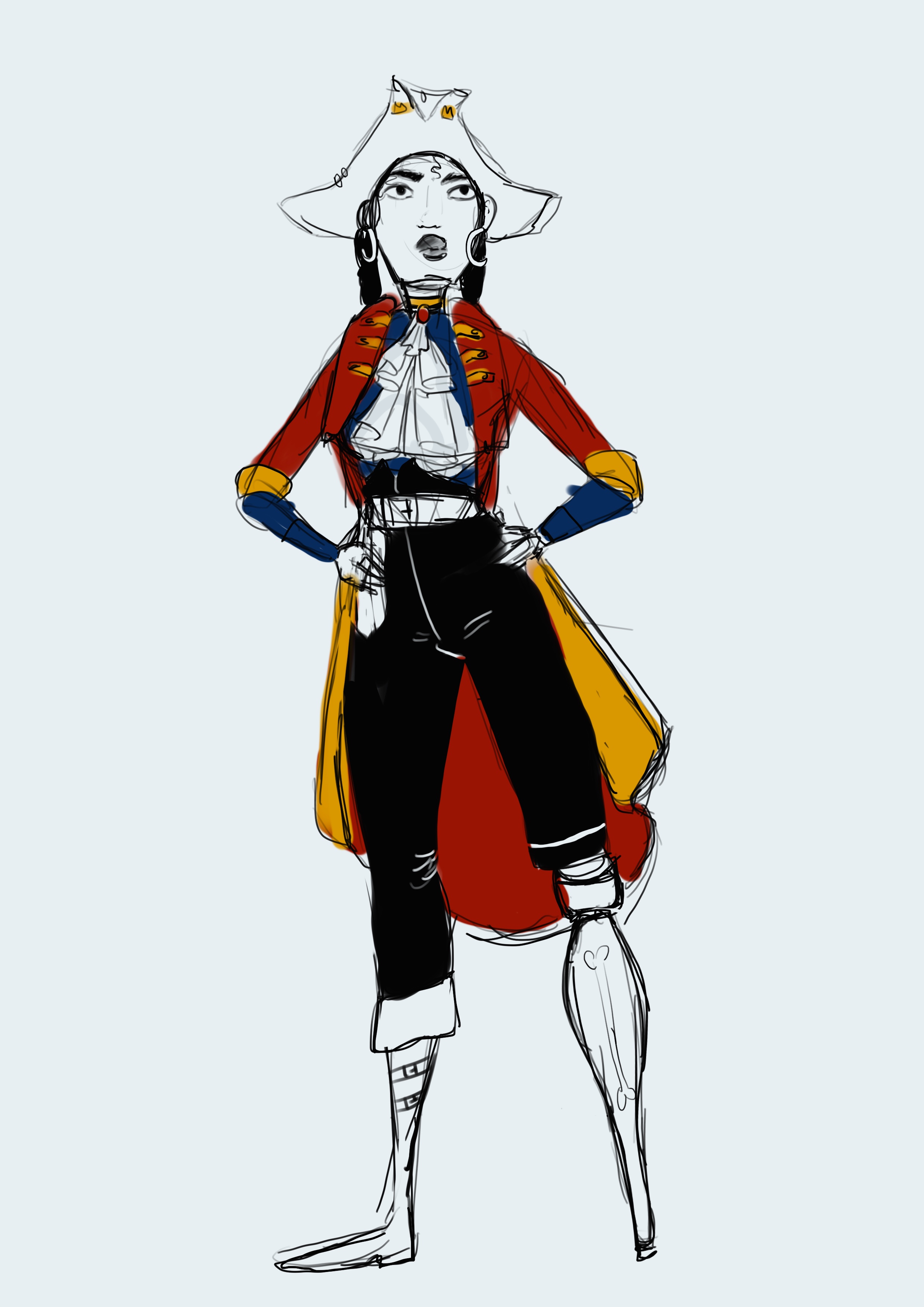
Her style is well crafted, but not flamboyant, her clothes are expensive and ornate, but not flashy. I want her in quite gender neutral dress, she will be distinctly female, but not wearing dresses or high heels. She, as her crew, would wear practical clothes for seafaring and skirts are just not practical. I want to give her a peg-leg, both because it is distinctly “piratey”, but also because it represents people with lost limbs which is very much in thread with the mentality of my book.
In terms of design i kept going back and forth on ethnicity. I knew I didn’t want a white captain, because the whole point is diversity, and having one blue and one white character isn’t exactly that. I was not stuck between Asian, African or Hispanic. After discussing with multiple people I settled on a generic middle brown colour, because this means that children can project themselves onto the character.


Hats and Hair
The captain’s hat is an essential part of her design. There are three iconic styles, the Tricorn, The Cavalier and the Bicorn.
The tricorn was likely the most popular amongst pirate crew, whilst the cavalier was very popular amongst captains, because of its more exaggerated appearance.
Below you see the image featuring hats, going from left to right the hat types are: Tricorn, Cavalier, Bicorn, Wide brimmed felt hat, Cavalier with pinned side and Tricorn,
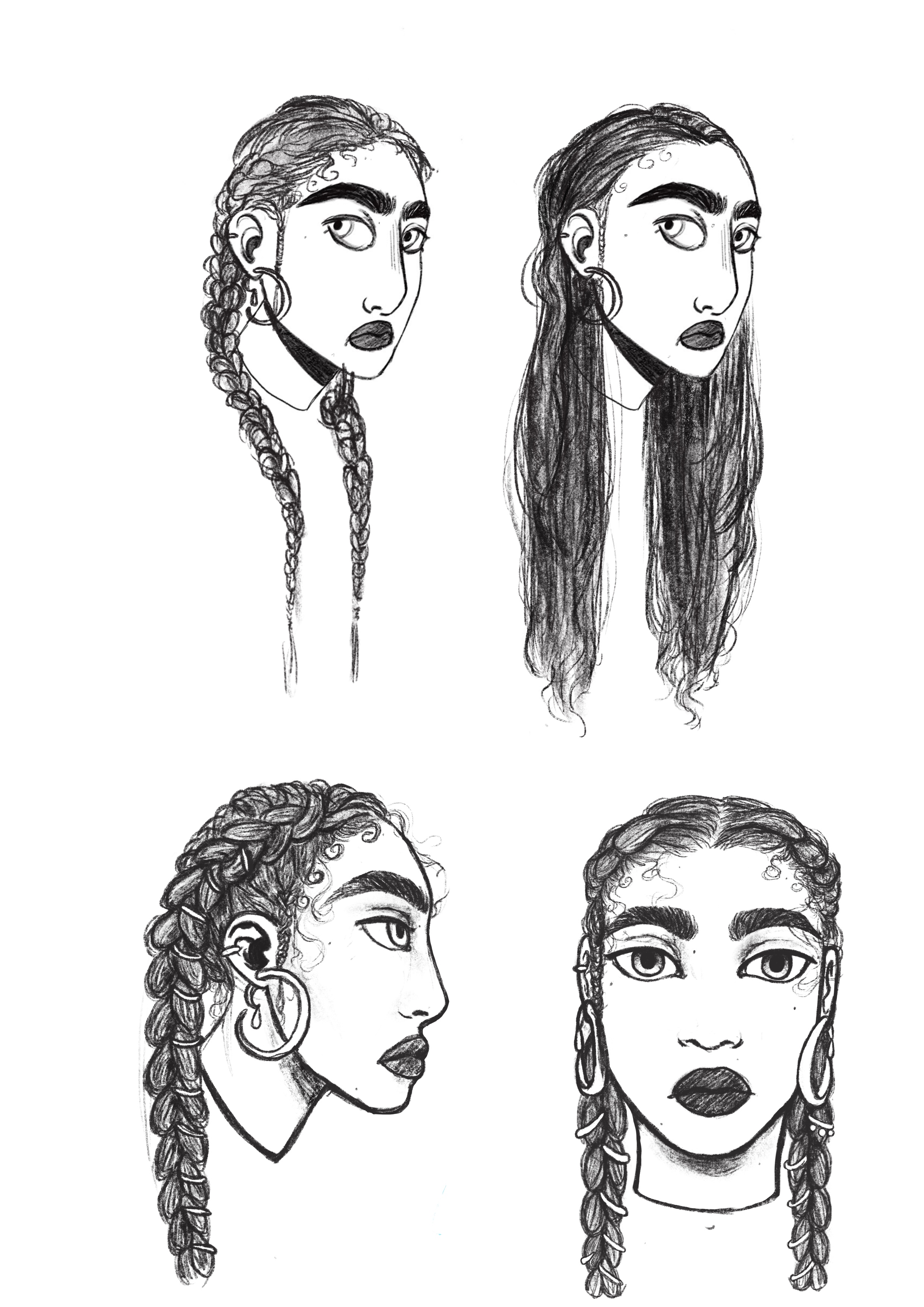
In terms of hair, I struggled between the choice of long or short. I originally wanted short hair, because as a girl with short hair I am constantly asked by children if I am “a boy, or a girl?”. Thus I wanted her to have short hair as a way to teach children that girls can have short hair too. However, I worry that that will feed into the stereotype that all lesbians have short hair. But on the other hand, giving her long hair will just perpetuate the idea that all girls have long hair. This was the loop I was stuck in, a couple of idea were suggested as possible solutions. Either she cuts off her hair half way through, or she has her hair tied up under her hat and only lets it down in the end. I am still unsure which option I like the best.
Out of the long haired option I am drawn to the two long braids because it is a practical and cool look. However, it was noted that they prove a prime target for being grabbed during battle. Which is a good point, but there will always be issues with a design, and at some point one needs to make a decision. In the end it is a children’s book, so I can’t forget to have fun with the design, because that is what children will respond to.


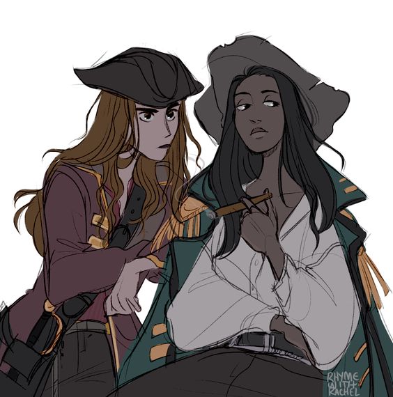
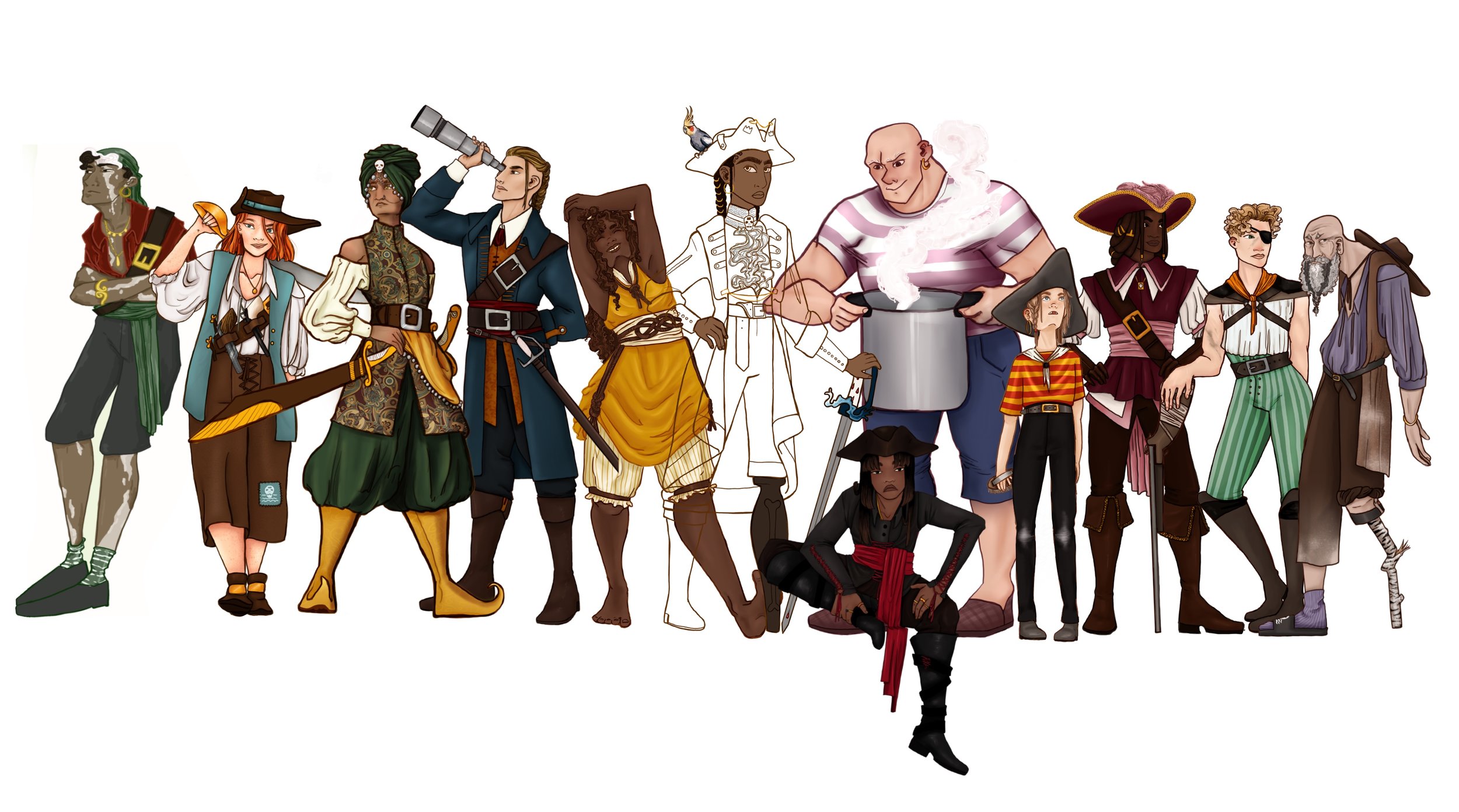
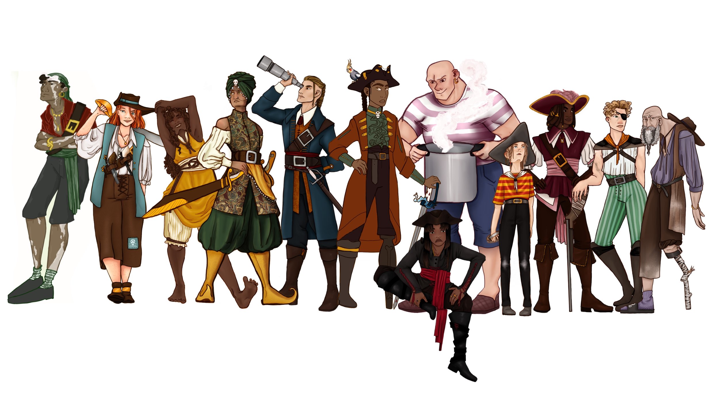
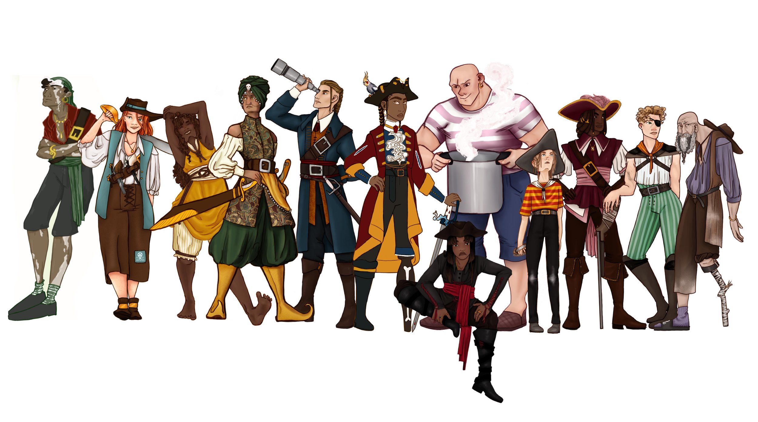
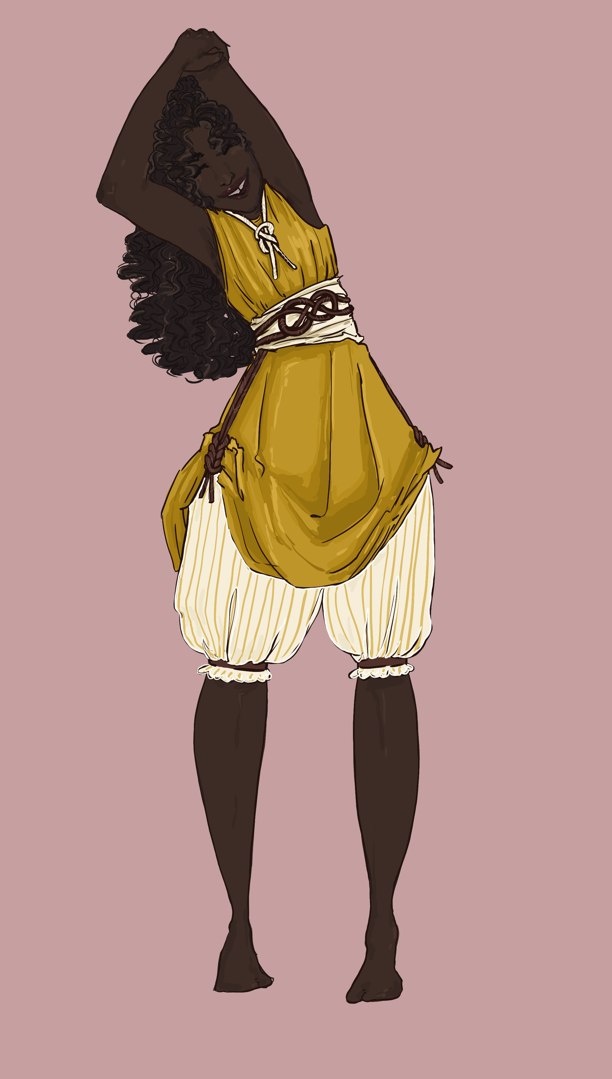
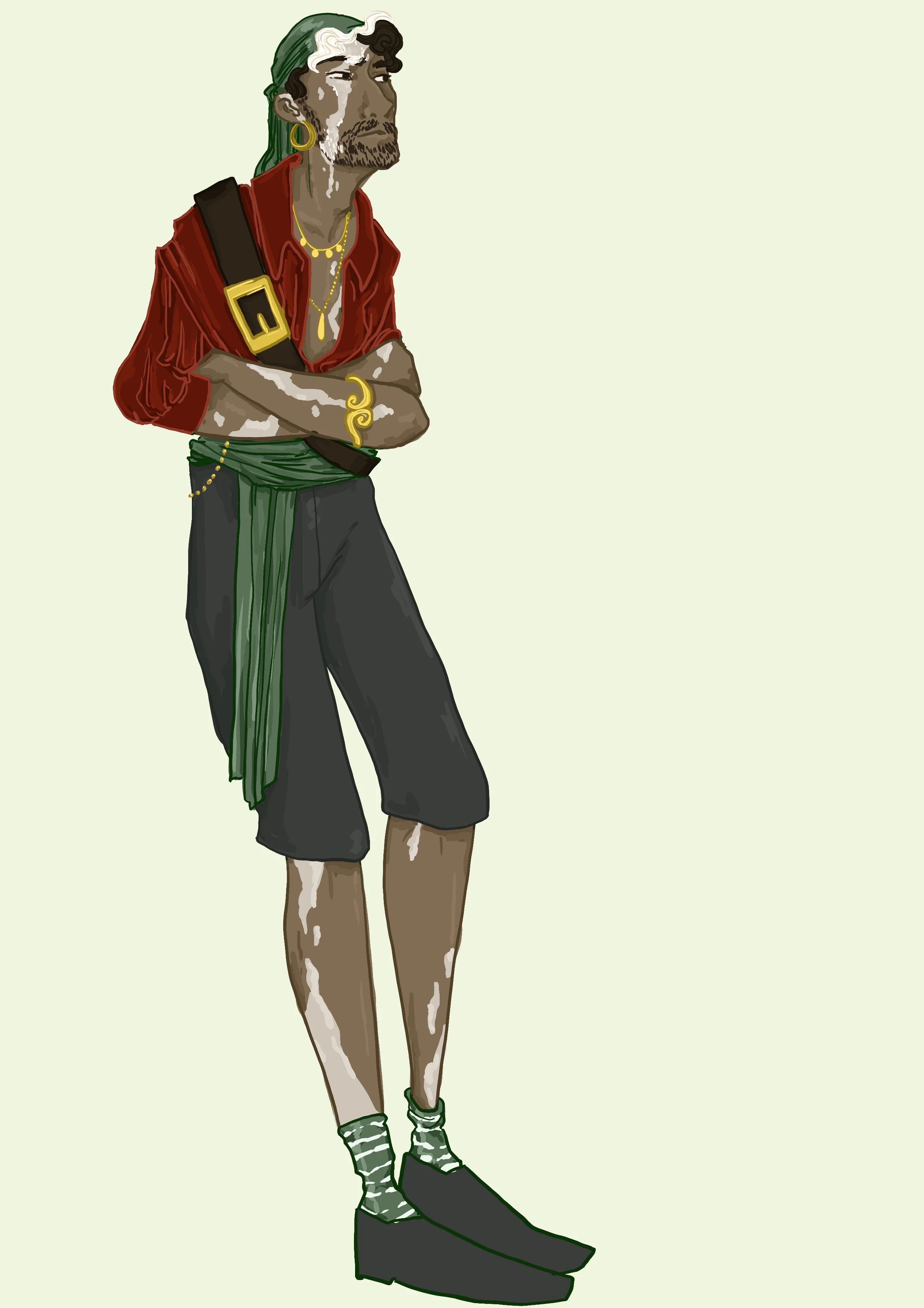
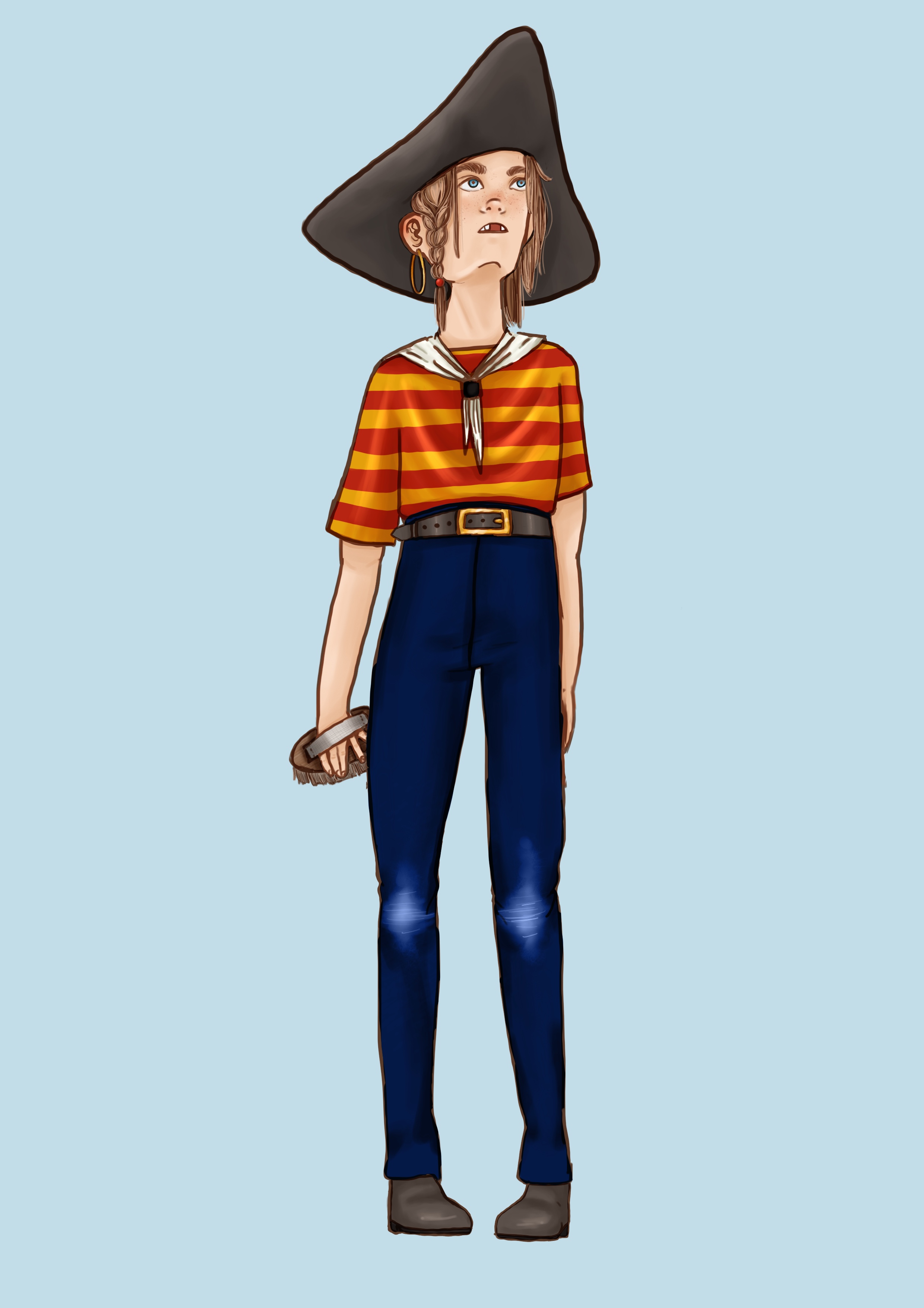
Crew
In terms of the crew’s design I will try to have more “fun” with their appearances. I want to cover every gender and ethnicity possible and make sure they all look cool and individual. I want to work with singular personality traits, much like the dwarfs in Snow White. I don’t want to be quite as extreme as that, but I do want to make them very one sided so that their character comes across even if they do not have any lines or plot of their own. Its is important to note that the crew I am designing here is the “main crew”. I will not be designing the entirety of the pirate crew, because that would be around 80 people and you will never see that amount of people in the book. So I will have a core crew of around 12, 7 of these will be “nice” and the remaining will be “bad”. This is because in the story a lot of the Captain’s crew leave her as she stops plundering and tried to become a better person, but her closest crew stay with her because they are such good friends. Thus I need to design the ones who leave and the ones who stay, and give each side equal exposure in the beginning so that the reader is uses to both of them. However, through body language and colour use I will make sure to portray the “bad” crew as lazy and grumpy, and the “nice” crew as happy and energetic. I want a very classic division between the two, since this is a children’s book I think making the designs over the top will make the narrative stand out.
I also want to be very self indulgent with these designs. I am going to create the characters I have always wanted to see. With The Sea and The Captain I am working very methodically, questioning myself at every turn to try to create the perfect characters, but here I will have the freedom to have more fun with the creating. There is less riding on these characters, which gives me the luxury to be a little bit selfish in my designs. As long as there is a balance in gender and ethnicity and the character look like pirates, then I can pretty much do what it want. (Within reason)
For the crew I want to work heavily with shapes, silhouettes and colours. I also want to look into specific nationalities and find ways to work them into the character’s design. Exploring questions such as “Did a Dutch pirate dress differently than a British pirate?”. I do worry about being accused of “over-representing” to the point where it feels forced or fake. But I don’t really want to give into that feeling, because I don’t see a reason why we can’t have characters in every shape and size without it being “try-hard”. My goal is to reflect the world like it is, with all its diverse type of people. That is why pirates is the perfect choice for telling a diverse story, because they were literally from every corner of the globe. They were outcasts from every walk of life, from young peppy Scandinavian sailors to old Asian pirate captains. Pirates are the definition of a Motley Crew. Thus, I think that if people have anything to complain about they should complain about how most of the pirates in media are white, instead of focusing on my diverse rainbow crew. Representing people who are usually ignored is fun, and I want to portray that!
A huge part of who the crew is, is tied to their age. Basing my decisions on my research on pirate demographics I have noted down this division in age between the crew mates:
2: 16-18 years
4: 20-25 years
3: 26-25 years
2: 30-35 years
1: 60+ years
I added more people to the 18-25 demographic, because children relate more to younger characters. This is my biggest concern, because I don’t want my characters to be children, but most sources say to never make your characters adult, thus I want to make them as young as I can within the constraints of my story. The reason I don’t want the characters, especially the main characters, to be too young is because it changes the story significantly. However, i did note that most of the pirate characters I observed in media, such as the Jolley-Rogers and Kaptein Sabeltann, have majority adult crew, but have children who drive the story. This still won’t work for me, but I did observe that Prince&Knight, which is a book with a similar target audience, that they instead drew the characters with less detail, making it hard to make out what age they were. Thus still letting children relate to the characters, thus I feel confident I can do the same.
In the board I have been looking at different faces and hairstyles and then I will combine that with the “Clothes” and “Arms” boards to create the full characters. Below I have sketched out some faces based on pictures from the Pinterest board. Usually I would not start designing this way, but I was feeling stuck and doing it this way meant that I could get a lot of illustrations done without having to think too much and I could just draw freely.
The ideas I have for the crewmates characters are:
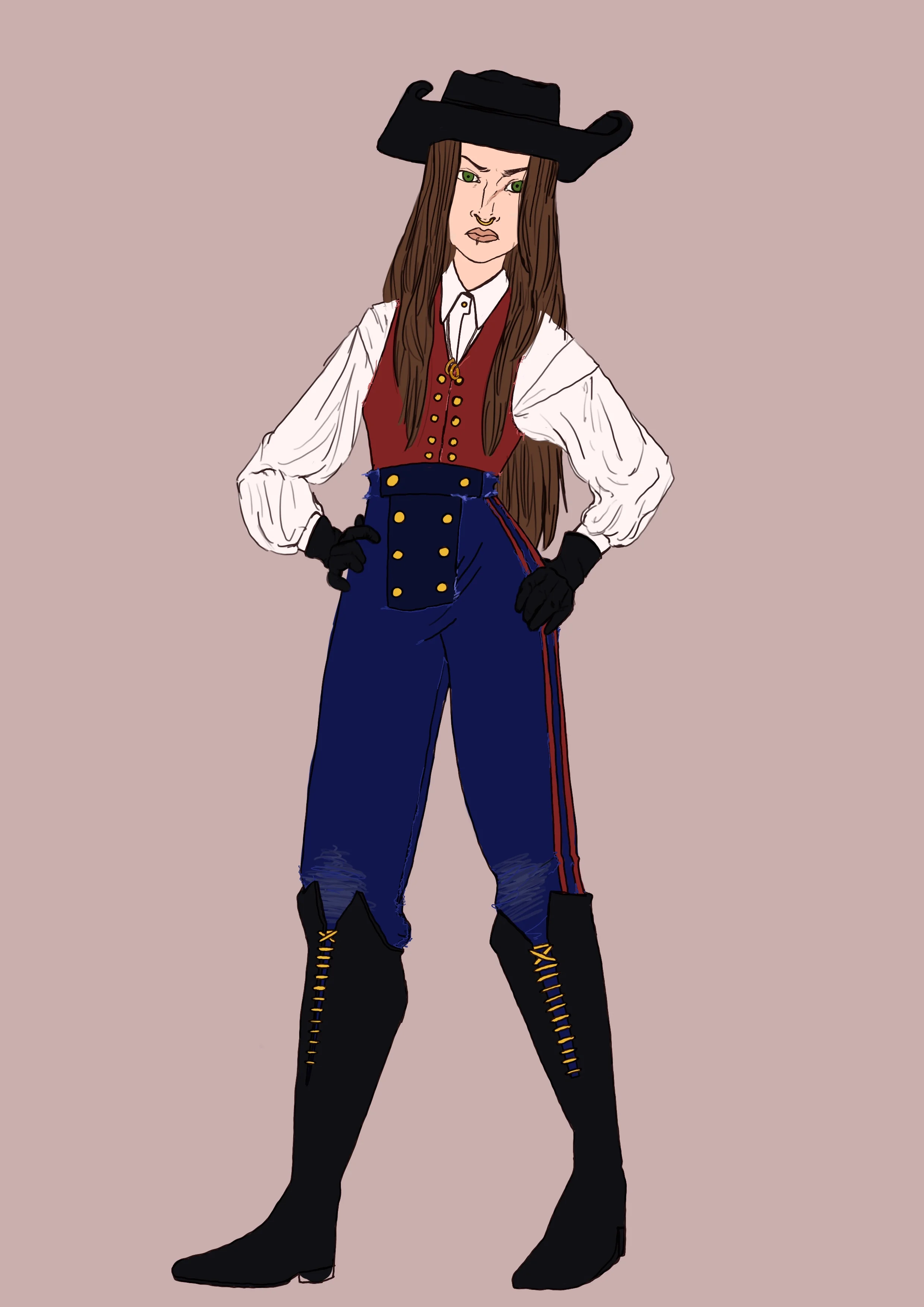
Really cool Quartermaster, who is stylish and powerful.
Bubbly girl with curly hair, who watches after the knots on the ship (incorporate nautical knots in her design)
Sad emo pirate, wearing all black and being very melancholy and too cool
Large hulking guy who is very sweet, Gentle Giant
Skilled sword fighting lady
Blind chef
Amputated arm sou-chef, with meat cleaver arm
Old salt woman
Bearded man with braided mustache (old-ish)
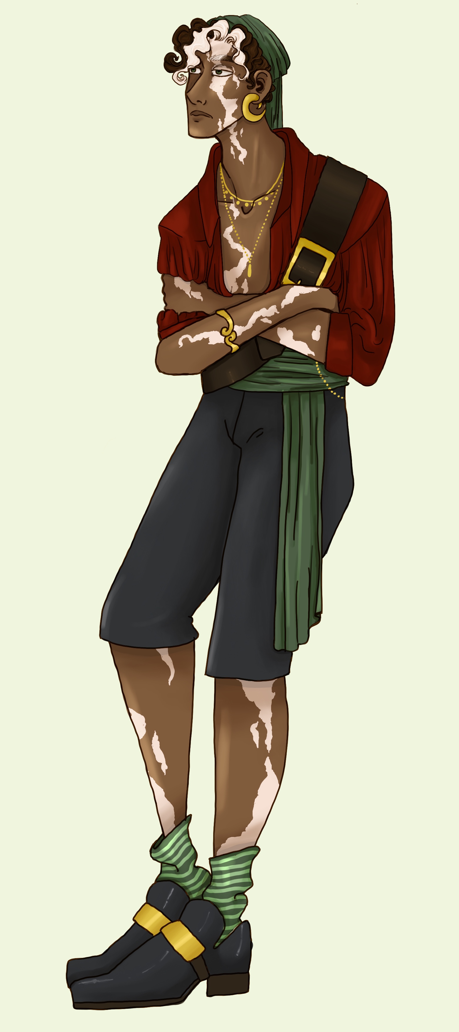
Vitiligo man
Someone ginger
African albino
Pirate in wheelchair
In relation to this list…
I have a problem and that is that I want a lot of these character to be “good”, because I want them all to be staple characters in the story. So I will have to be strict with myself here regarding who I include and what character they are. All of these have the ability to be both “good” and “bad” it all just depends on how I design them, their facial expressions and colour schemes.
An idea that I got and want to save for another time is the “blind chef” and the “amputated sou-chef” . I got the vision of a comedy duo between these two, where the chef is passionate about cooking, but lost their vision during a raid and can no longer cook. Thus they assigned them the sou-chef, who just recently lost their arm, to help the chef realize their cooking idea. Essentially functioning as the chef’s arms and eyes. However, the sou-chef knows nothing about cooking and keeps messing up, to the constant headache of the chef. I really liked this idea because it opens for a lot of slapstick humour and classic comedy. This is a storyline that I want to save for later. I also really like this idea because it is based on historical facts. Pirates who were wounded in battle and either lost their eyesight or limbs were usually compensated with coin and then allowed to stay on the ship for as long as they wanted and most of them usually ended up working as chefs. Thus this comedy duo idea works within an historical context as well, which makes me really happy.
I have written out the annotation for the first image below because it was too much to fit on the image itself.
NB! I will not be drawing in this style, this is just the draft style.
This was fun! The faces I liked the most are:
5: I love this bulky graphic design. His profile is incredible, very strong and pronounced. I imagine him like a friendly giant, much like Fezzik (Princess Bride) or Lurch (Addams Family).
6: I think this will be the inspiration for the first mate or the quartermaster (the second in command). I want him to have a really cool braid, I want to approach men’s long hair the same way I would with woman’s hair. That if they had long hair they would likely tie it away as to not get in the way during battle. I also really like the idea of the first mate being very dreamy and handsome.
8: I want to use this exact hair, the drawing is a bit messy, but it’s essentially just natural curly hair with bangs and a topknot. I really love this and imagine her to be very happy and bubbly, I also like her tooth gap.
9: This design is inspired by Finon’s drawing of the pirates with the sad skull and crossbones. I wanted to incorporate this and make an edgy “emo” pirate who wears all-black and is very grumpy.
12: Since the captain is not going to have short hair anymore, I knew I wanted a female pirate that did. I am not convinced by this design, but I like the messy curls because it is an “easy” cut to maintain on a ship, blade shaved sides and a mess on the top. I also want someone who has an eye patch, but I don’t know if it should be her.
13. I loved the idea of having a glammed up turban with loads of pearls and trinkets. I imagine them to be incredibly skilled with swords, wielding two scimitars. I don’t know if I want them to be male or female, I might have them be gender neutral. I also love the idea of having the central gem be a skull, I think it looks really cool.
14: This is kind of a generic design, but I think it is good to have some “plain” and easy pirates that aren’t too “unique”. I think she would be a good palate cleanser,
15: I was unsure if I wanted someone with vitiligo, but I just loved the way this guy looked, the albino strip down his face almost looks like a scar. So I will probably include this.
17: Old salt. I need someone old, I don’t know if I will use this, but I like his braided mustache. However, I did like the idea of having an old woman as the “old salt” character.


Design Method
For the crew I had to be strict by myself. I spent a lot of time designing and deciding on what The Sea and The Captain would look like, which put me a bit behind schedule. Thus, I had to just jump head first into designing these characters. Usually I would do a lot more prep-work, but to save as much time as possible I just had to go with my gut. I had done some research and made general decisions about what type of characters I wanted, so It was more the specifics of the designs (such as hair and clothes) that I had to “wing”.
A great example of the process I went through can be seen is this video, here I am designing Clement. In my mind I knew i wanted someone who looked fabulous. Initially I was inspired by this painting, I was looking at traditinal African clothing, but as I couldn’t make it work I started considering having a Native American character, but I felt that needed more research than I had time for, so I circled back to African, but now went out and looked for some period appropriate references and used that as a guideline. The video below illustrates the trial and error process I went through, constantly sketching and redrawing until I drew something I liked which I then pursued and completed, not having time to second guess myself too much. Although this is not my preferred method of working it was a nice change of pace to the constant second guessing I had been doing for The Captain and The Sea.
The image above has all the skin colours and codes of all the characters. I used this as a refrence so that tha their skin colour would be consitent throughout. I also wrote out the hex colour code in case there was any variation in how the colour picker worked from software to software. The numbers on their wrists corresponds to what character they are, I had a list that explained what character had which number.
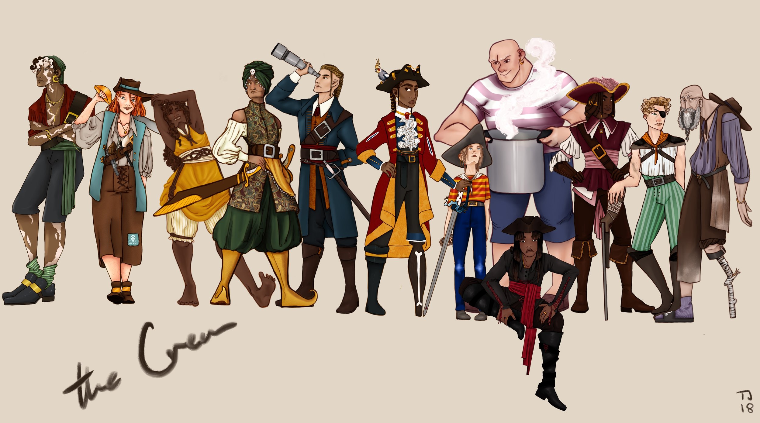
The Crew and the Captain
Additional Characters
The Council
On page 21 and 22 The Pirate Captain give up her title and riches to the pirate council. This means I had to design the members of the council. I debated for a while what kind of people they would be, would they be evil haggard pirates or would they all be people shrouded in shadows, almost without faces. After some deliberation I decided the council should be put together of some of the most famous pirates through history. Not that I would make a point out of this, but It was a fun task for me to redesign historic people and reinterpret them in my style.
For my famous pirates I chose Blackbeard, Bartholomew Roberts, Mary Read and Ching Shih. I chose them because they are the ones who (in my opinion) had the biggest effect on the pirates throughout history. Blackbeard is probably the most notorious, being pretty much a household name, he was known for such strength and ferocity and with his theatrical presentation he is the perfect candidate for the council. Bartholomew is my personal favourite, being the pirate who wrote the most famous set of pirate codes, he had a huge fleet to his name and was the most organized of all the famous pirates. That compared with his flamboyant appearance and taste for finery makes him a fun character to investigate. Mary Read is one of the two most well known female pirates during the golden age, her and Anne Bonny. I could have gone for Anne Bonny, but in terms of piracy and military prowess Mary Read is more skilled. She also had a strict personal honour code, making her an interesting authority figure. Ching Shih a female Chinese pirate. She had a huge fleet of Junks (a type of Chinese ship from 1700-1800). She was not active during the golden age of piracy, she was born in 1775, more than 50 years after the end of the golden age of piracy. However, she is such an iconic figure that I feel she deserves a place on the council. If I were to be more “accurate” I should draw Ching as a child since she is younger than the others, but instead I drew her as an older woman because I feel it gives her a sense of authority while still signifying that she is another time.


Suitors
On page 5 and 6 there are two people proposing to The Captain. To have a reference for what they look like I did a quick concept sketch.
I wanted them to have some semblance of matching colour schemes. In terms of the colours I chose earth tones, greens, browns and terracotta, this is meant to create connotations for land and earth. Them as characters symbolizes land being tied down, something that The Captain doesn’t want. In essence, rejecting them and their proposal is rejecting a life on land and other earthly ties.
Flag
The skull and crossbones is not the only flag that pirates used and black wasn’t the only colour. Other than black they also used red. Black flags were a warning of surrender, saying; 2It is in your best interest to surrender.” Whilst red was a more forthright threat, it announced death of the people who saw it. The pirates used imagery like blood, skulls, bones, swords, cannonballs w/lit fuse etc. “The whole Panoply of Death graced their flags”. (Lapogue, p.154) The hourglass is disputed in its meaning. Some say it means that is a warning that the “enemy’s ship’s time is running out” others mean that it is just a general statement of “life is fleeting”.
Elements I want to incorporate in my flag is:
Royalty/Crown
Killing
Female
Edward Low’s Flag
I want to make something new, but that still feels distinctly piratey and is easily recognizable. My main inspiration was Edward Low’s flag, I don’t know why exactly, I think it is just the uniqueness of it. It is so simple, yet so original and I really love the combination of red skeleton on black background. I am tempted to just use that as my flag, but that is just lazy and it would take away the fun job of designing a flag.
None of these designs really hit the mark and I haven’t reworked any of them since the day I made them. Since then I had the idea of having a red skull on a black background, or a black skull on red background. This might sound boring, but I hadn’t done that during my first experimentation. I am apprehensive about using the classic skull and crossbones because it feels so cliche, but at the same time I want to make sure kids understand it is a pirate flag.
Updated Designs
I finally got around to looking at the flag design again. As I mentioned above I wanted to try a different version of the skull and crossbones, but with a red skull on black background. That is what I explored here. The idea behind this drawing was a simple skull and some stylized waves and then I have two options, one with a crown and one without. The flag has two meanings, the meaning in the story and the meaning outside the story. In story the flag is meant to show a skull being drowned and the version with the crown further states that the Queen of Pirates is going to drown you. Out of the story the crown symbolizes the captain being the queen of pirates and the water is a reference to the captain’s love of the sea. The reason it doesn’t have any front teeth is because I thought it was a fun design that set it apart from the classic skull and cross bones. It is also a nod towards children who loose their front teeth, I felt this would give it something children would recognize and could resonate with, even if it is a tiny detail. Out of the two I prefer the one with the crown, because I think it adds another layer of meaning to the flag.
Ship Names
I know I need to figure out a name of the ship, even if it won’t be a central part of the story and it might not even be mentioned, but it will have an impact on the design of the ship. Especially, in regards to the figurehead which is meant to represent the name of the ship. I want the name to be something that either represents the captain’s cruelty or references her love for the sea.
My current ideas are:
The Sea’s Shanty
Treasure’s Tide
The Drowned Lass
The Coral’s Bow
The Queen’s Lover
My personal favourite is “The Sea’s Shanty”, but I don’t know if this will be the final name yet, as it feels a bit too jolly and kind. We’ll see.
Environment
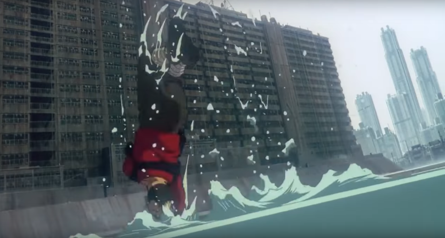
I haven’t mentioned the environment in detail, because I do not feel it has a huge effect on the story. Pirates traversed almost every sea on the planet, traveling from Europe to America, to Africa and the West Indies. I will likely set the scene in a generic tropical environment, because that is what the pirates were most known for. The Caribbean setting will feature a lot of bright blue water, white sands and tropical islands. This will be the focus for the horizon and background, however, most of the story will take place on their ship, thus the design of the ship is what will be most important to the environment and layout.
This was the first ocean test I drew. I knew going into this that drawing the ocean was going to be a huge challenge for me, so I sat down to practice. This is obviously not that great. The shading is all wrong and it lacks any atmosphere. However, it was a valuable experience and any water I draw is a step in the right direction. I just need to keep practicing.
Here is a draft of the environment style I envisioned, something fun and whimsical, but still very atmospheric. I don’t think it will be drawn in this way, because it is a very time consuming style. I need to decide what style I want to draw in, but as I mentioned before I will decide on this as I start finishing the character design for The Captain and The Sea. I also need to practice drawing water, because I found this very challenging and my book as a lot of water in it, so I have to become an expert at drawing water, or at least very comfortable with it. style
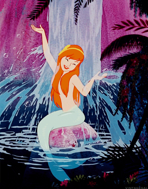
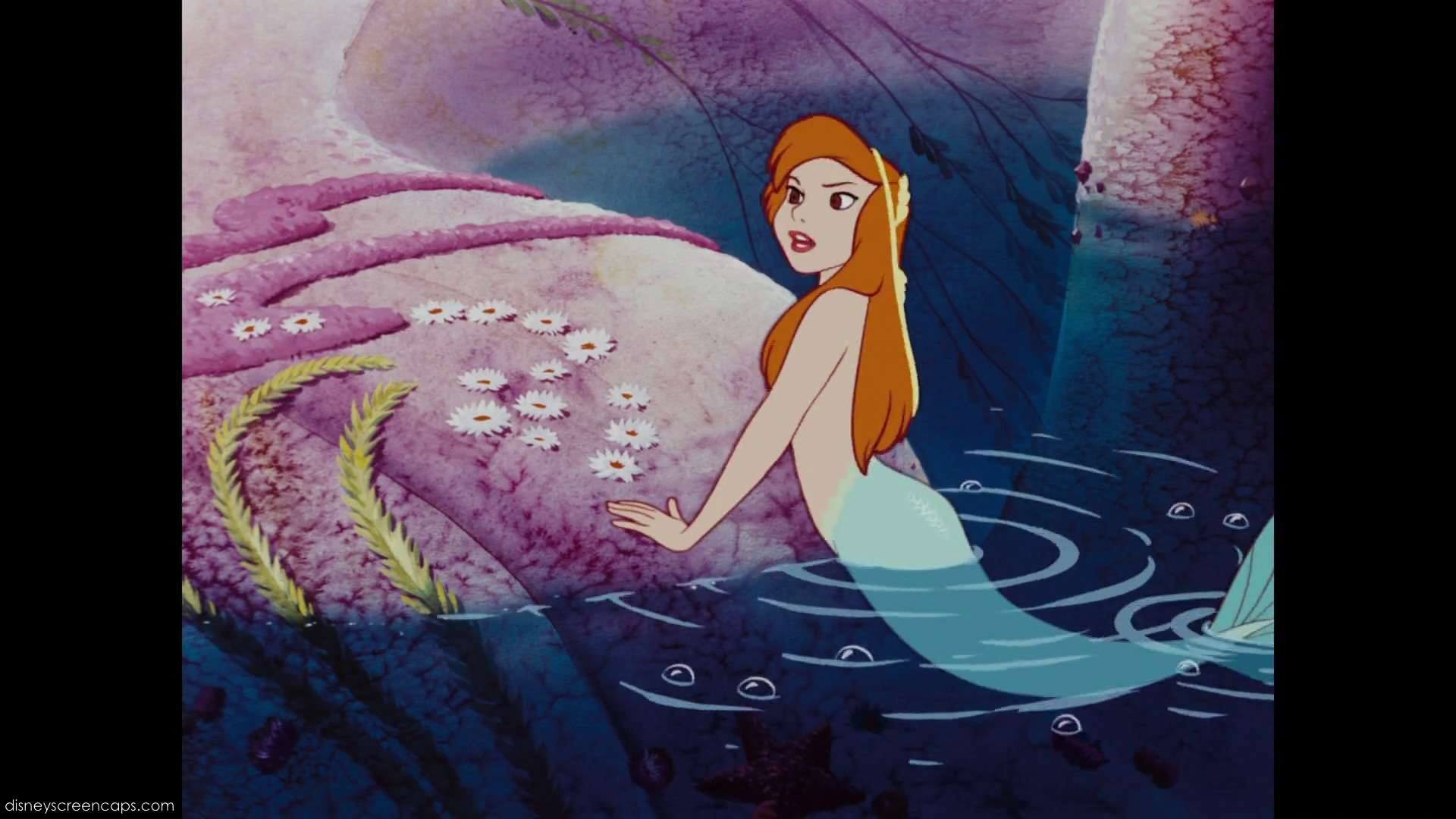
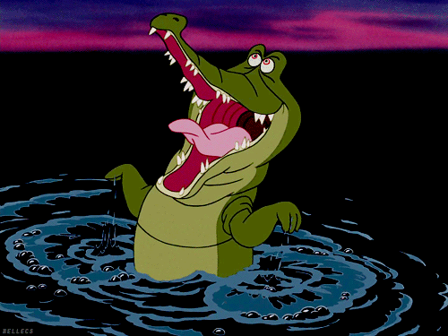
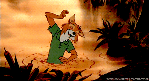
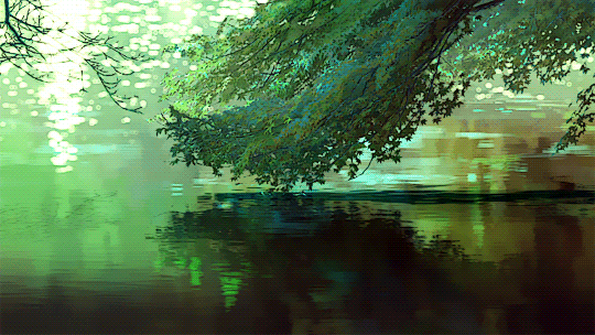
Below you see a collection of water drawn in 2D media. I wanted to find as many references of stylized water I could so that I had a good library of references to draw from. What I find most of the time is that they use blocked colours in different shades of the water to show depth, but the real focus is the shapes. The shape of the shadows and the shape of the splash/waves/ripples. I found that mastering these shapes can give the illusion of water even if the background color is just a solid colour, like you see in the gif of the crocodile from Peter Pan.


The Ship
I think the biggest shame of my design process has been the ship. I have not had enough time to design the ship to the detail I wanted, or to any significant detail at all. It hadn’t been a huge problem, because in my last iteration of the page drafts I excluded the ship in as many frames as possible. Both because I hadn’t had time to design the ship, but also because ships are incredibly hard to draw. The amount to detail that goes into a ship is immense and to draw it well takes a lot of time. This was an attempt to save time on the production as a whole, which I am happy I did because drawing 17 full illustrations is already enough work. However, regardless of whether it saves time or not, I am still sad that I didn’t get a chance to explore the ship and its nooks and crannies and how they reflect its inhabitants.
Home Page Animation
I wanted to have a short animation on the home page for the project, however my Photoshop was not registering the AnimationToolbar plug-in, so I had to animate without onion skin, which is never fun. So here is a very short and janky animation of the ship on water. I didn’t add any details because I didn’t like how it turned out, but it’s a cute source of inspiration.

References
Lapouge, G. (2004). Pirates and buccaneers. London: Hachette Illustrated.