Final Major Project
SCRIPT
Children’s Book: The Pirate Captain and The Sea
Here you get a detailed look at how I developed the story and the process I went through to create the script. Then, later in the process I will go into detail about the page layout and font to figure out the best way to merge the script and the art.
Table of Contents:
Script Iterations
Page Drafts
Colour Script
Workflow
Ideas
it took a lot of brainstorming before I decided on the idea I have now.
First I dabbled in some other ideas:
I wanted to do a study of people’s profiles, with a focus on noses.
If not, I wanted do focus on walk cycles and how they portray characters before they even open their mouths.
___
But then I got the idea of doing a children’s book. I found this appealing, because I am very interested in children’s book and as I have explained on my research I think it is a good market for it. The reason I chose pirates is because I knew there were a lot of books about Princesses and Knights and the only other period situation I could think about was pirates. The technical aspects of my choice are also detailed in my research.
Below are some of the other ideas I had before I landed on the story I have now.
STORY 1:
A maiden on an island is the most beautiful girl on this side of the ocean. However, all of her suitors are super lame. And she is grumpy and hates everything, especially pirates. She starts sending messages in bottles for fun and suddenly the captain of a pirate ship gets it and starts messaging back. Her father is then getting so tired of her refusing that she challenges the whole kingdom, that anyone that woos her can get her. The pirate then takes the chance to woo her, to the dismay of everyone. But since they’re so in love it worked out and happily ever after.
STORY 2:
Two captains on rivaling pirate ships fall in love as they have to work together to fight a sea monster.
Scene idea: The ship meets mermaids, there are male and female mermaids and the ship’s crew fall in love with the ones who matches their preferences. F/F M/M F/M
STORY 3:
The captain loves her boat, she doesn't care about strong men or fair maidens. Her boat has always been her life. The suddenly the head figure in the front comes to life and the gets to actually fall in love with her boat.
STORY 4:
The main character is a Pirate Queen who only cares about money, power and glory. She does not need no (wo)man and only loves the sea. Then the sea shows up embodied as a beautiful woman and teaches her to me honest and how to be a better person, through the power of love.

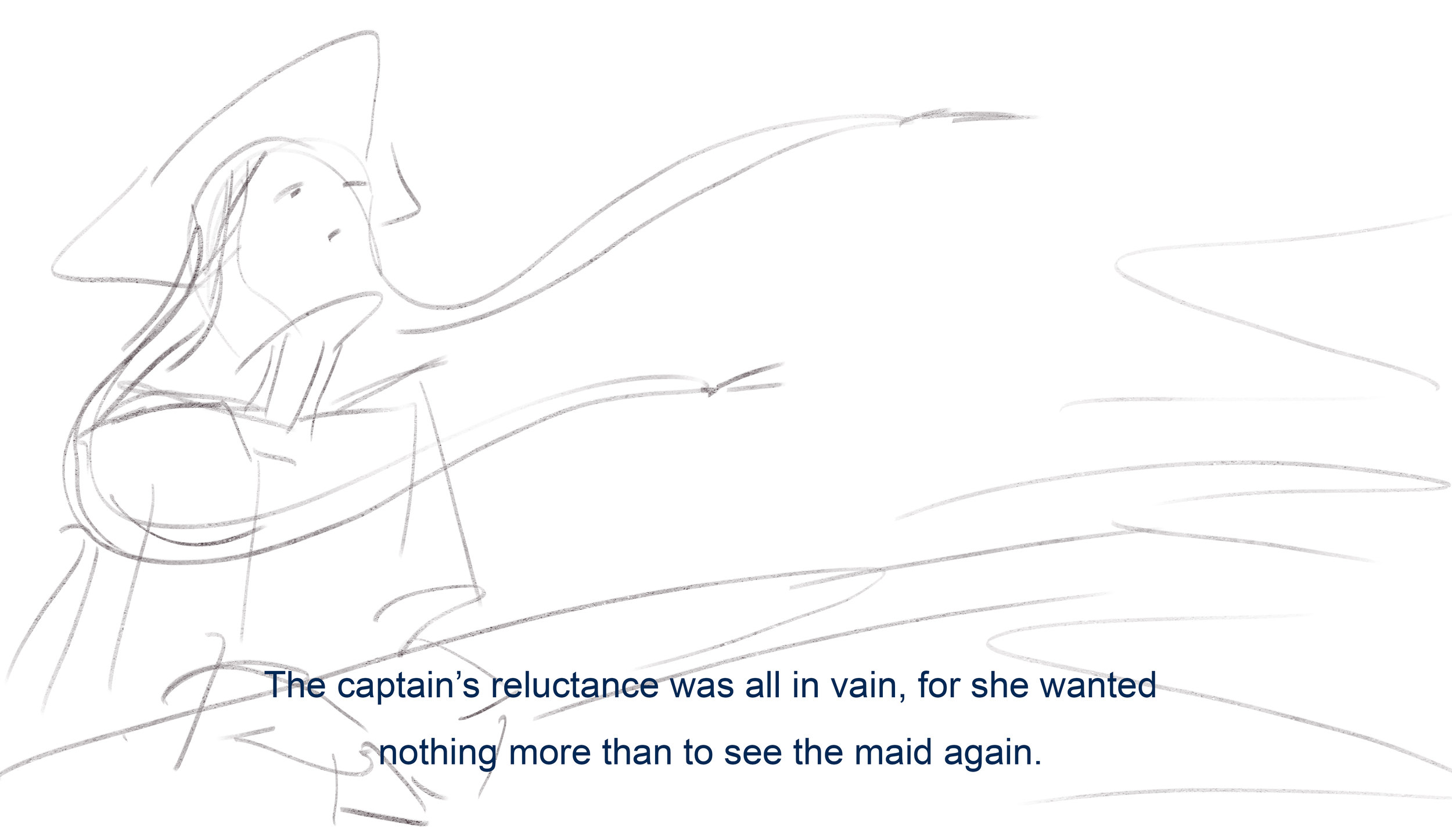
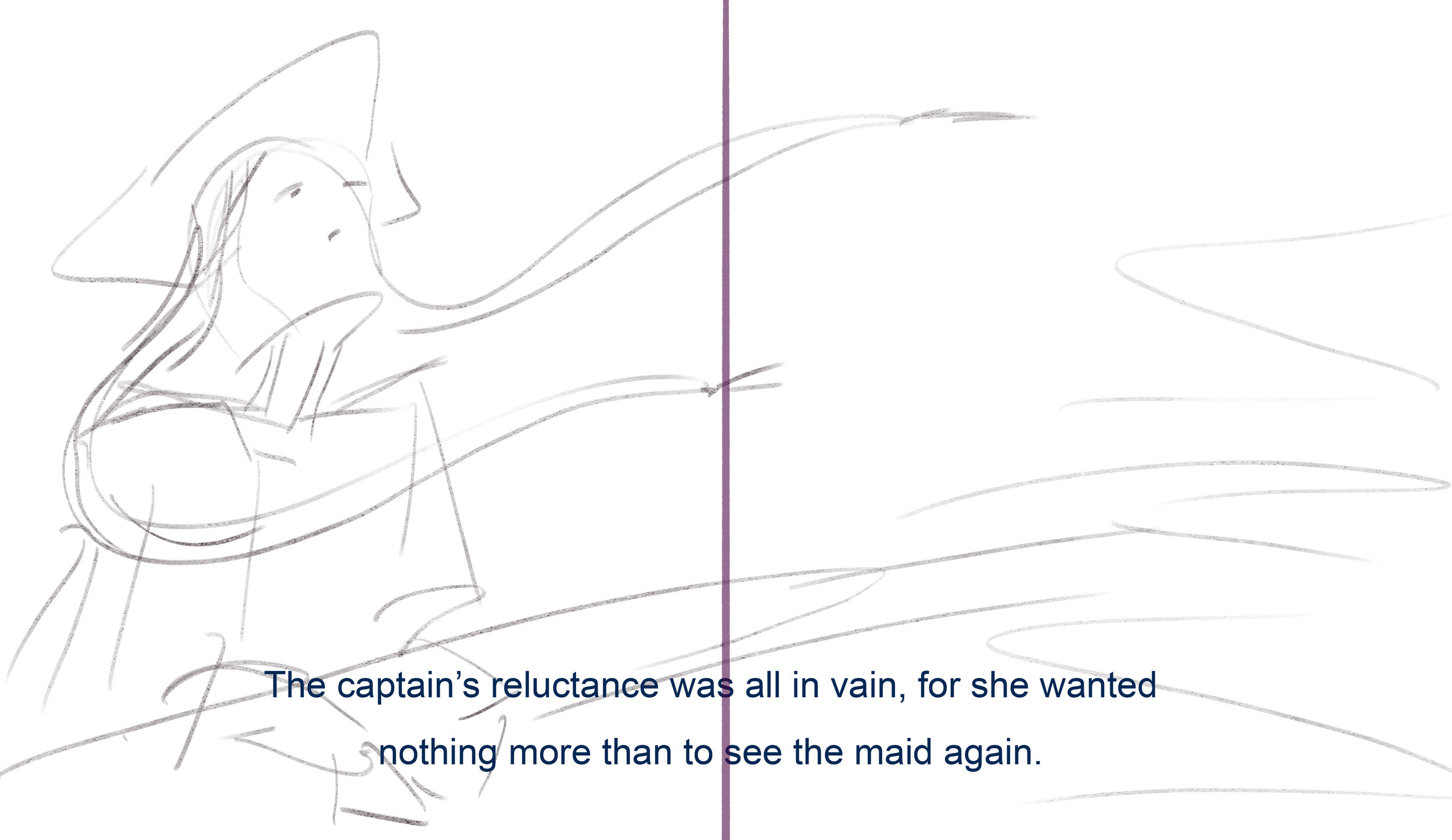
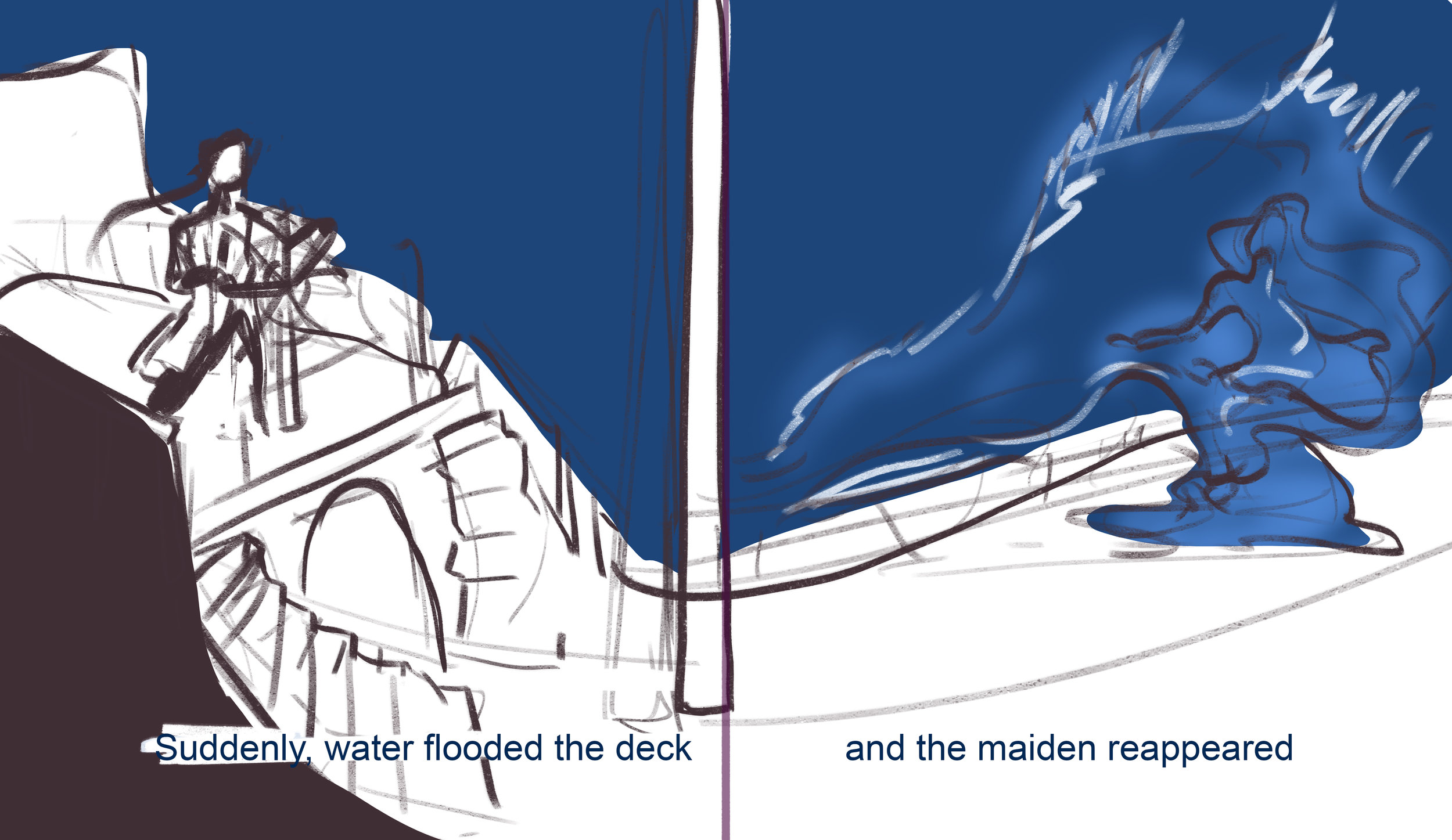
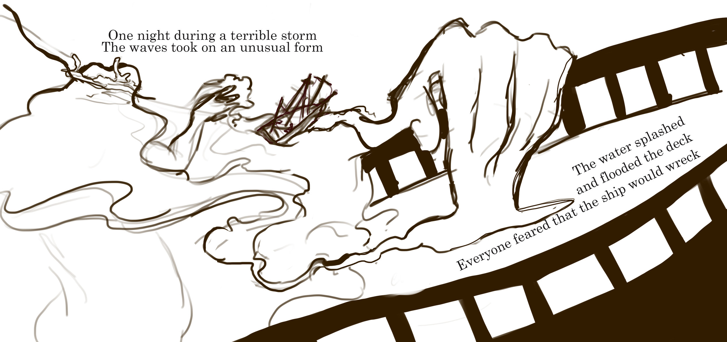
This is the first scene I visualized when I got the idea for the story. This is The Sea’s first appearance when she is washed aboard the the ship by a huge wave amidst a raging storm. This scene is the centerpiece of the story and should feel powerful and dramatic. However, here I drew her as a mermaid, but this has changed. I don’t want to bring in mermaid references because I think it will muddle her character. She should look mysterious and powerful enough to unsettle a pirate crew, but still beautiful enough to intrigue the Captain. This was why I had the idea of a mermaid to being with because they are beautiful, but still something to fear and if sailors saw a mermaid they would be scared and try to plug their ears as to not succumb to her song. However, as I said, I think it might just confuse the message.
Script Iteration
Above you see the collection of the script iterations I have gone through.
The first script was a freely written 1000 word story. I wrote this for myself to note down all of the ideas that I had and to get a sense for the story. I had descriptors and details of language that I knew I wouldn’t have in the final story, but it helped me get a sense for the scene I wanted to set as well. Since the average picture book story is between 300-550 words long I knew I had to work hard to cut down the story.
Thus I ventured to compress and rewrite the story within the desired word count. At this point I had been in contact with Michelle from Richard Cloudesly where I asked about what type of books they read for their students. They said that they prefer books with rhyme as it is easier for the kids to access on their own. The rhyme makes it easier for them to connect the sentences together, because they can expect what word is coming. Additionally it is fun for the parents to read out loud. Furthermore the research I did on my own also proved that rhyme is the most popular storytelling device for picture books. I went to multiple books stores and looked at their children’s section, there the majority of the books had rhyme. All this combined prompted me to rhyme as well. I am not unfamiliar with rhyme and have written a handful of poems just for fun, but rhyming within a narrative is exceedingly difficult. This is my biggest challenge, I am not uncomfortable with script writing, but I am not the best at it so I will seek a lot of help at this front. I find it easier to write, especially rhyme, with other people present. Because with rhyme it is so easy to get stuck on a sentence or word and getting someone’s outside opinion is the best way to avoid this.
The second draft is my attempt at shortening it. The focus here was not so much on the rhyme as just getting the narrative into a shortened version. I went from 1000+ words to 400 words, which I was very satisfied with. But the script itself was trash, so I knew it needed a lot of work. It is also important to note that the structure of the document above is that every stanza is connected to one page spread. So the first group on this draft:
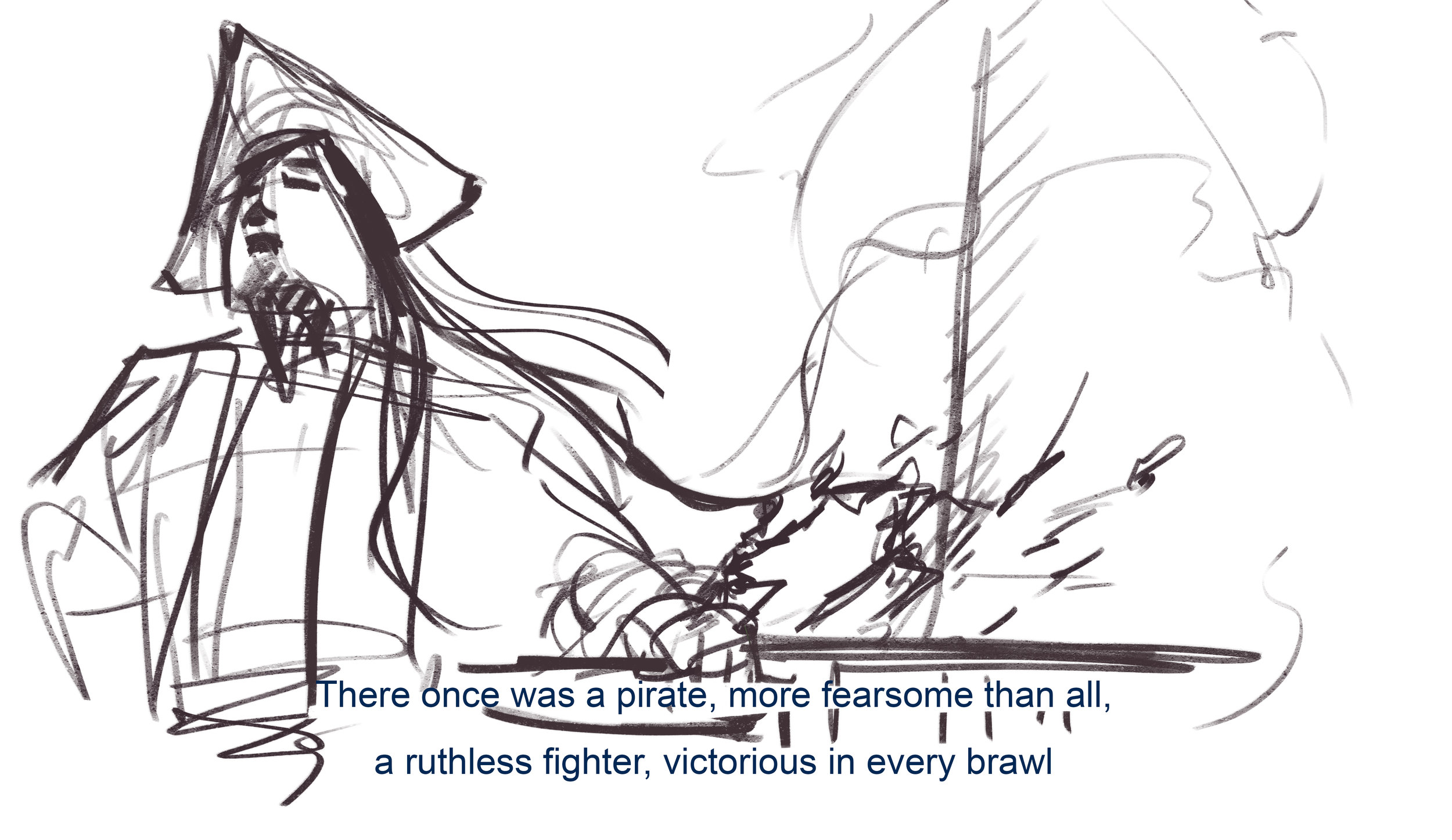
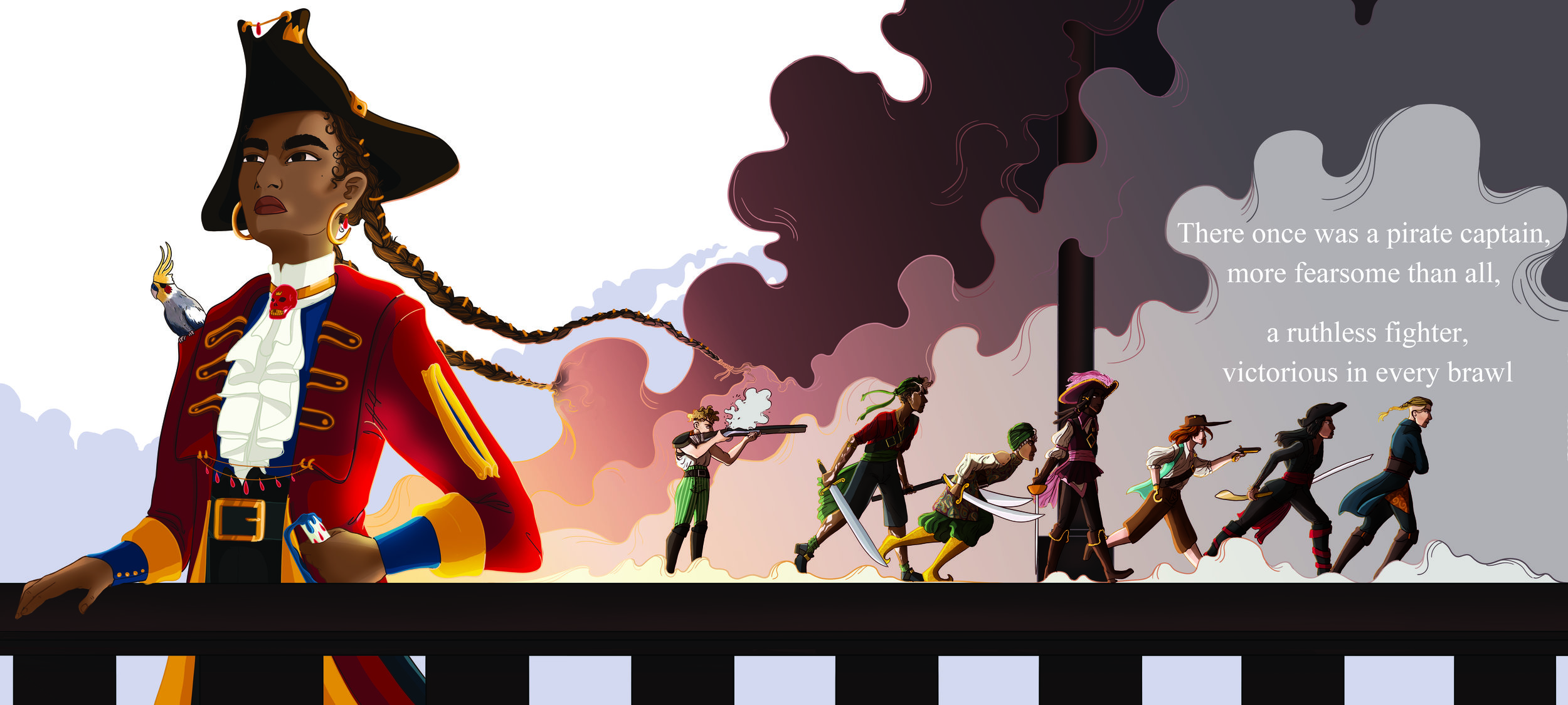
“There once was a pirate, more fearsome than all,
She was the queen of pirates, both small and tall”
Is the equivalent of pages 1 - 2. Then I will work on how to position them on the page when I start drafting the page layouts.
The third draft is the first usable draft. Here I began to get a lot of the rhymes down and I started to have a base that I could work from. At this point an issue arose about what level of language I could use. Are words such as “Brawl” acceptable for a children’s book? I asked my Lecturer Giles and other native English speaker, I also asked Michelle when I visited the school. The general consensus was that it was OK to use more difficult words because it helped the children learn and expand their vocabulary. Personally I think using words that are easily defined is a good way to go, so that if a child asks their parent “What does brawl mean?” the parents can easily say “It means ‘fight’.” This is easy to define and doesn’t require a lot of explanation.
From this point on it was essentially just reworking the script, constantly building and improving. At this point we had the core of the sentences worked out and the majority of the rhyming structure. The system I applied for my progress was to mark the stanzas that were “good” and that I was pleased with in green, so that I could focus more easily on the parts that needed more work. Below are the parts that proved the most challenging:
Version 2 Version 12
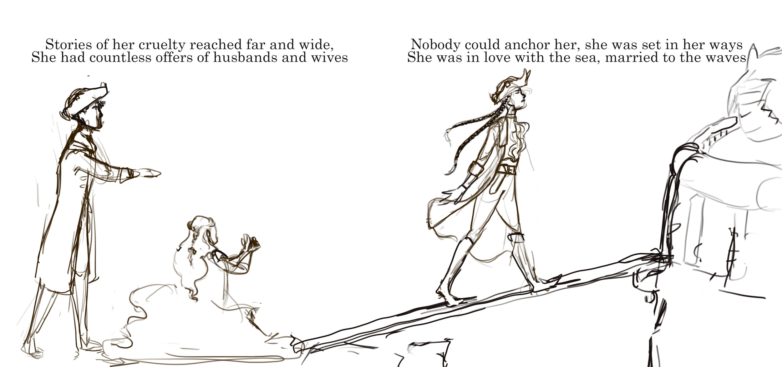
Stories of her bountiful treasure reached far and wide, and ended up as Stories of her cruelty reached far and wide,
which meant many people asked “to have her by their side” Therefore many wanted to be by her side
But she would never be their bride. But nobody could anchor her, she was set in her ways
“The only love I have, is for the sea” she always replied She was in love with the sea, married to the waves
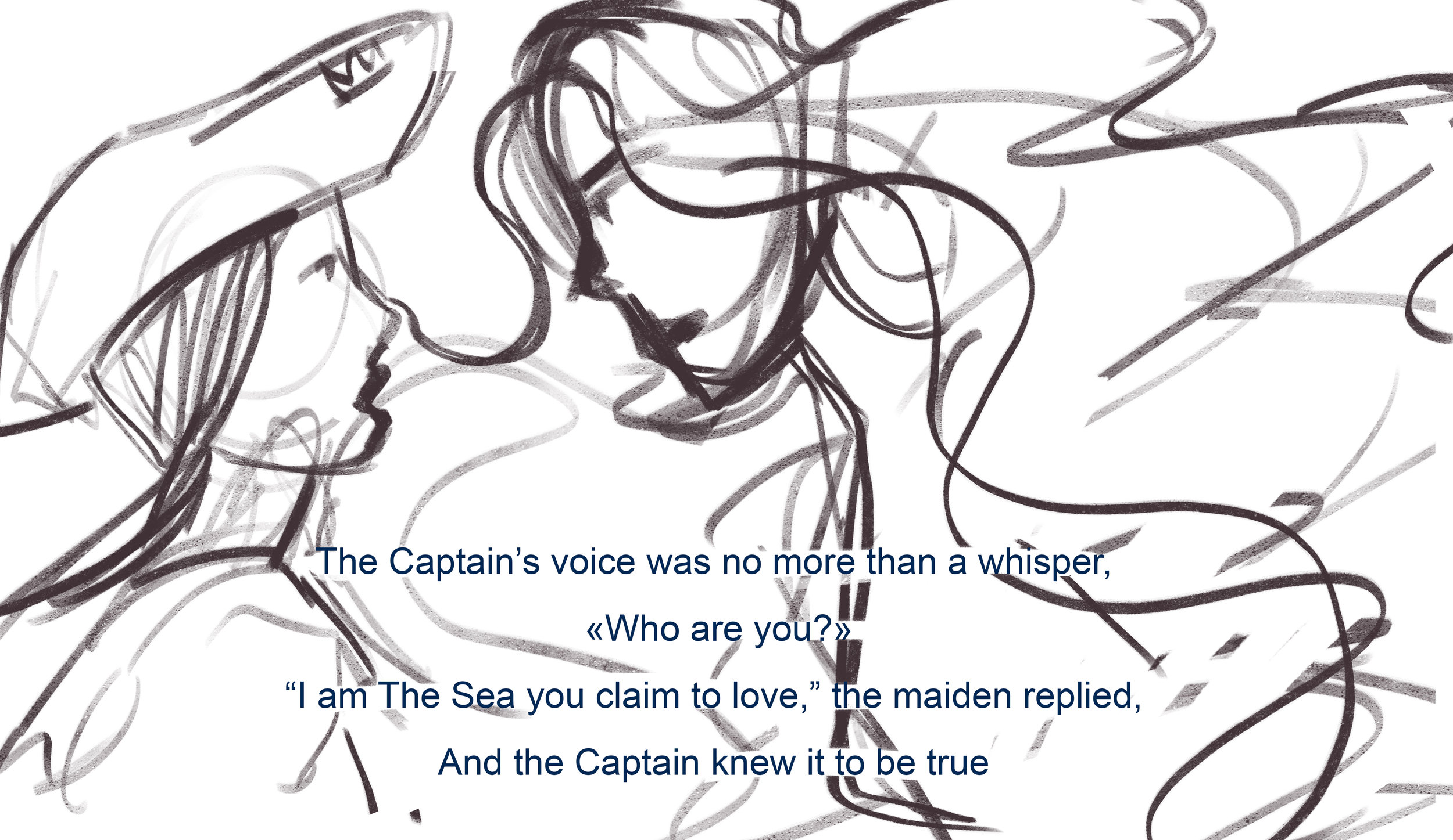
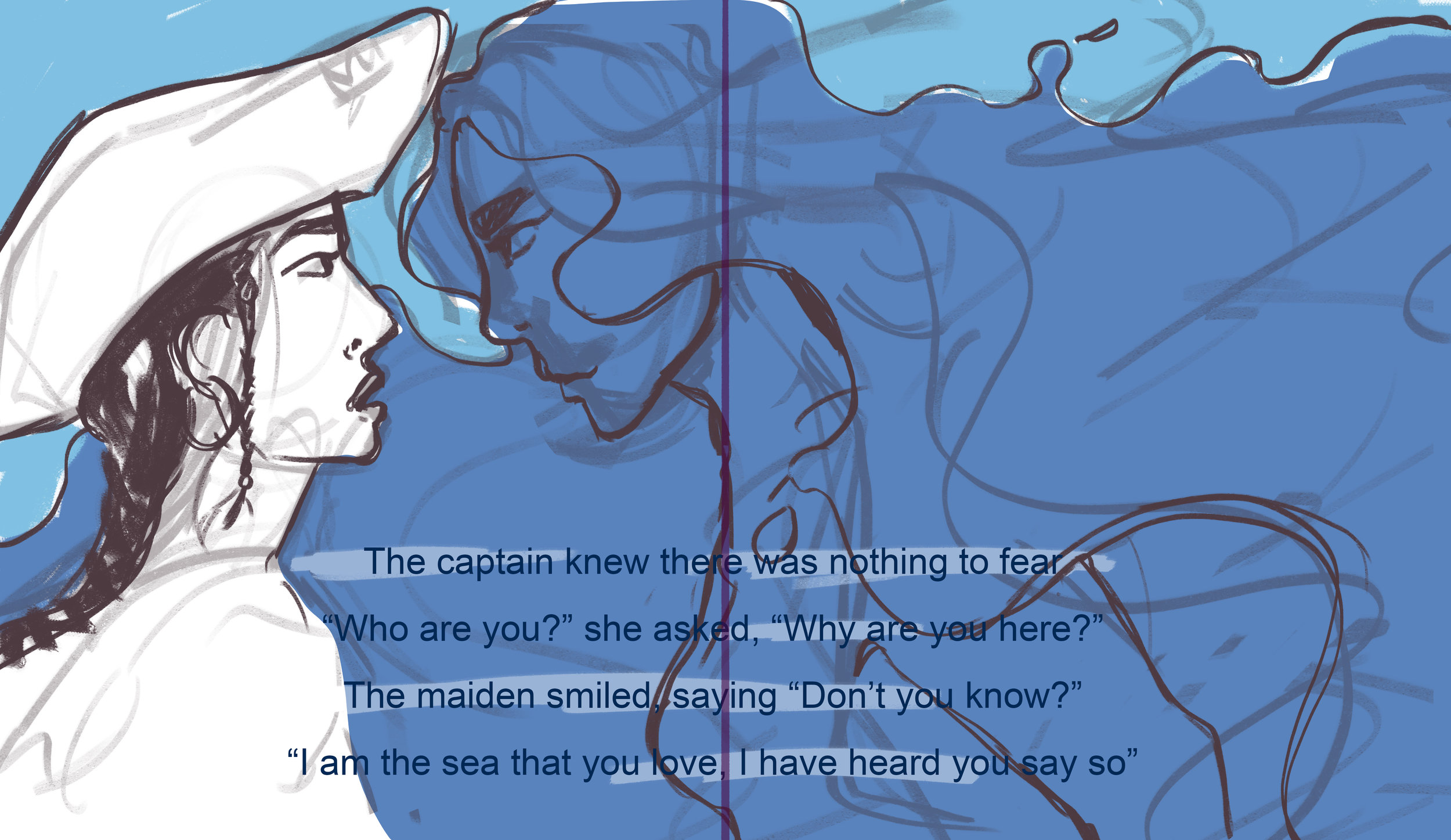
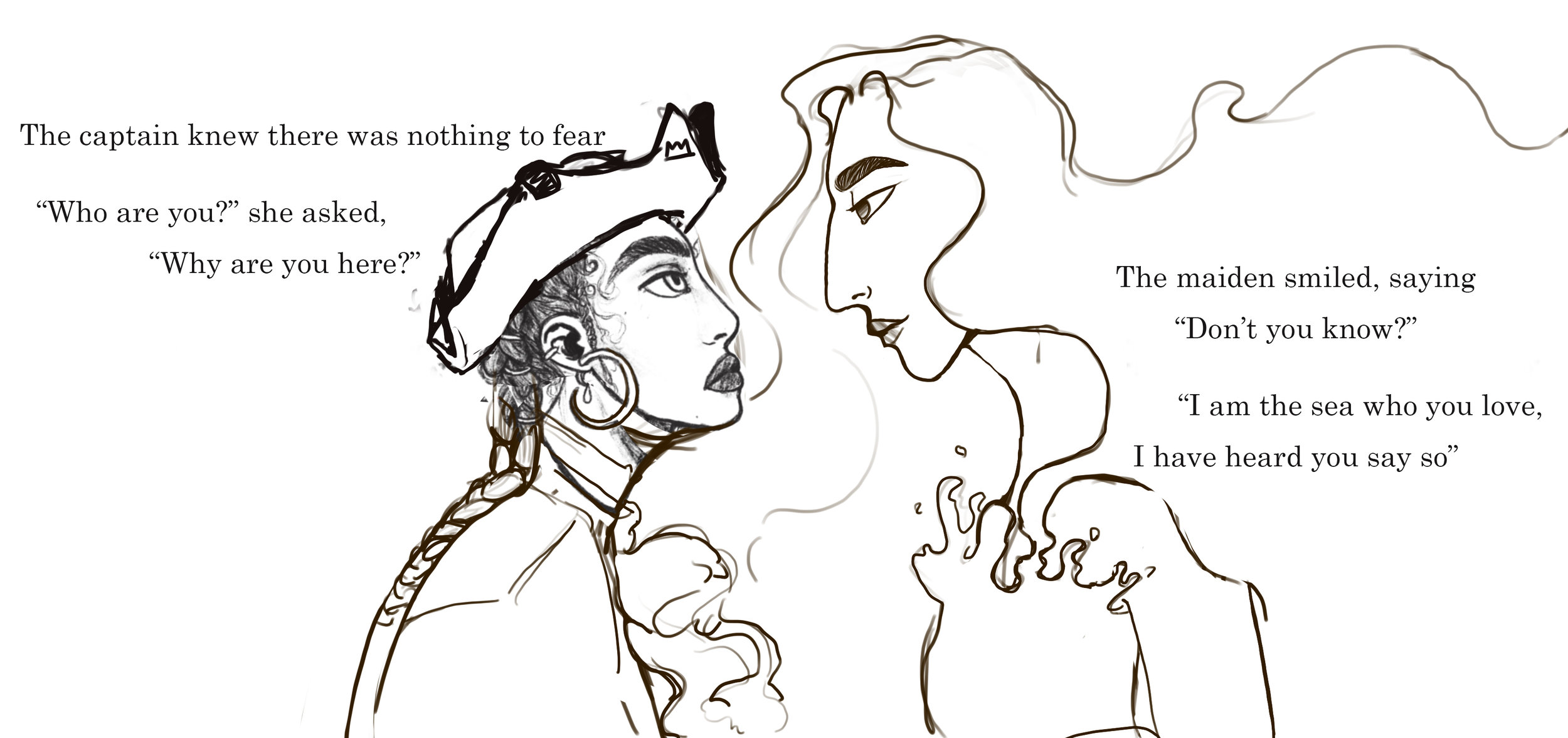
The maid looked up, the captain’s heart felt like it would stop. and ended up as The captain knew there was nothing to fear
“Who are you?” The captain asked “Who are you?” she asked, “Why are you here?”
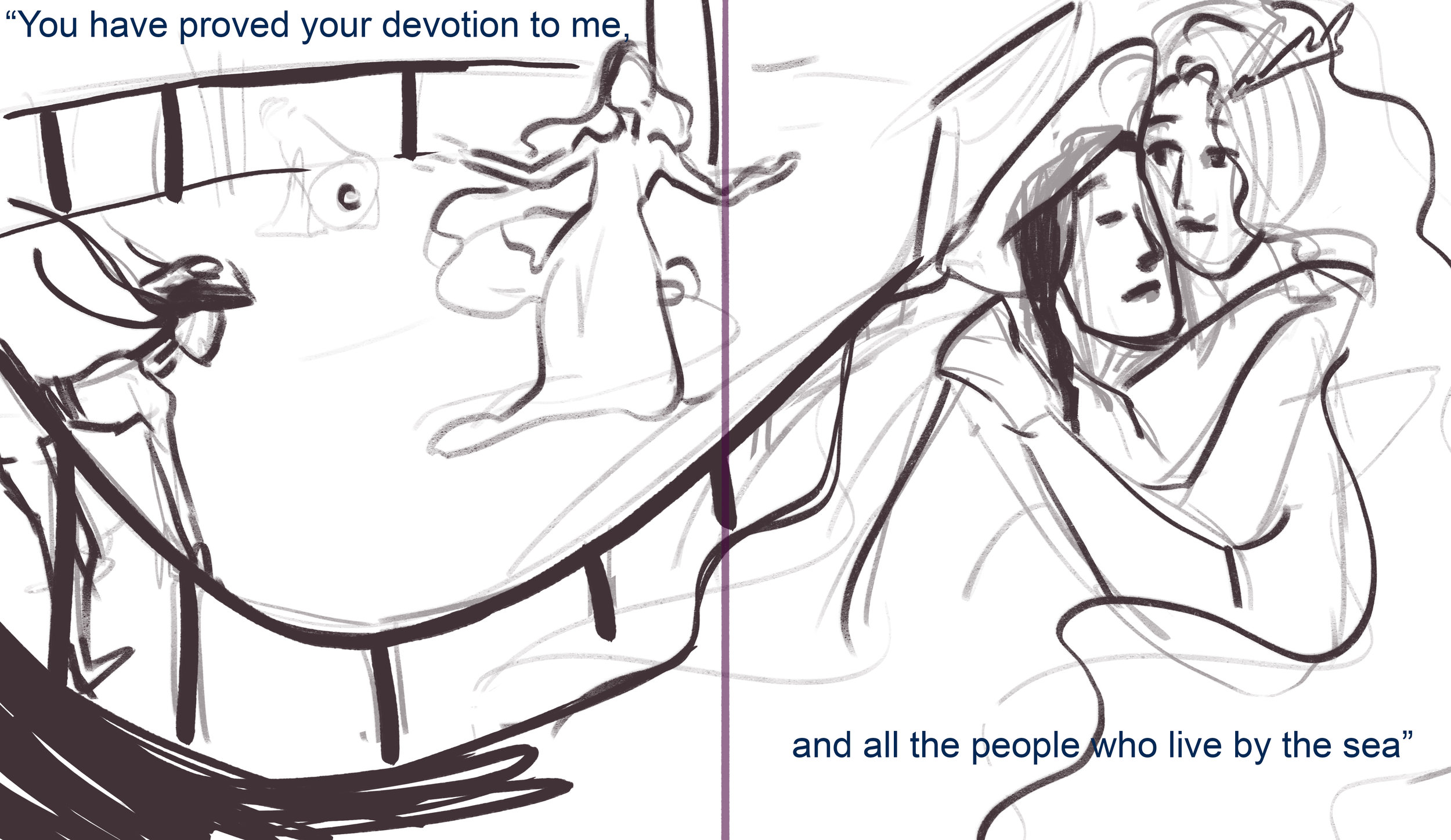
“I am the one you love” she said The maiden smiled, saying “Don’t you know?”
“I am the sea that you love, I have heard you say so”
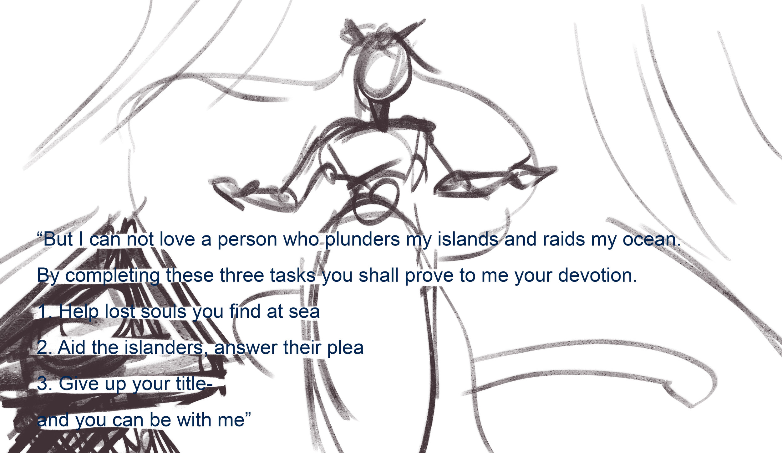
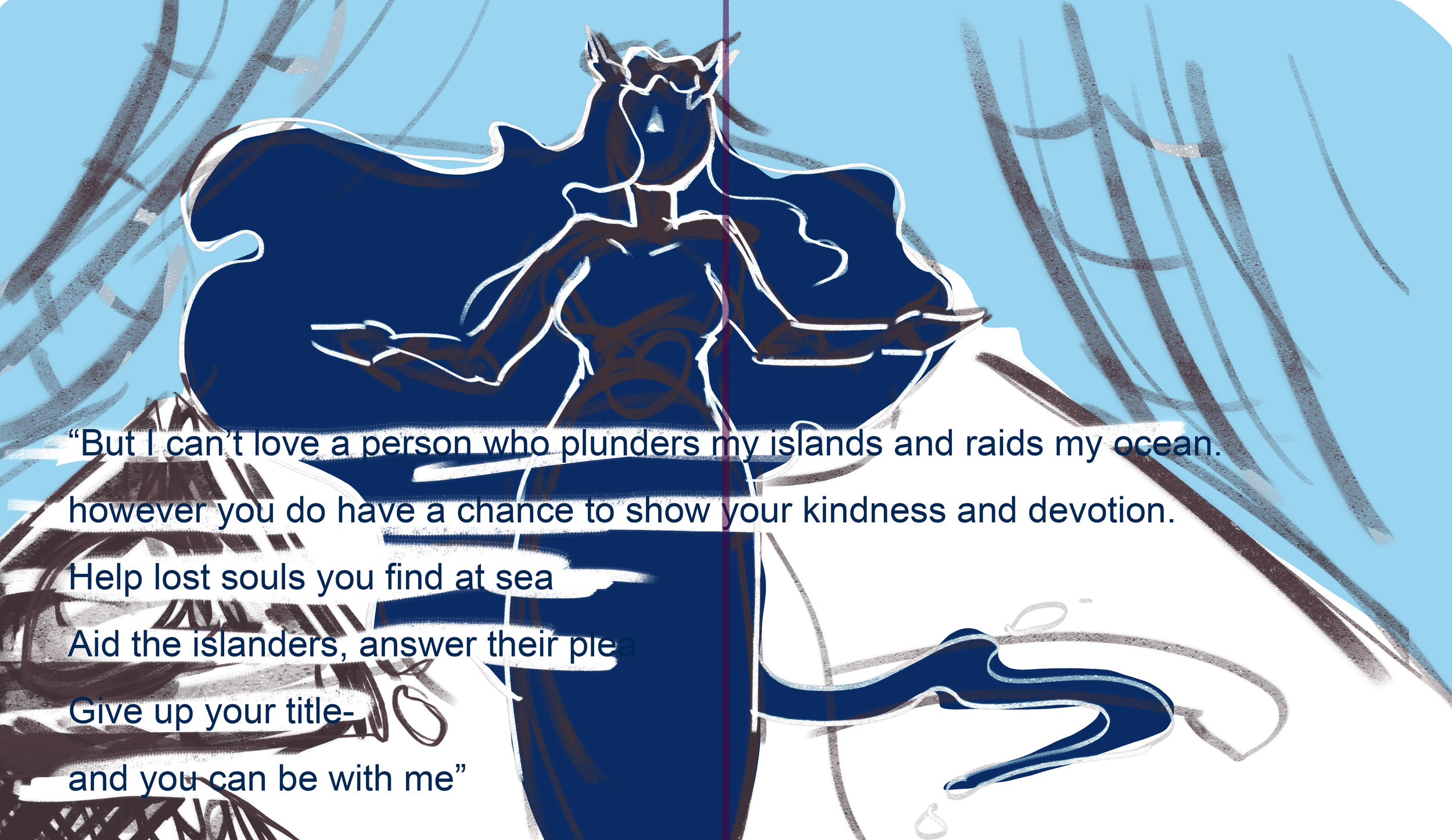
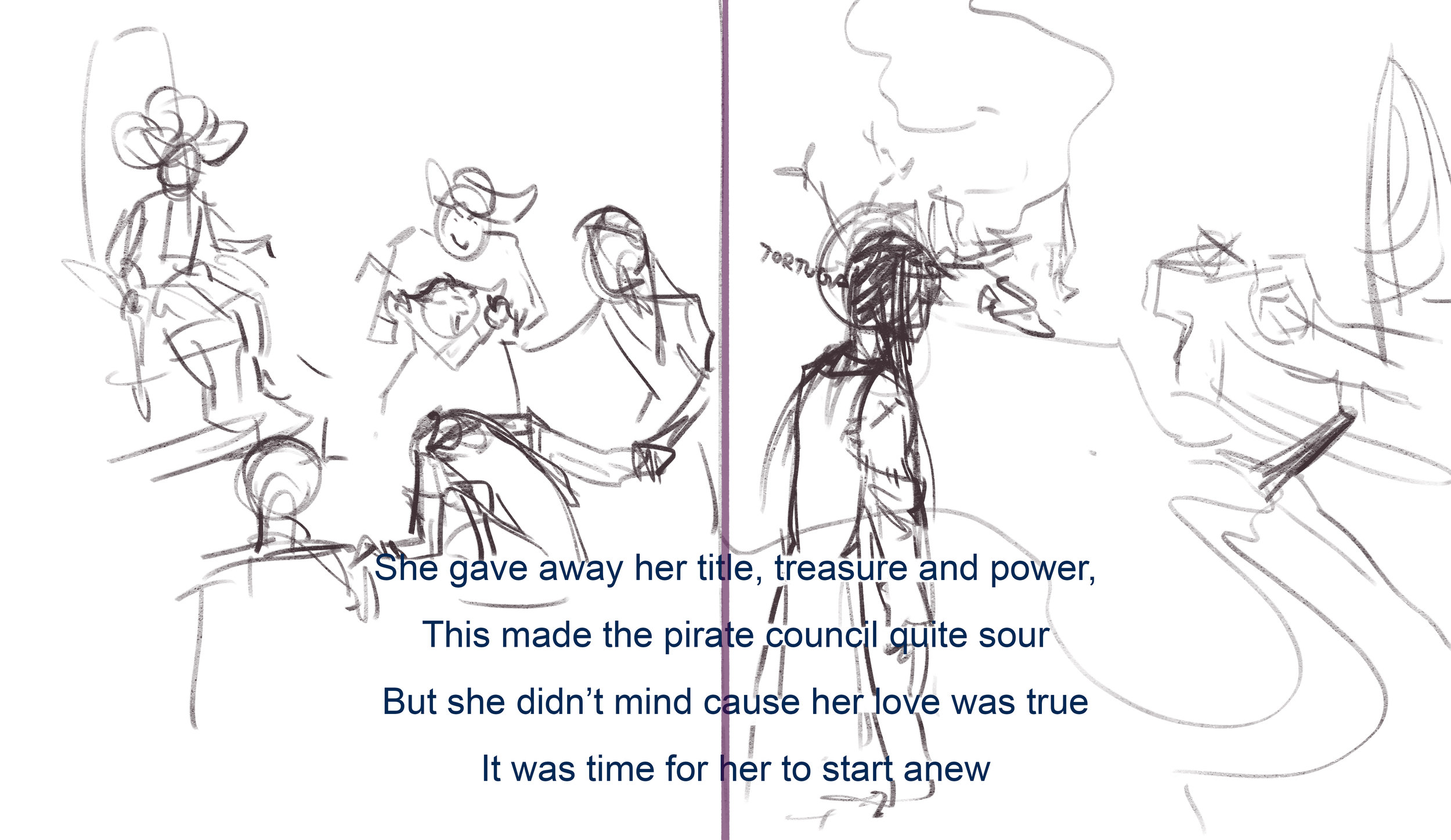
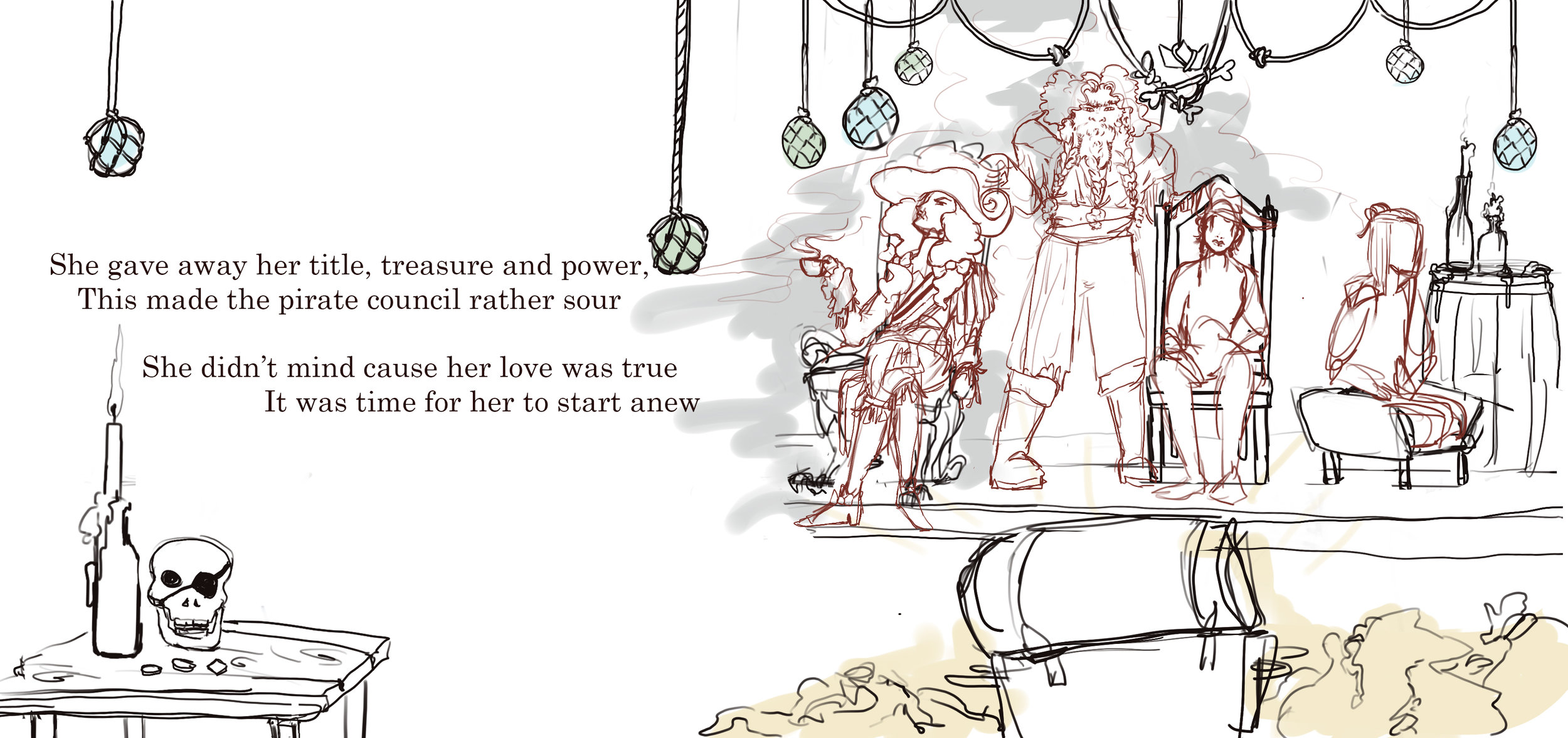
The last task was both the easiest and the most difficult, and ended up as She gave away her title, treasure and power,
The pirate council was angry at her for being so nice, This made the pirate council rather sour
They tore away her status and her belongings. She didn’t mind cause her love was true
Taking away everything she had worked for. It was time for her to start anew
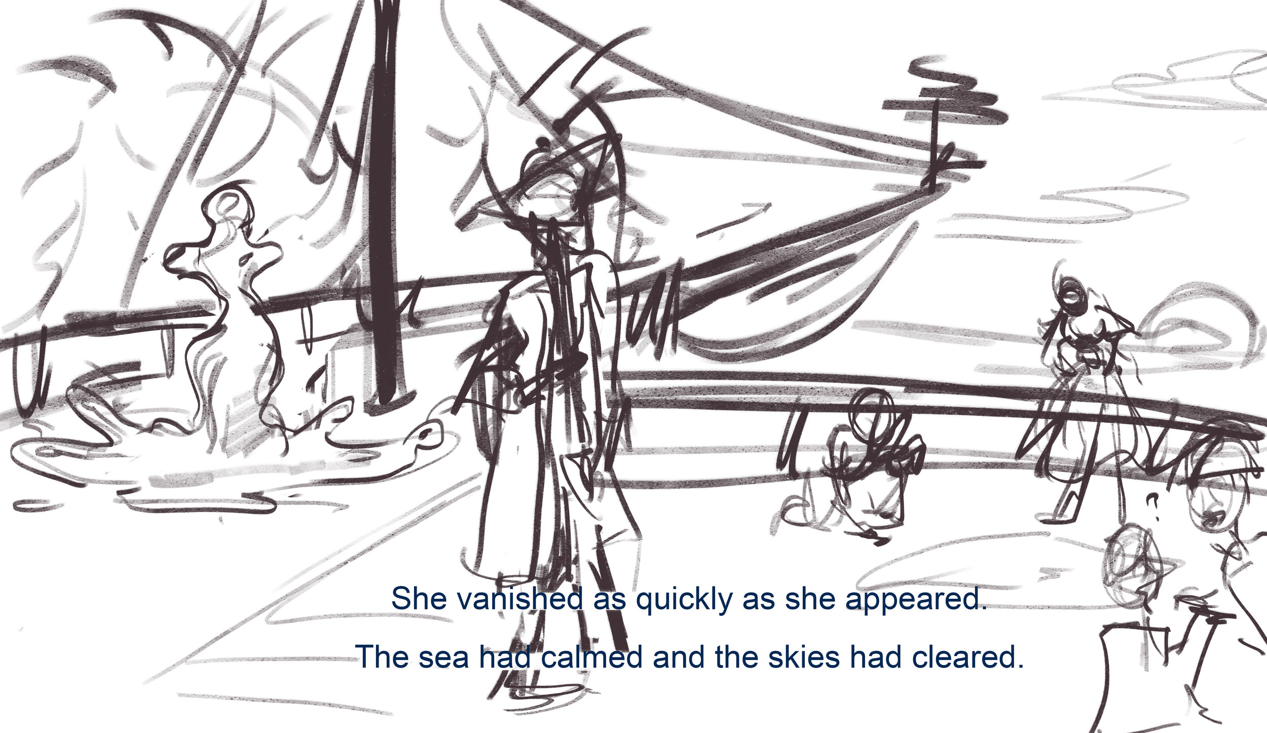
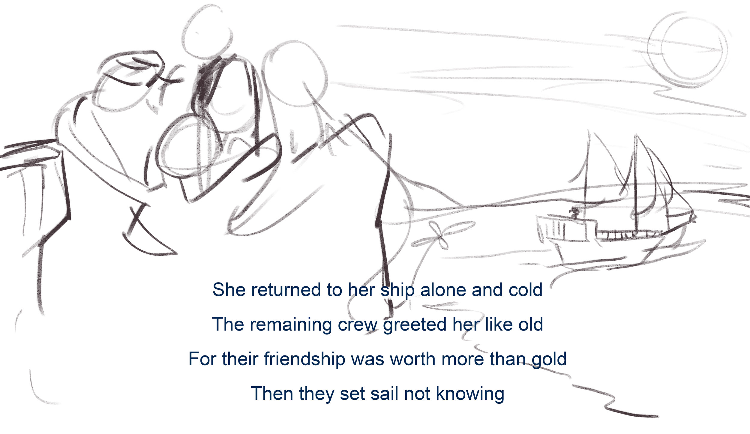
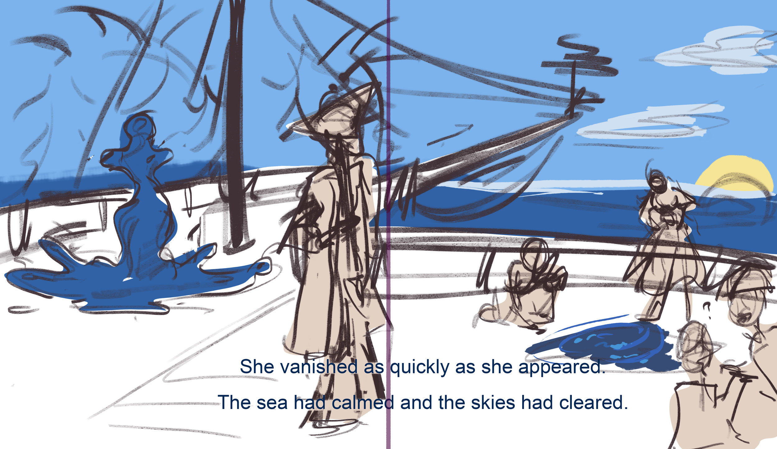
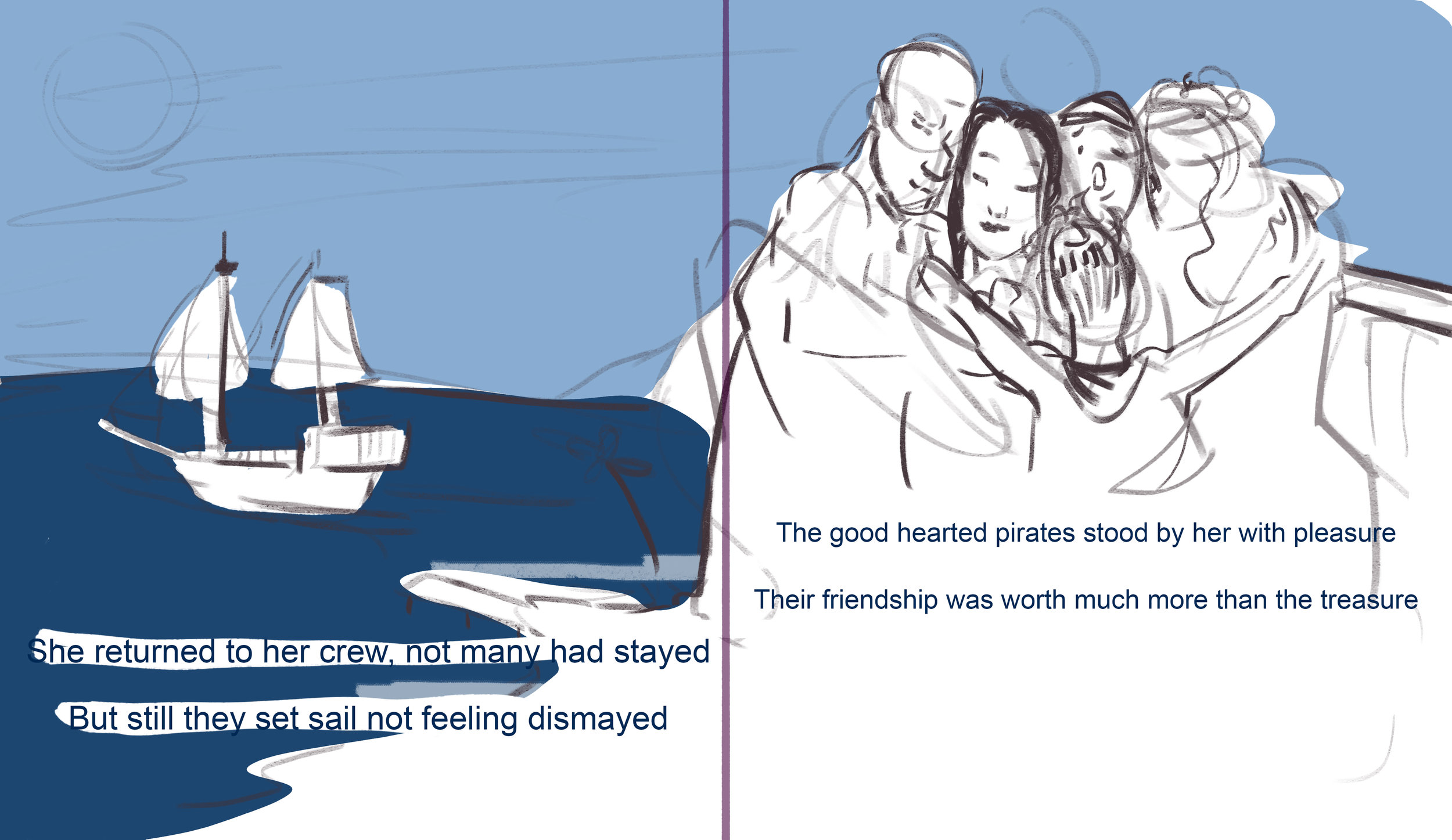
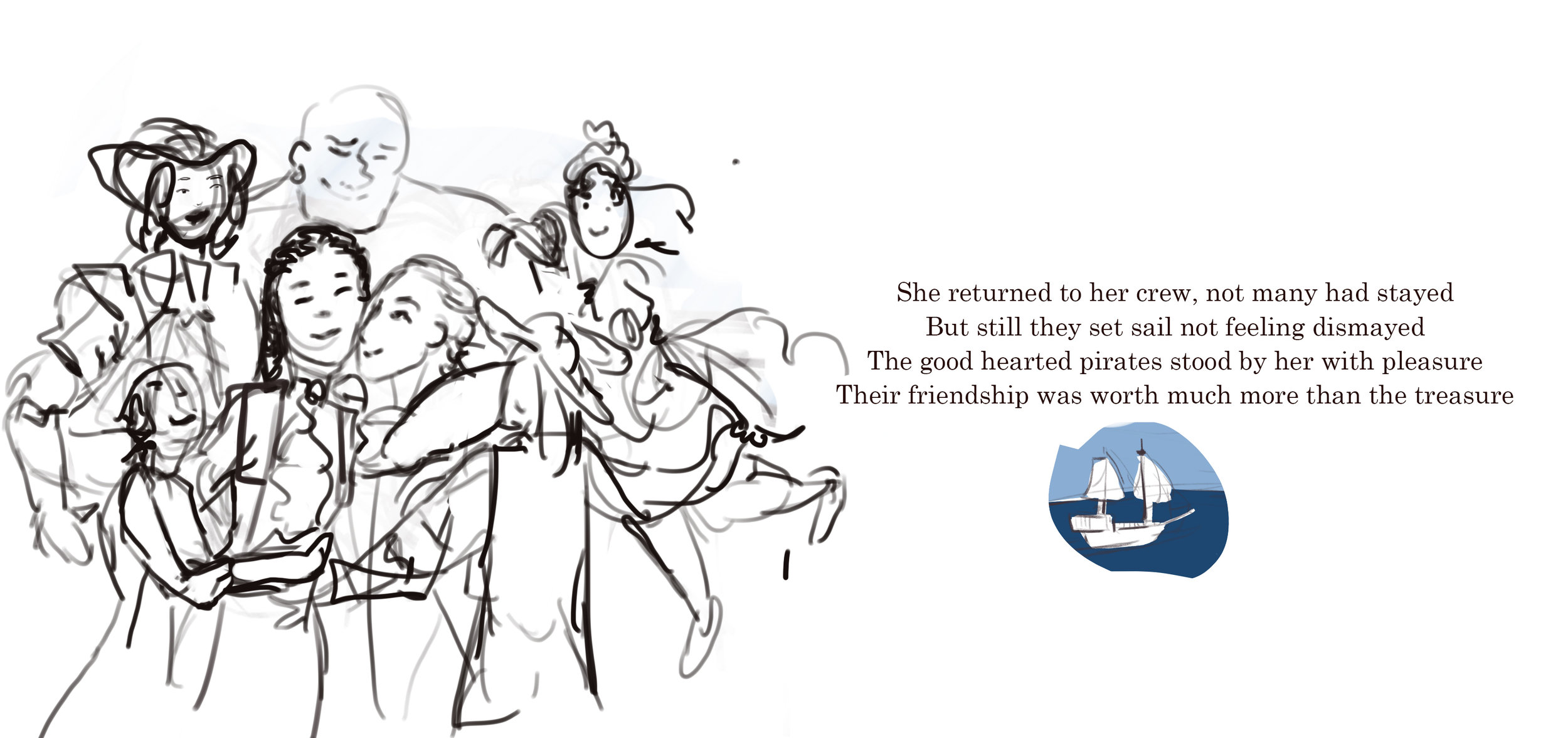
The crew that hadn’t left greeted her warmly and ended up as She returned to her crew, not many had stayed
For their friendship was worth more than gold But still they set sail not feeling dismayed
Then they set sail not knowing where to go The good hearted pirates stood by her with pleasure
Their friendship was worth much more than the treasure
After months of trials and tribulations I finally have a finished draft. The twelfth draft is the one that I finally feel like I can start showing to people. This iteration is something I am proud of and can start getting feedback up. I am infinitely proud over the progress that was made, looking back at the first drafts and seeing where it is now is just incredible. There are still things that need improvement in this version, but over all I am happy that it rhymes and has a narrative. this is the version of the script that I will make a new page draft of and start showing to people.
At this point the script is almost done, but there are still small things that needs to be weeded out. Some phrasings are very clunky and still needs to be reedited. At this point I am going to start looking at syllables to make sure that the rhythm of each stanza feels consistent and comfortable to read. Now I need to digest the story and leave it for a while so that I can come back to it later with fresh eyes.
After having left it for a while to let it settle, I have now decided to surround myself with it so that I constantly see it and can think about it all the time. I will now work on syllables and level of language, I want to make sure that it isn’t too difficult for children to read. As a method of surrounding myself with it, I printed out and posted the script around my flat so in every room there is a part of the story. To make sure it was legible I have the previous and next stanza in smaller font above and below the current stanza which is central on the page in a bigger font. You can see this in the images below.


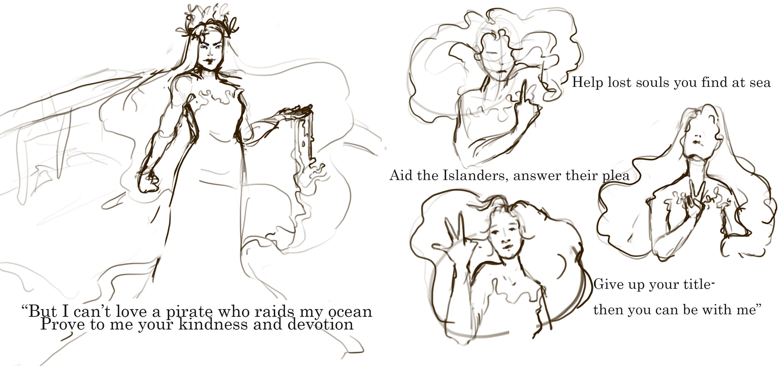
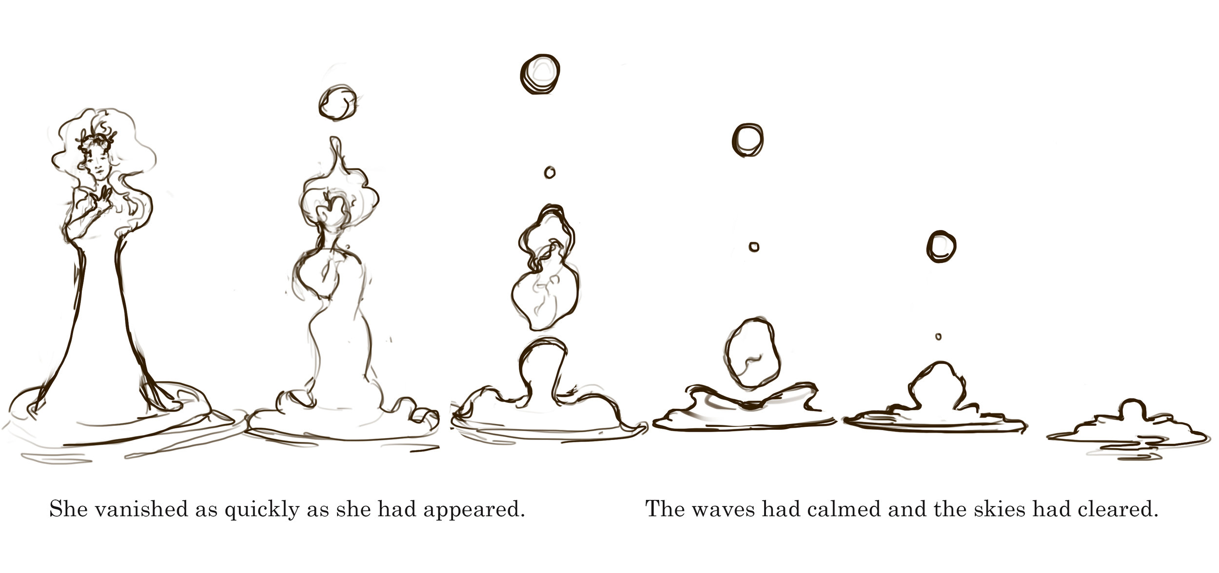
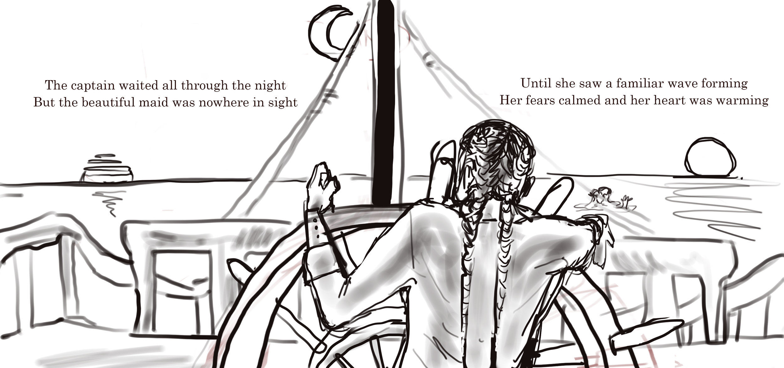
Now I have reworked the script further and am now on the 16th iteration. I am incredibly happy with the final changes, because on the 12th iteration I felt quite confident with the script and didn’t think it would need much change, but after looking at it again and getting some more outside feedback I got some good suggestions and ideas for how to improve it. The main change is to the two last stanzas. You can see in the document above the changes that they went through. Originally, they were two short sentences, that repeated and built on previous lines in the script, but now as the script had changed so much those lines didn’t work anymore. Because, they were referencing back to lines that no longer existed. But the feedback that really made me go back to change these lines was when someone pointed out that this was the last two bits of the story. They should be the best ones that leave you going “aww” and will make you want to read it again. Currently, the second to last stanza is pretty much settled:
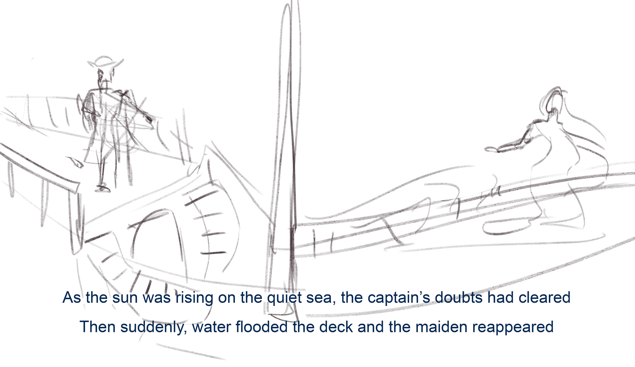
The captain waited all through the night
But the beautiful maid was nowhere in sight
Until she saw a familiar wave forming
Her fears calmed and her heart was warming
I like this because it portrays the captain waiting for The Sea to return and adds this insecurity to a very strong character, It also has a nice repetition of the line from The Sea’s original appearance.
Page Drafts
Page Draft 1
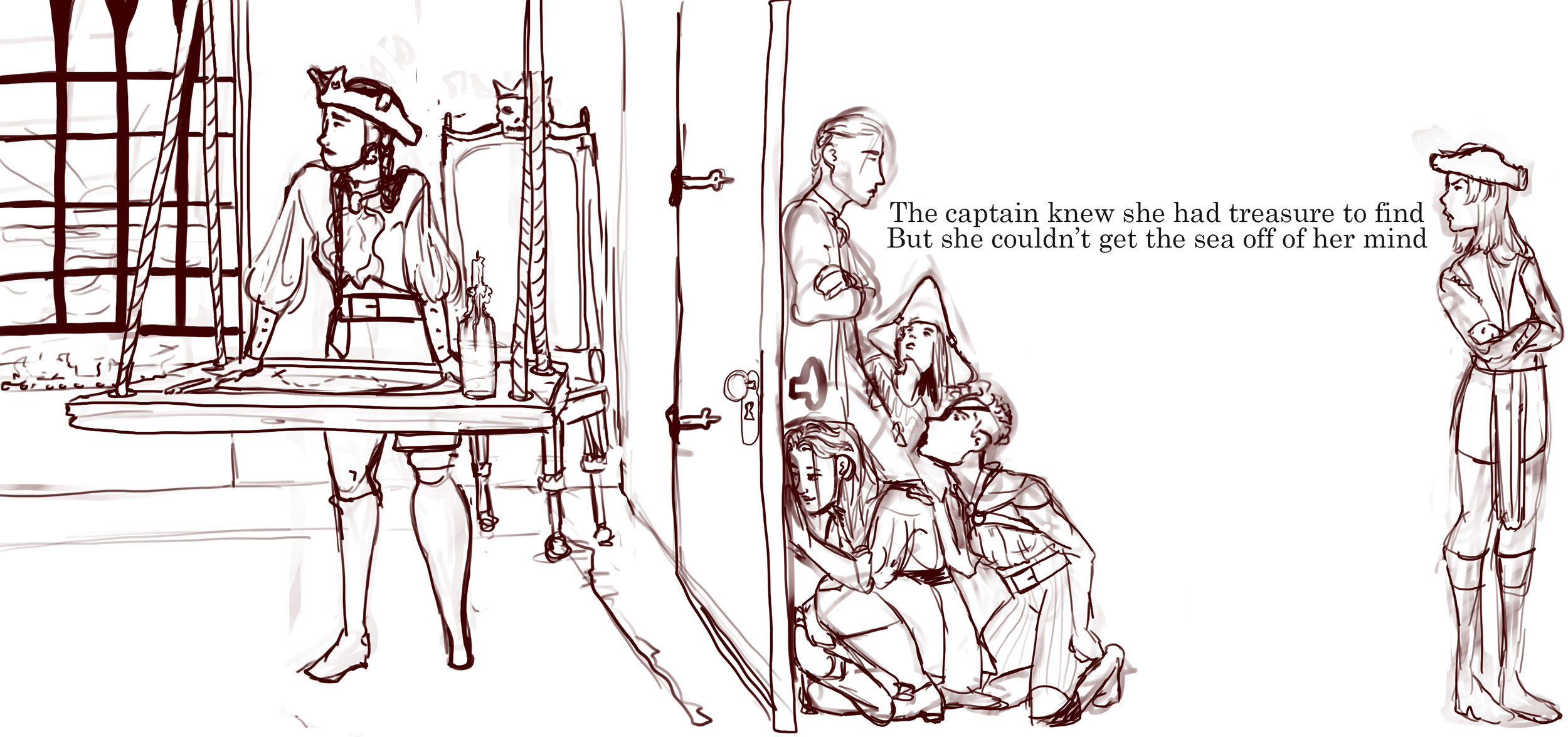
At this point the script had been worked on quite a lot. It was still not great, however, the improvements were monumental. I was feeling quite stuck at this point, especially with the character design. The script was coming along, but I needed a lot of help with it and the progress was slow. At this point I decided to quickly draft some pages to get a sense of the visual progression. For this page draft is used the sixth iteration of the script, as that was the most current one at the time when I made this. You can see that some of the sentences don’t rhyme and some of them aren’t even full sentences. Obviously this is a very rough draft and more for personal use, but it was very nice to see how the story flows and fits together. Here the text is just placed on the page as reference and not representational of the final product. Creating this gave me a sense of accomplishment as I felt like I was seeing the story come to life as I was drawing. My biggest focus when drawing this was looking at curves and how the two pages will blend together, I want to make sure there are smooth transitions between the pages and keep the hard cuts to a minimum. I like the idea of bending solid shapes and playing with perspective to make the scenes feel like they follow the character’s line of action. Additionally, I feel like having smooth lines and curves that creates associations of ocean waves.
A lot of these frames need to be redrawn completely, but some of them I think are really great and will likely keep in the final version. The pages I especially like are:
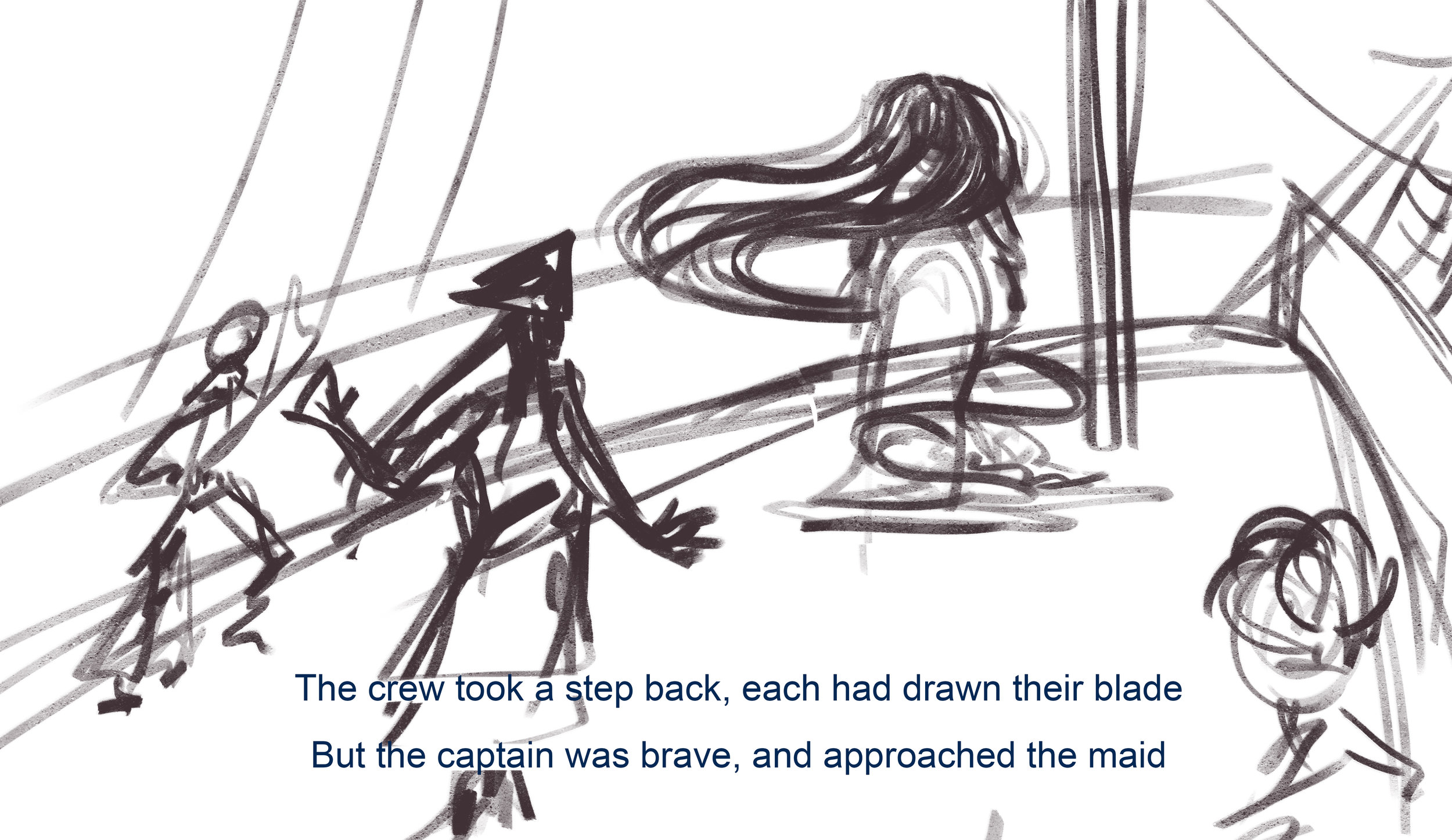
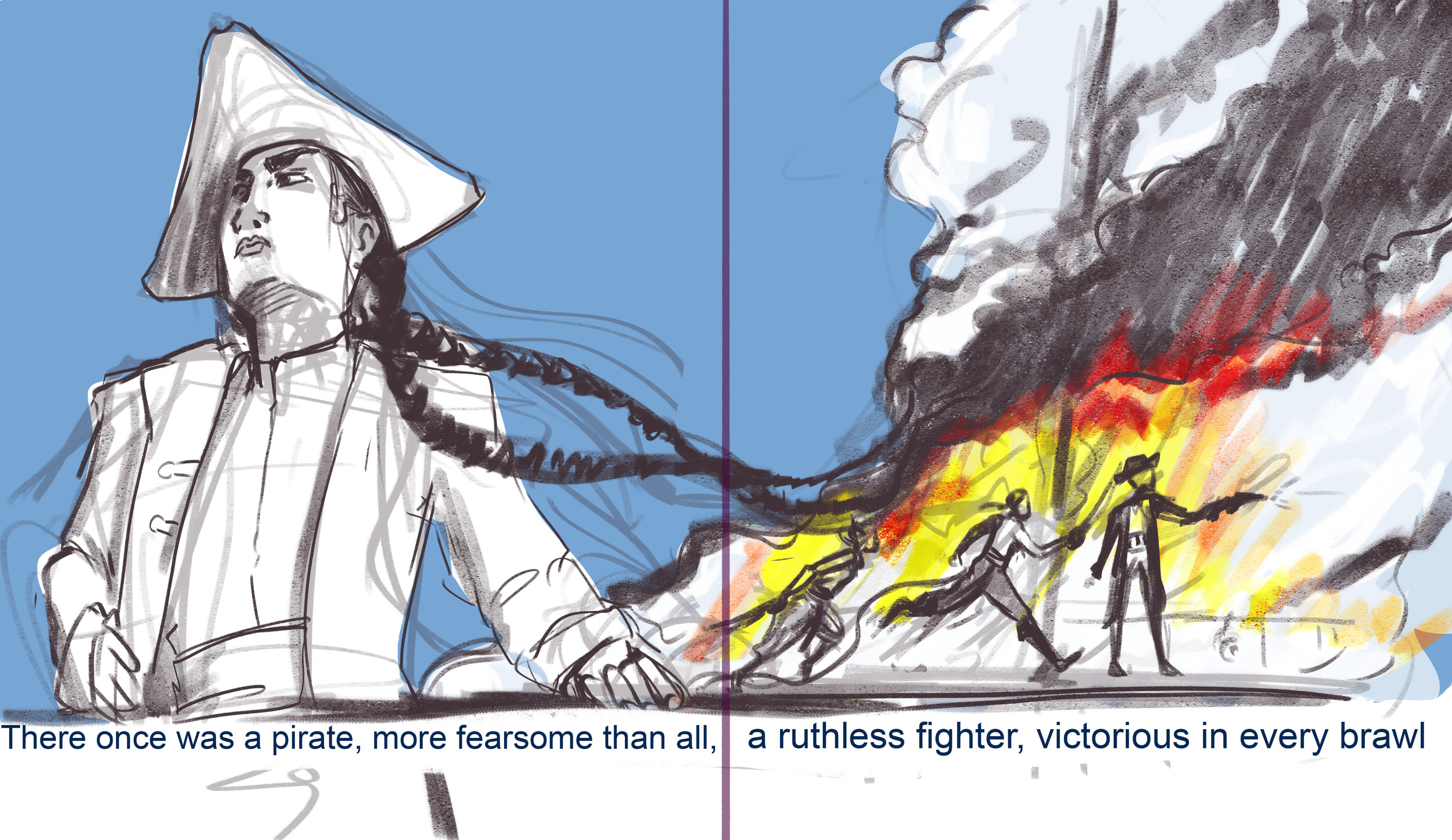
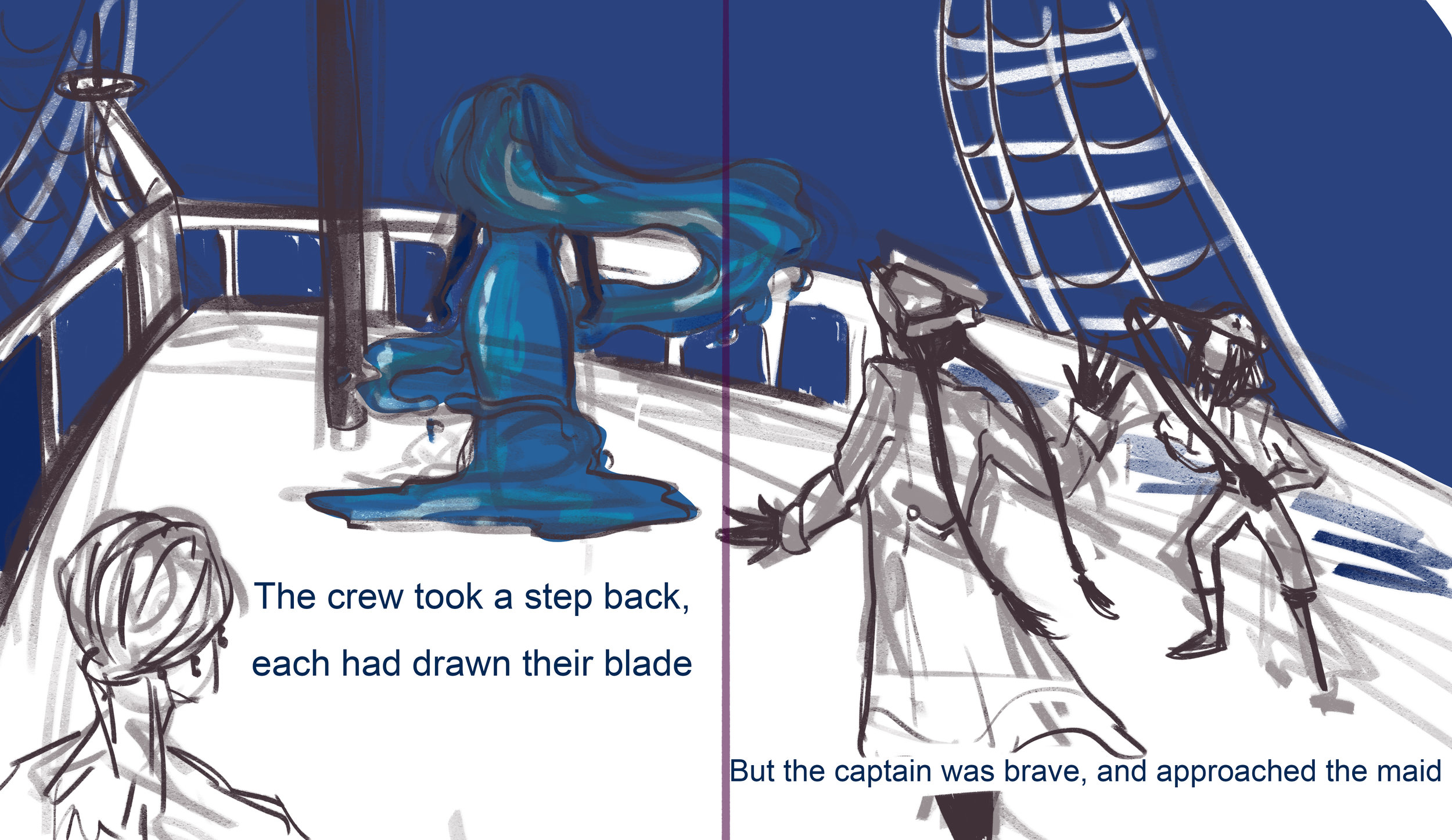
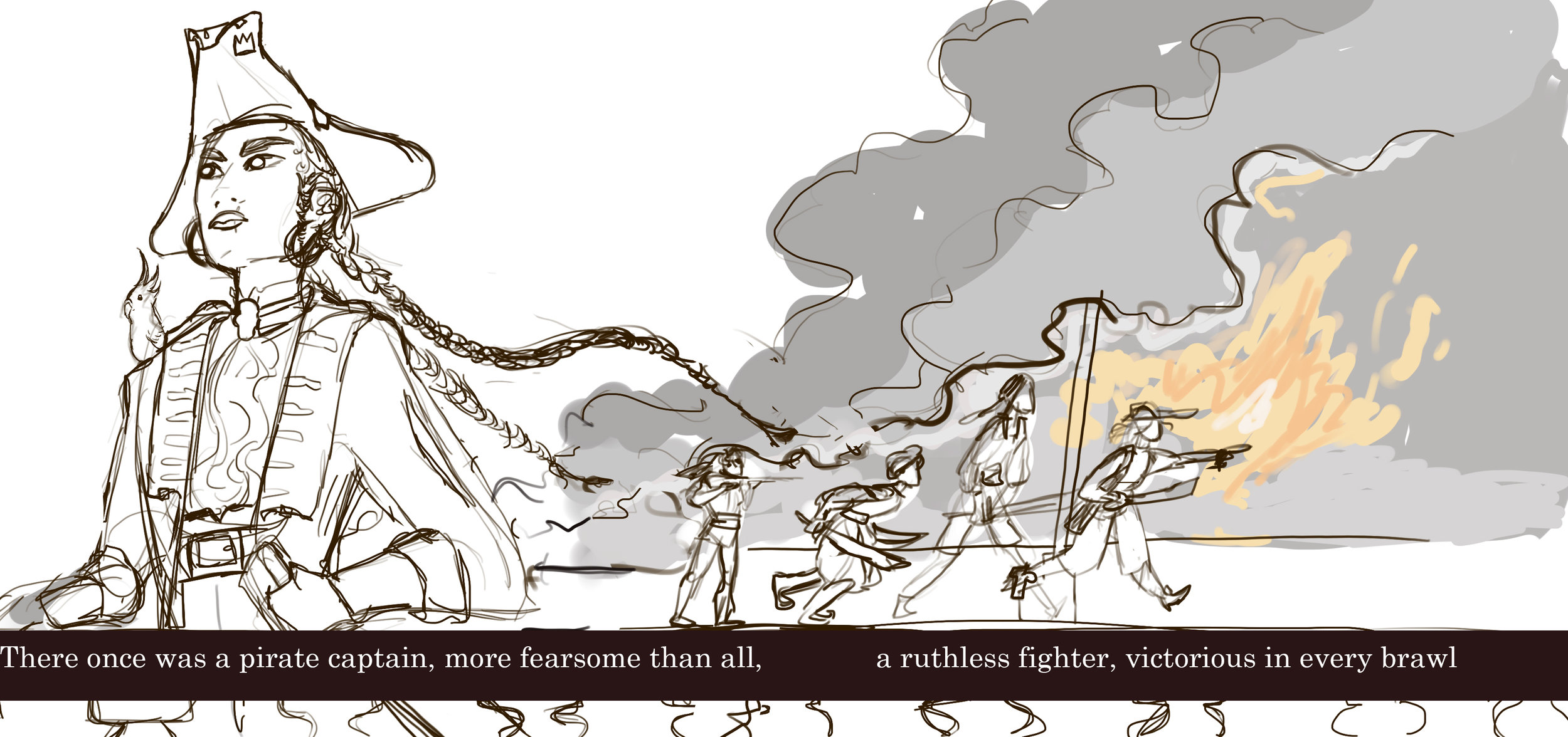
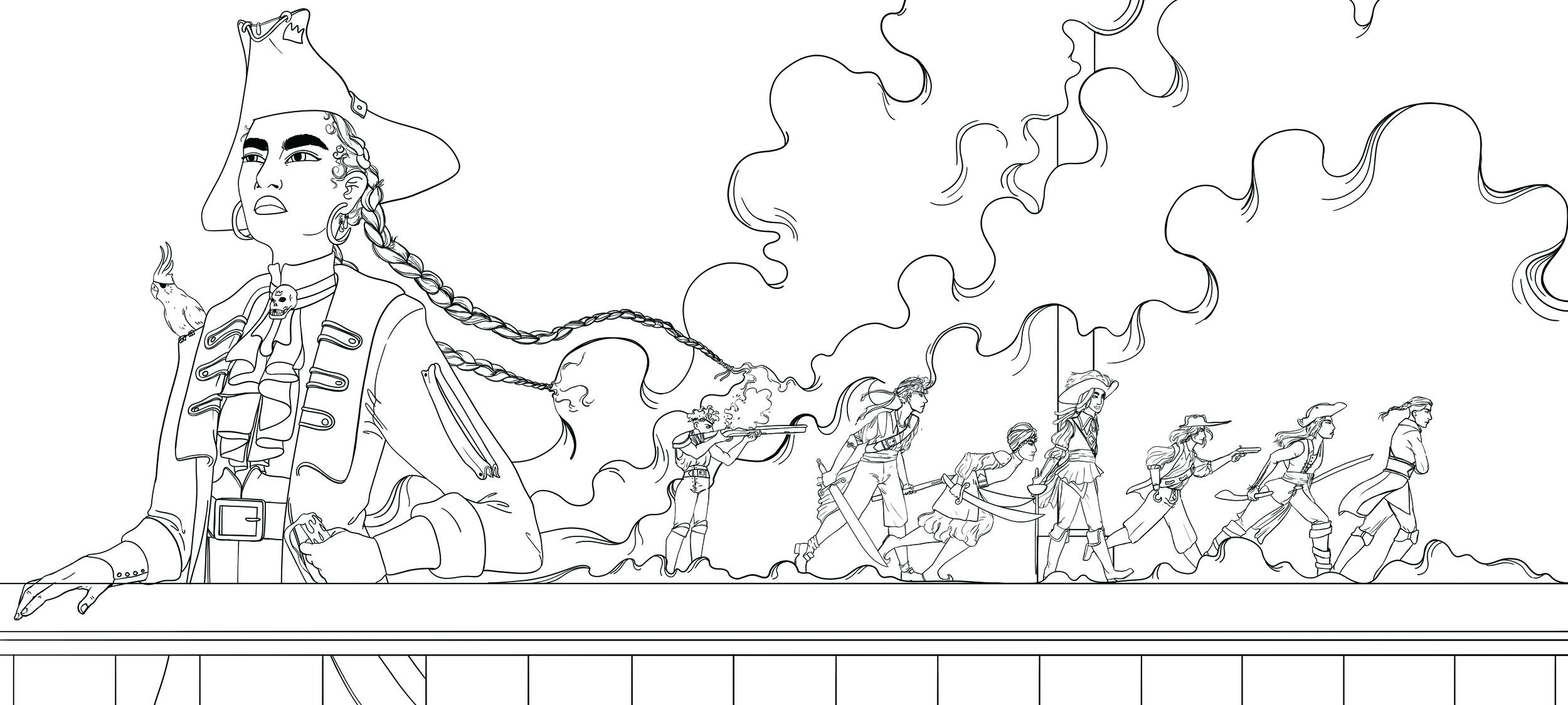
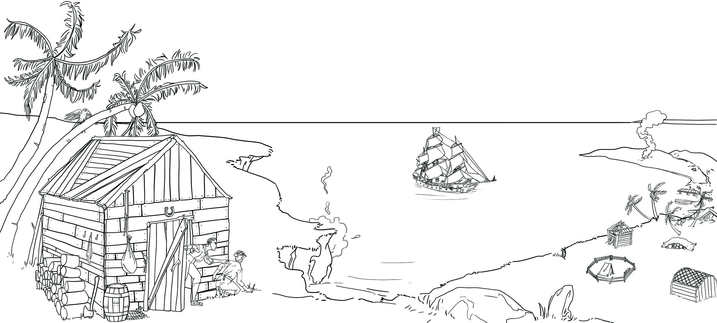
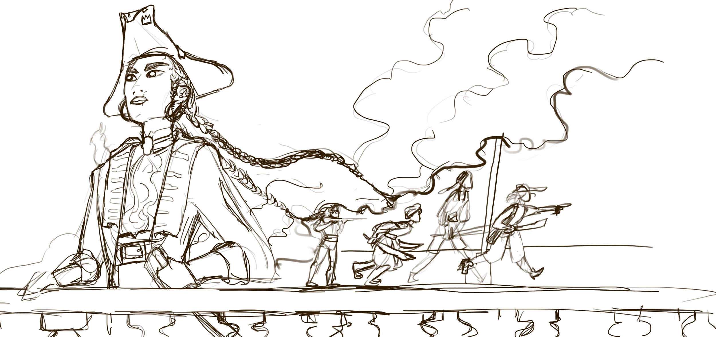
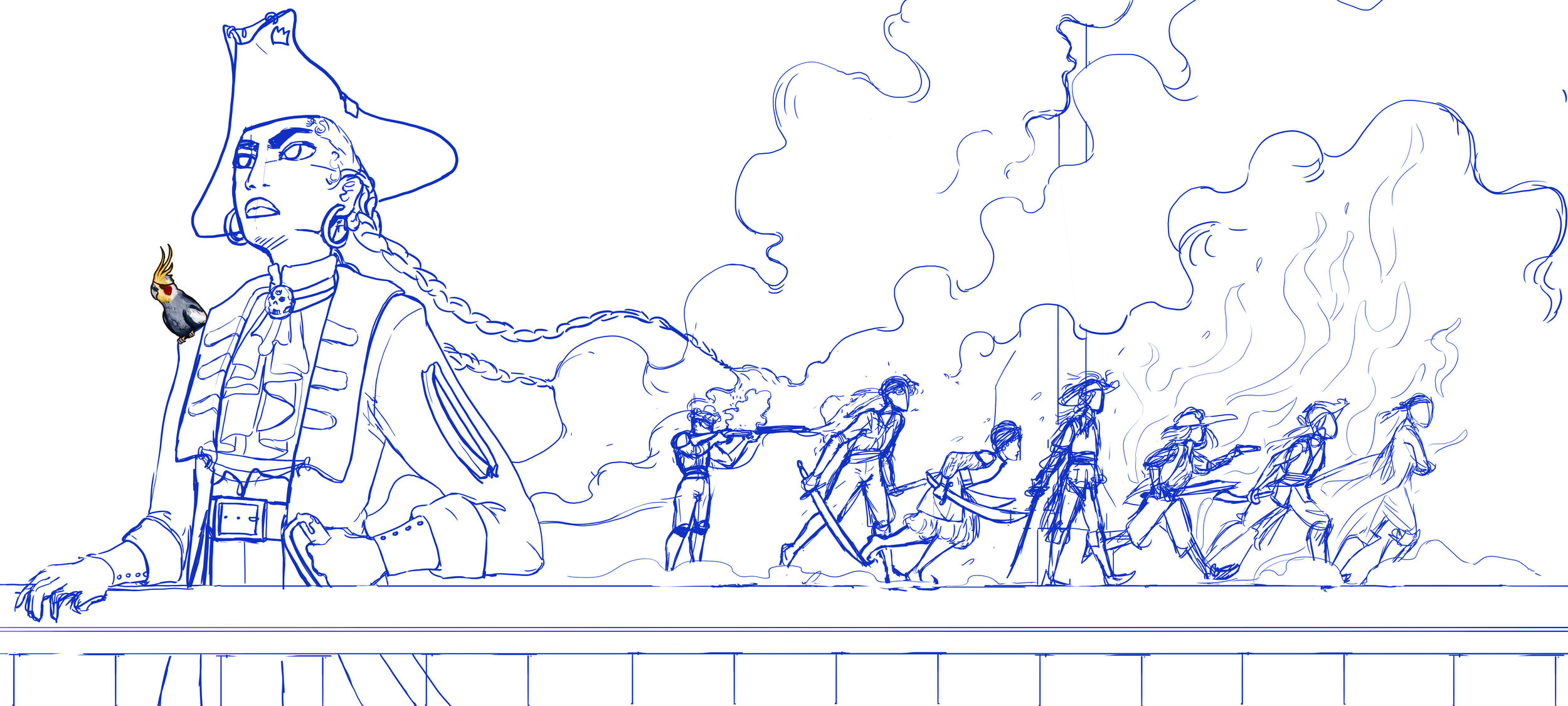
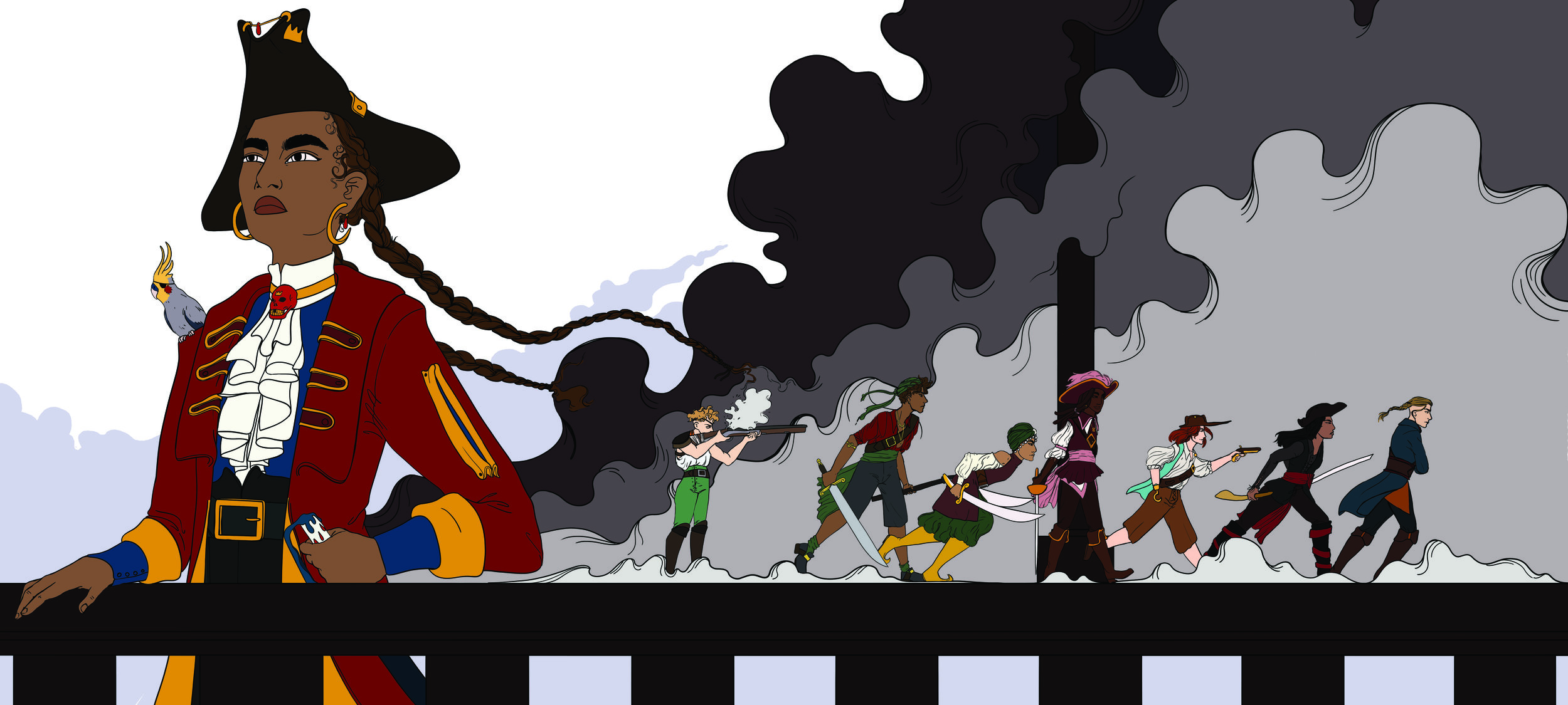
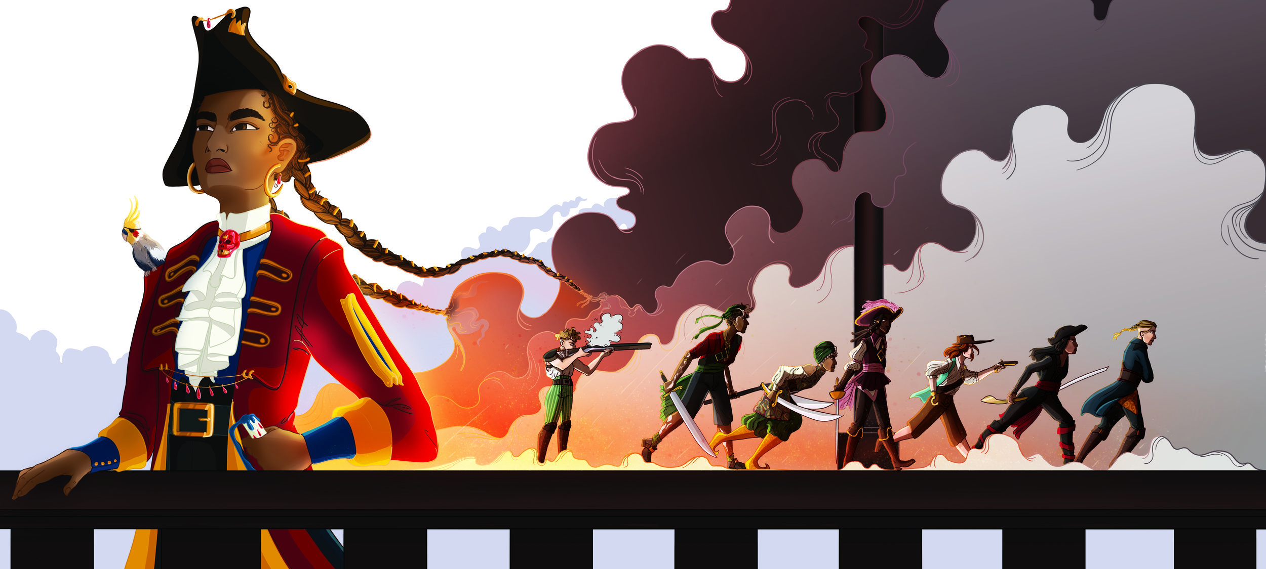
1-2: This is the opening page and I want you to get an immediate impression about this badass character. And I think having her in her full glory with flowing hair that seamlessly blends into a cloud of smoke as her and her crew storm a ship is a pretty cool first impression.
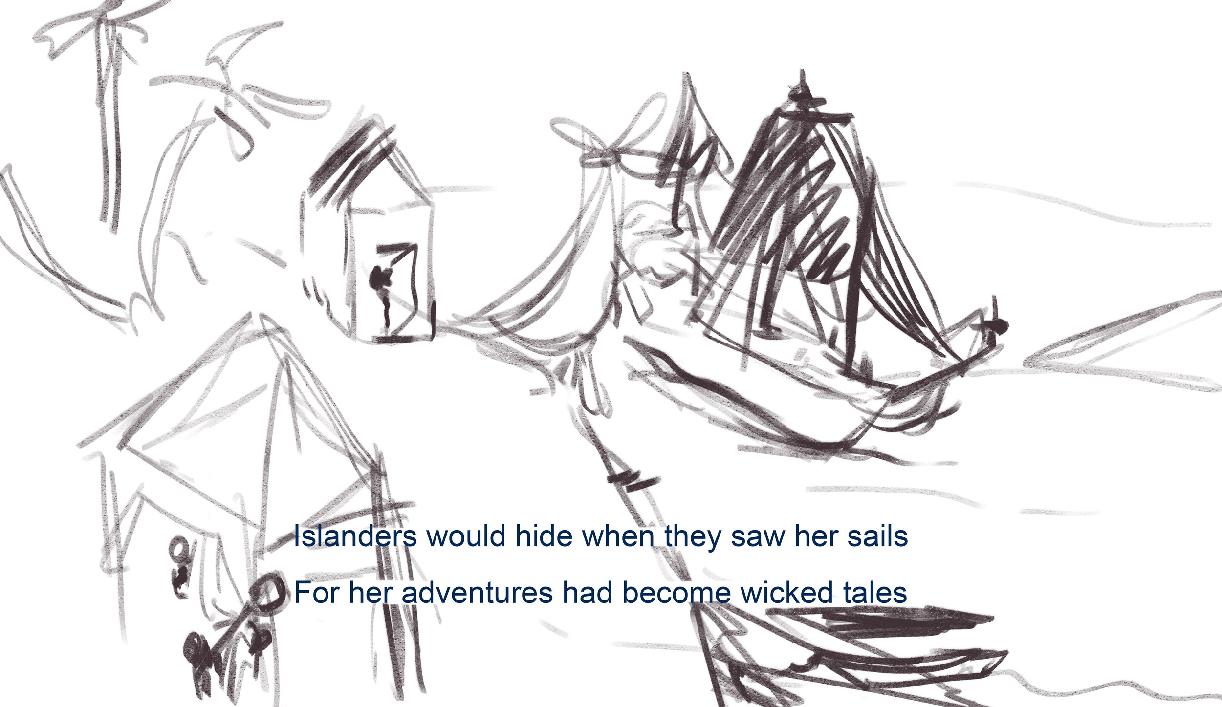
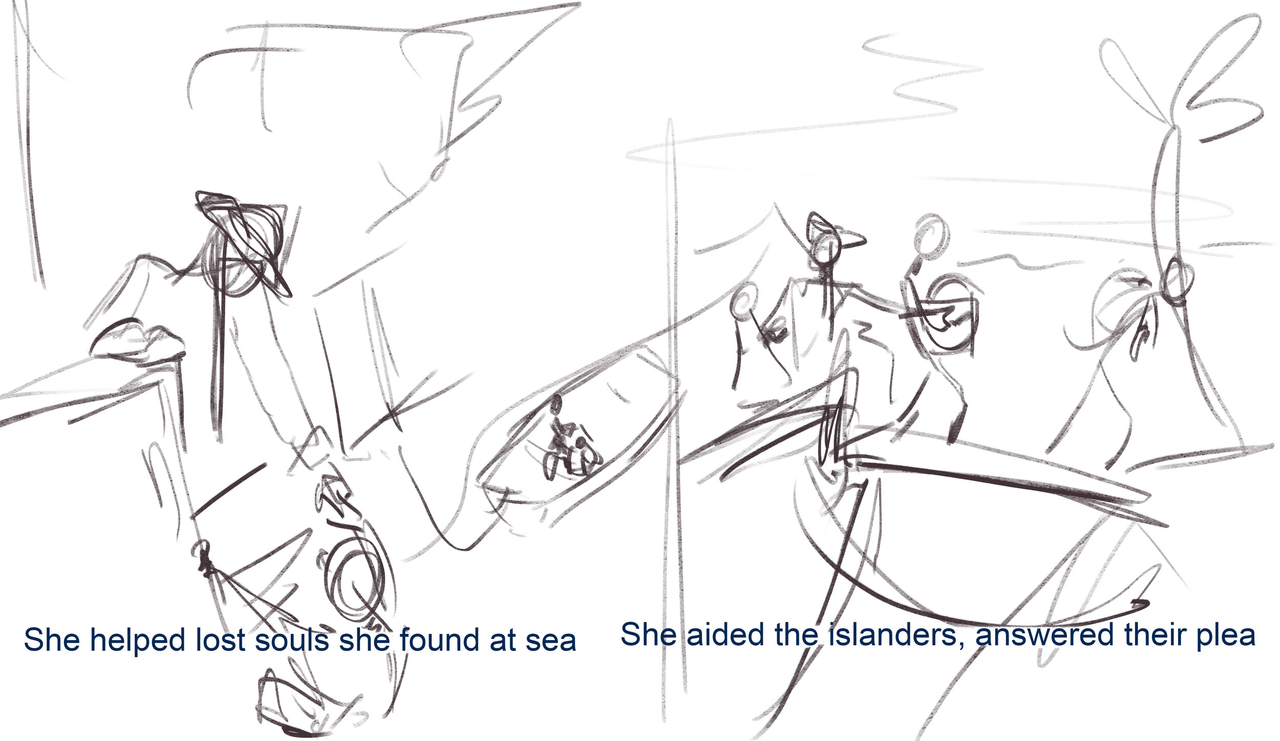
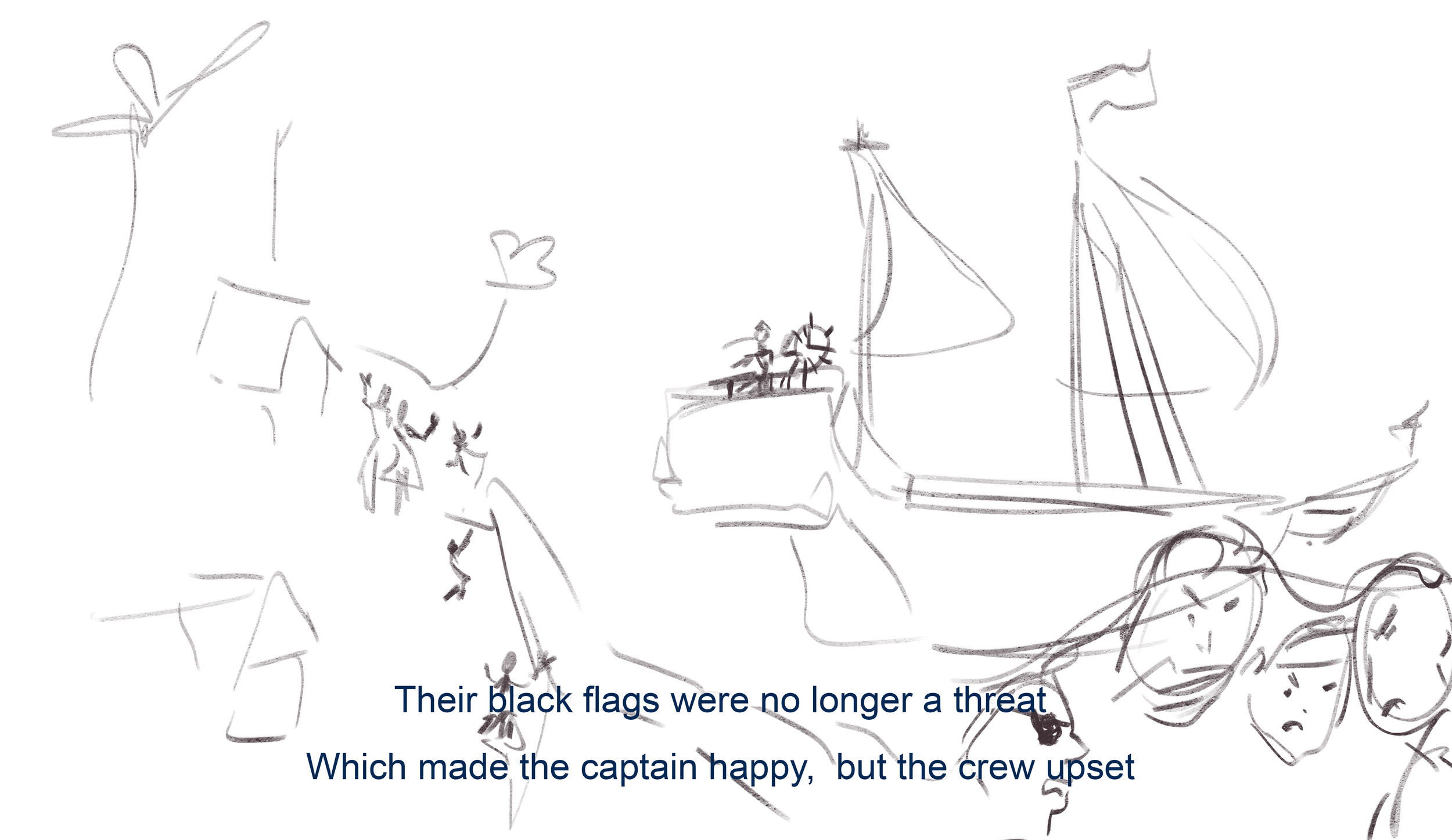
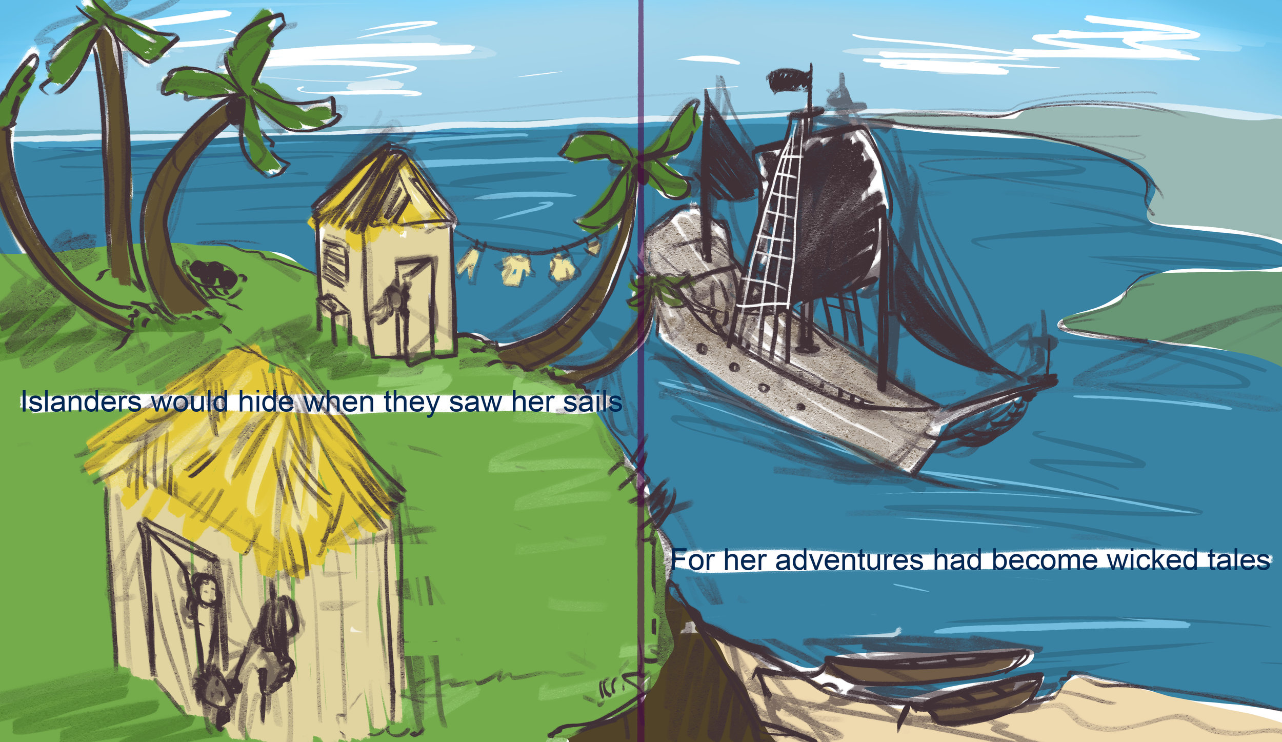
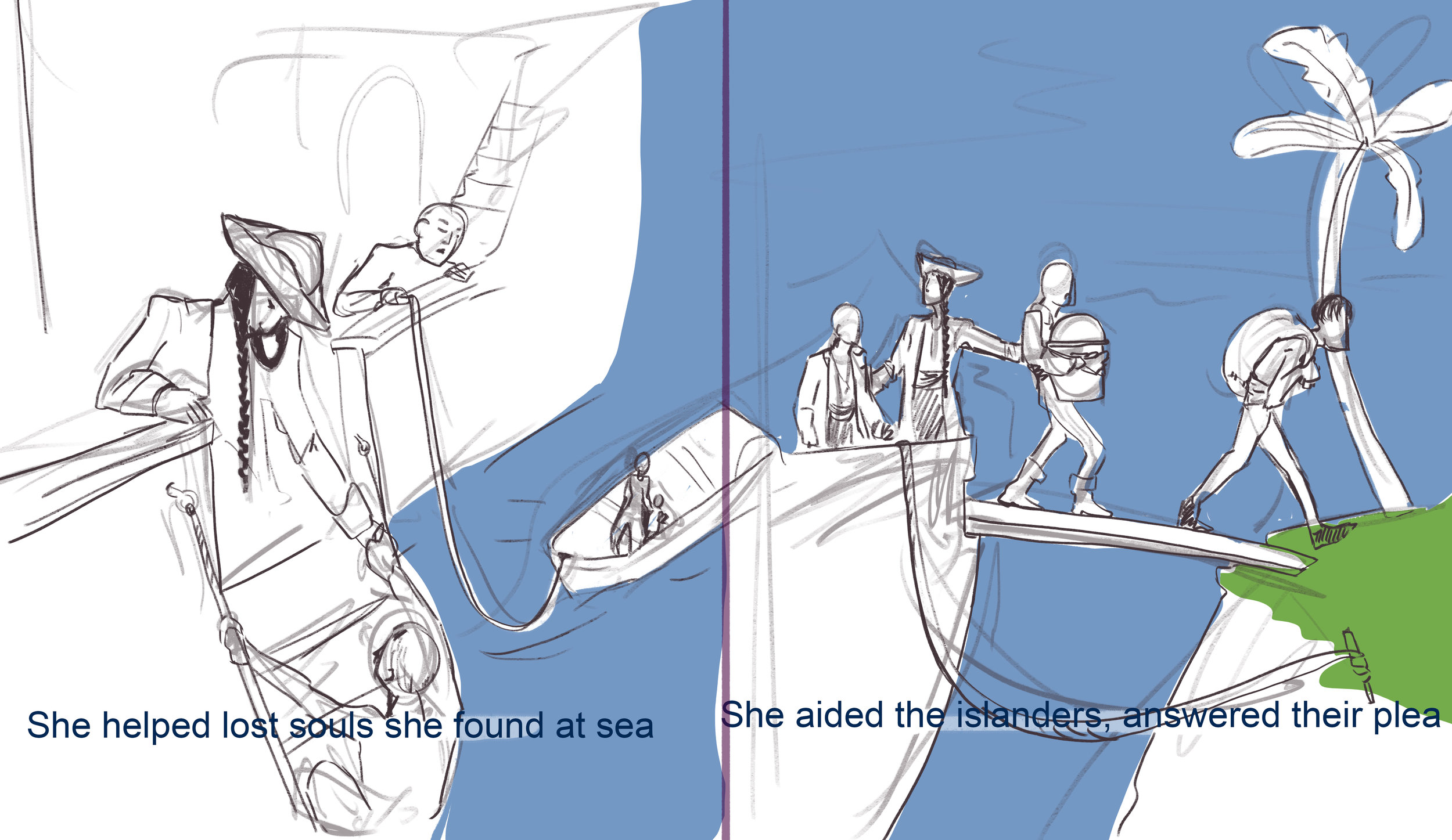
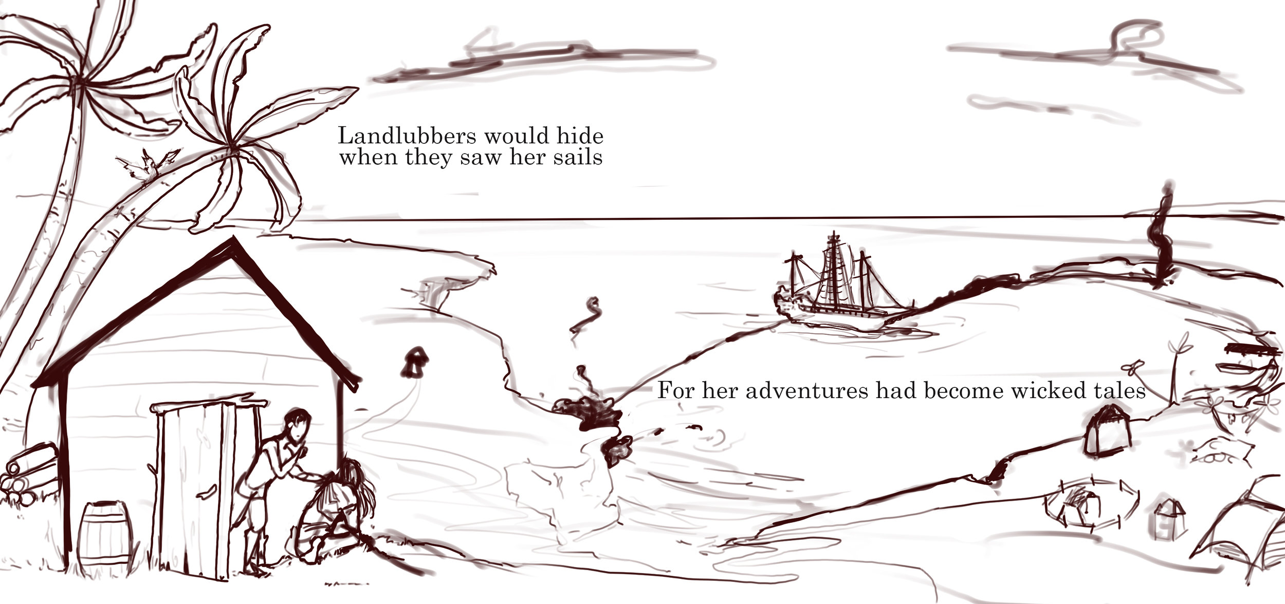
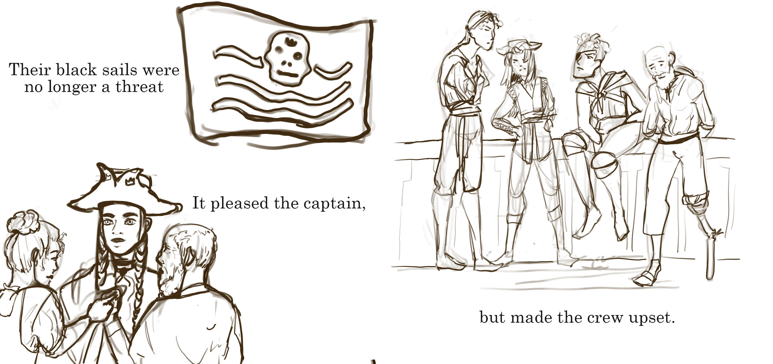
3-4: What I really like about this spread is the way the ship is gliding in the background an the islanders are cowering in the foreground. For some reason I just find this page very illustrative of the narrative I am trying to tell. I will probably find a way to make the black sails stand out more since that is emphasized in the script.
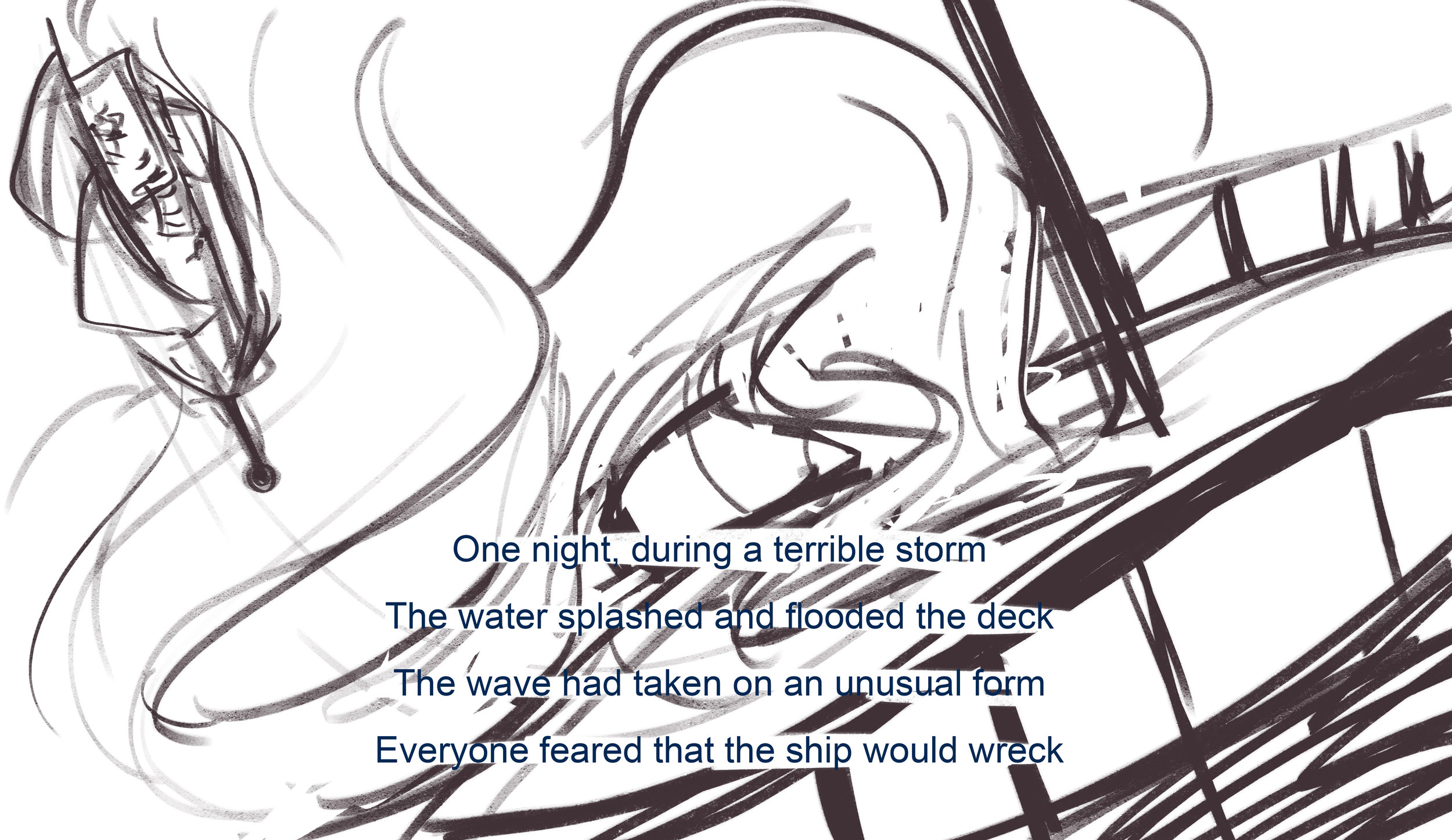
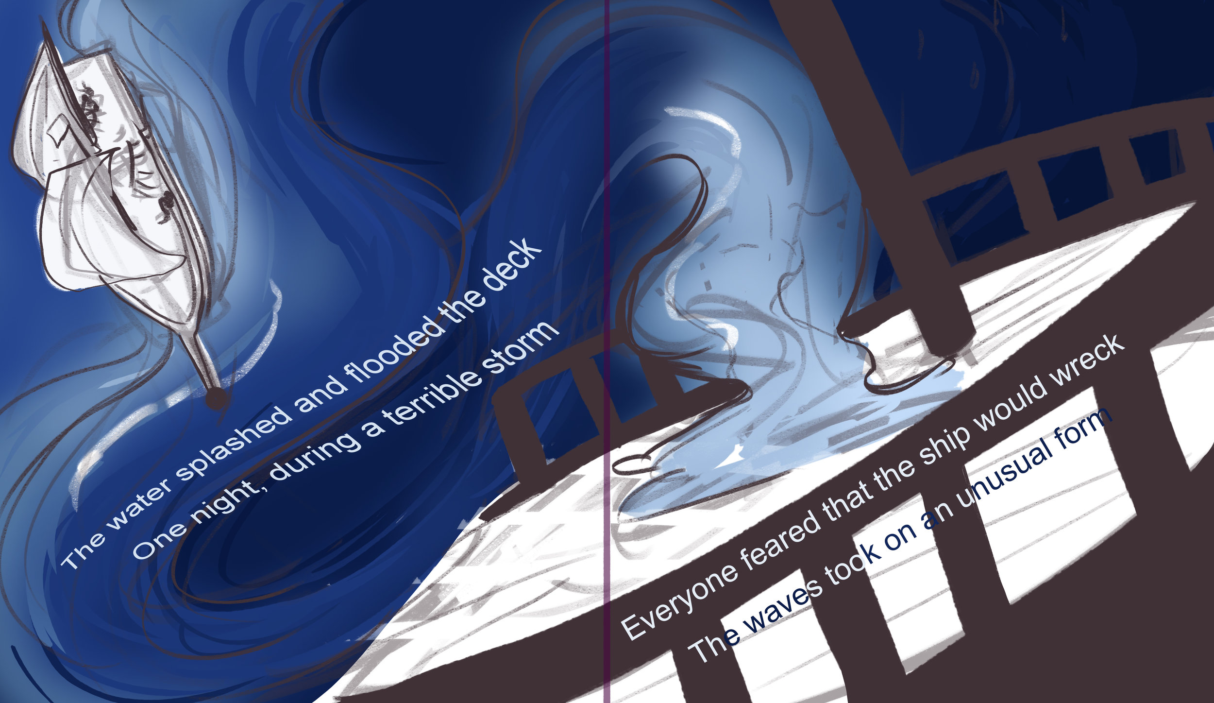
7-8: This page will likely change a little bit, but I want to keep the core idea of the huge wave slamming onto the deck, I love the fluidity of this page and I want to keep this as the focus of this page.

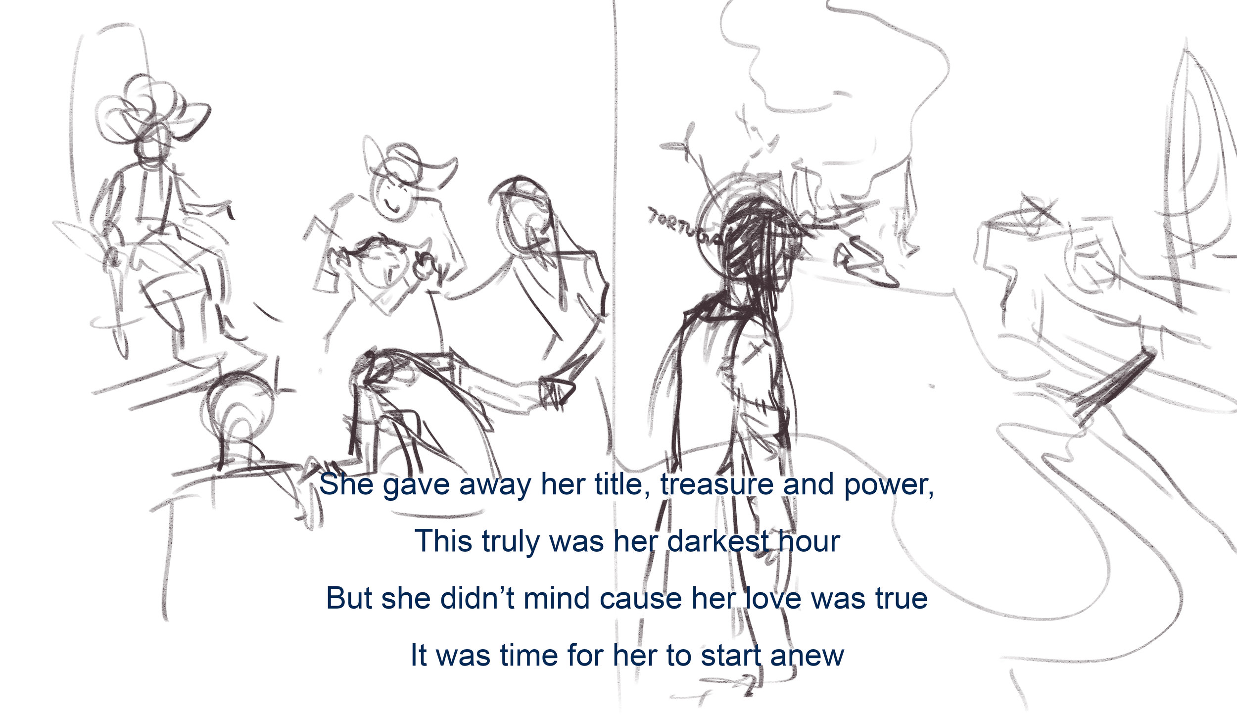
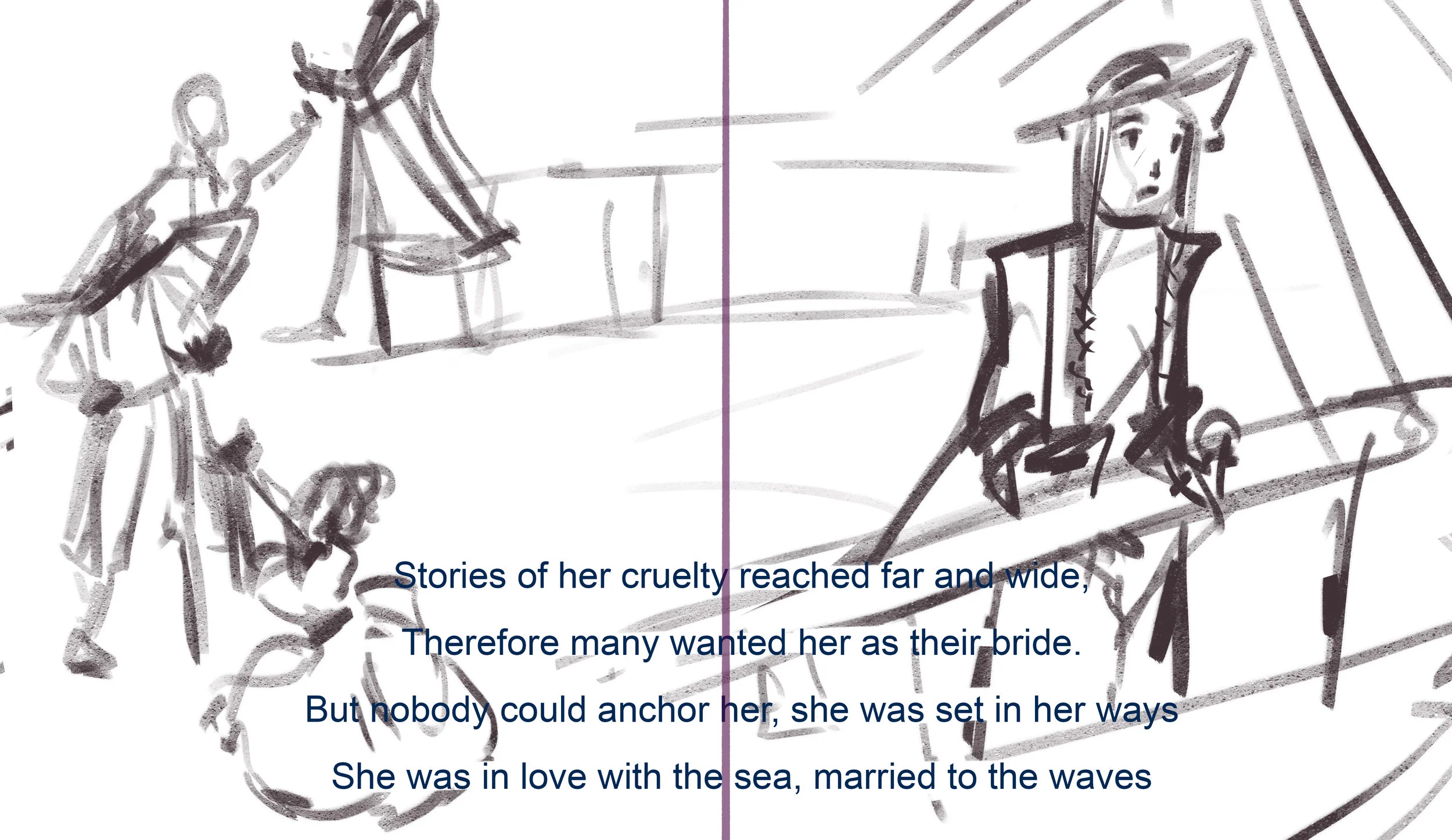
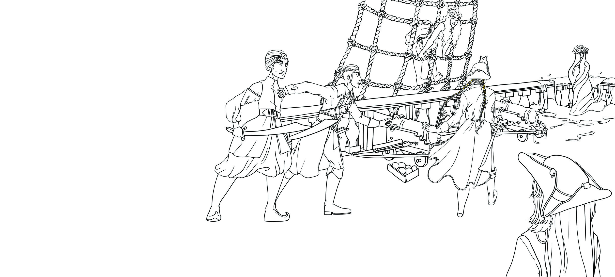
19-20: The thing that stands out to me about this page is the body language of the angry crew. Here I can really work with their silhouettes and focus on portraying the narrative through that. However, this is the page with the worst transitions, so I might rework that aspect or just have it as a hard cut page, since that is a pivotal part of the story.
21-22: Here I enjoy the repetition of the layout of page 3-4. It creates a sense of continuity. I also like the idea of having the angry pirate’s heads be a part of the waves the ship sails on, but I don’t know is this is too abstract for a children’s book.
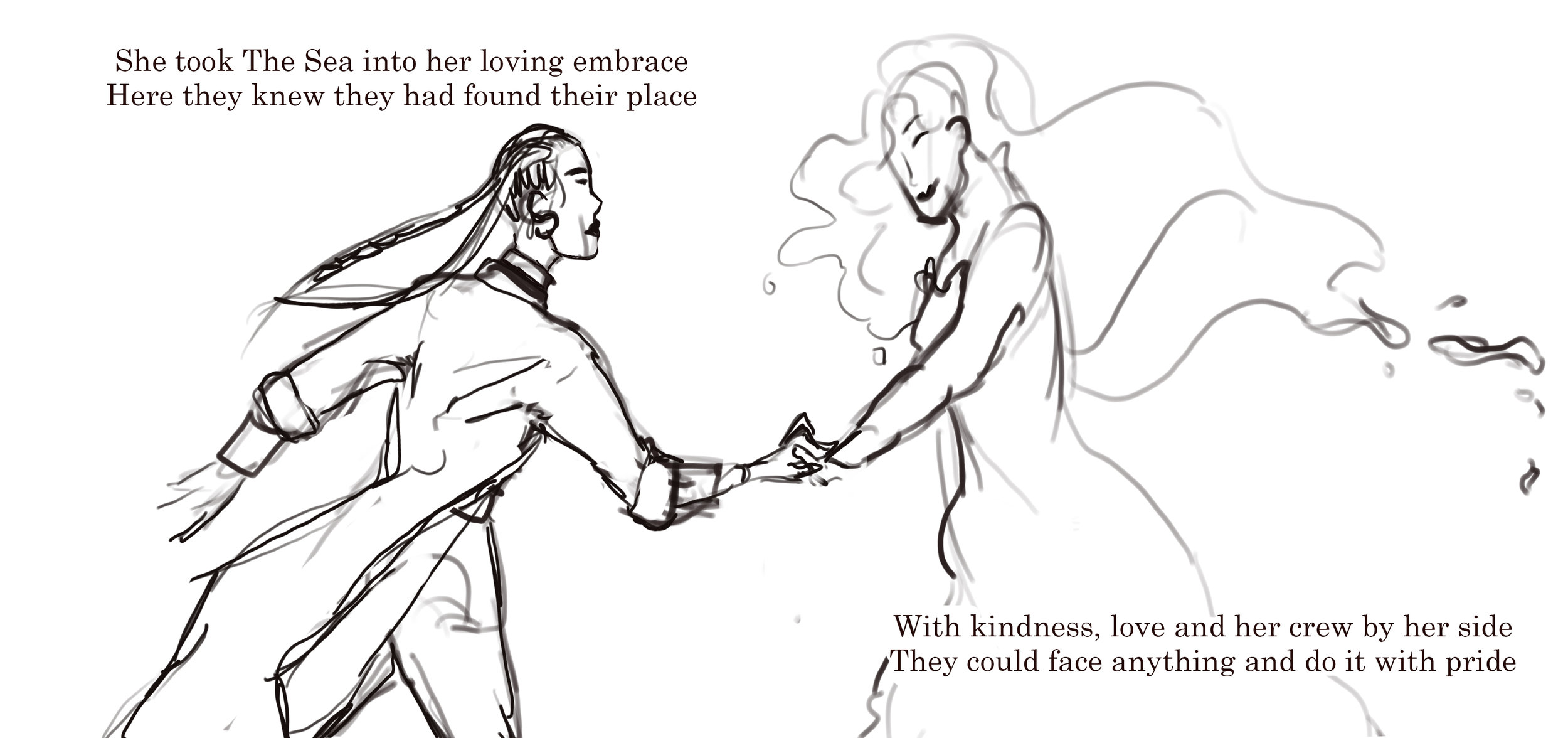
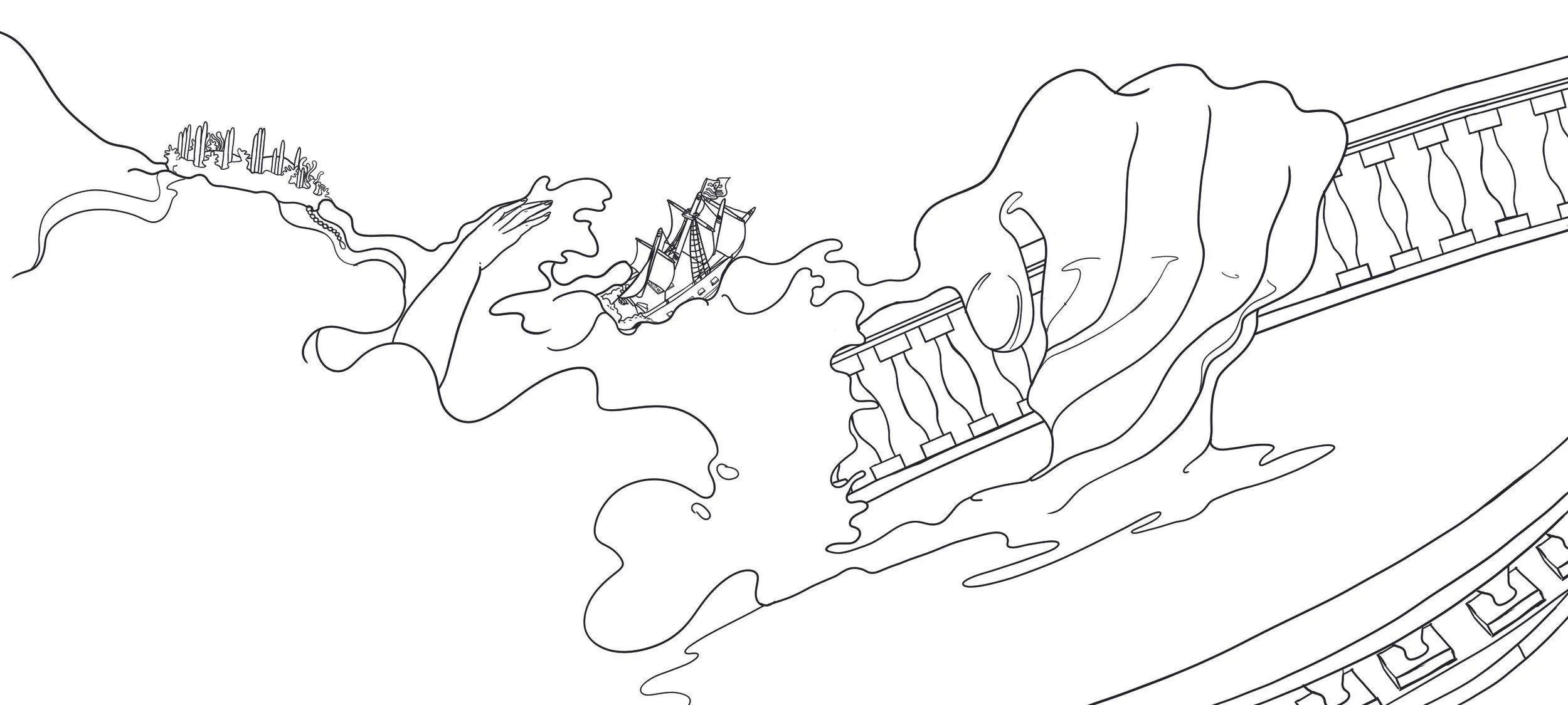
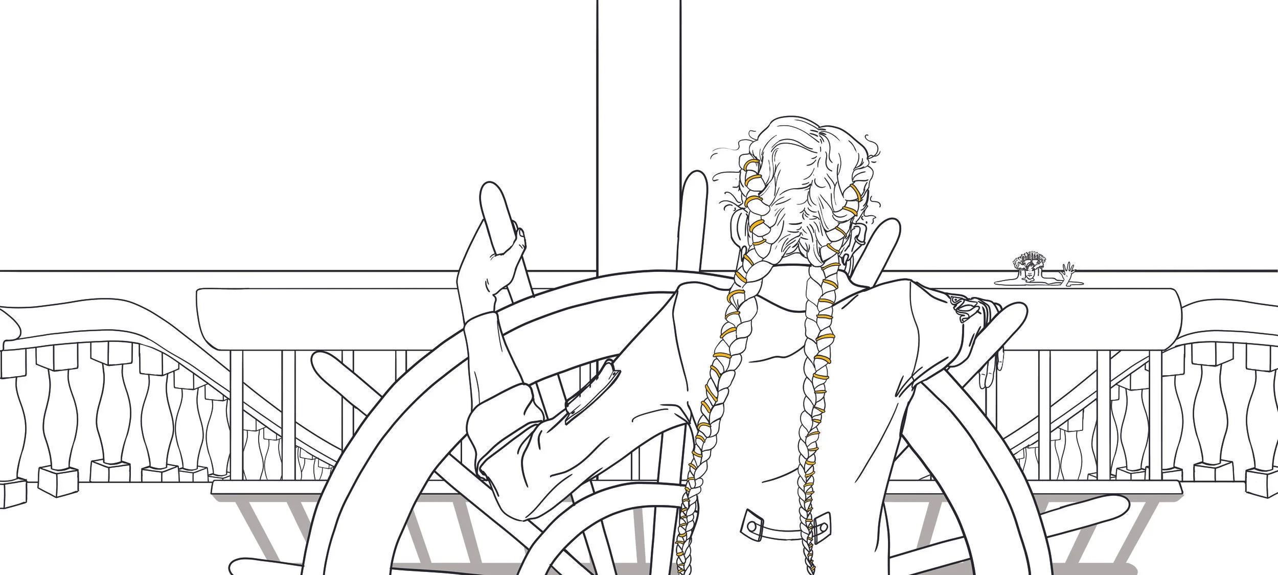
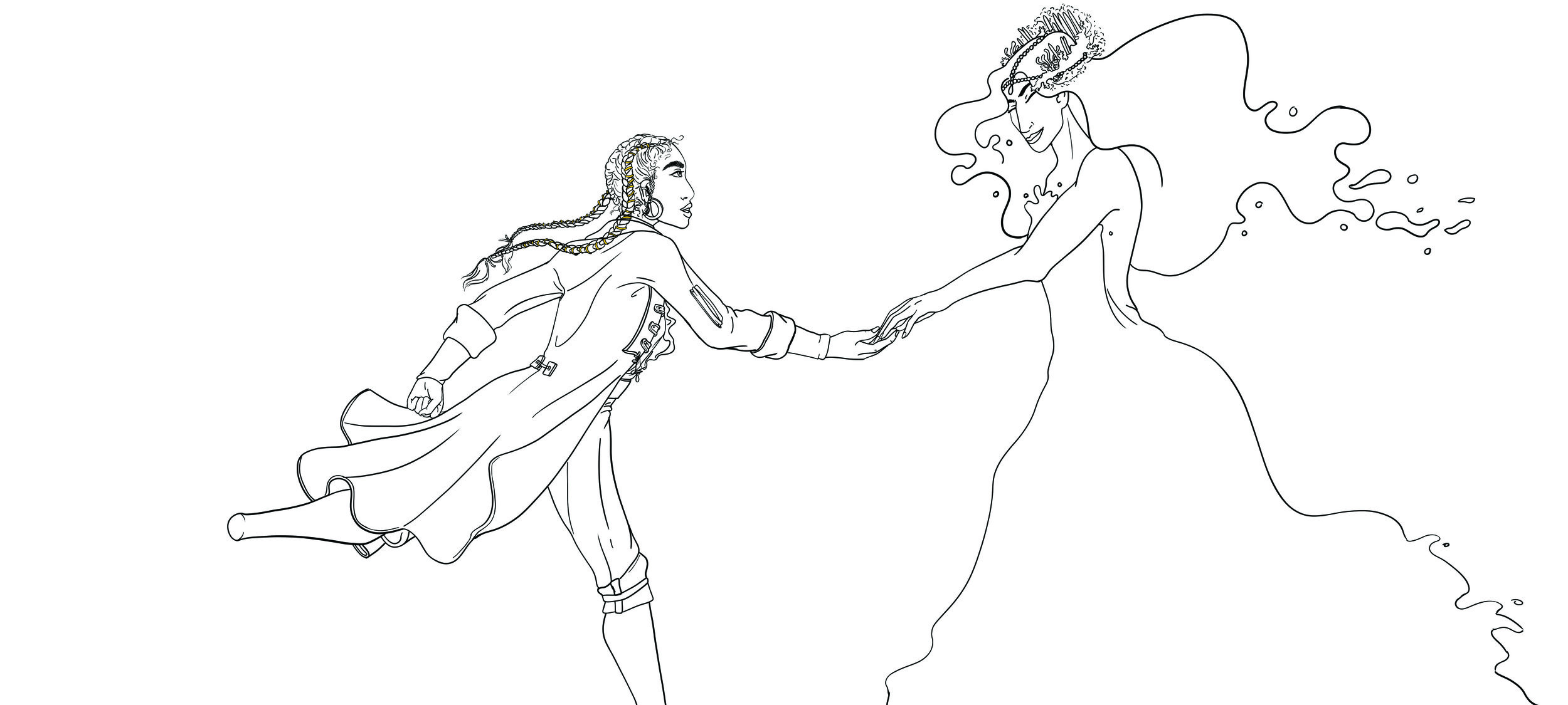
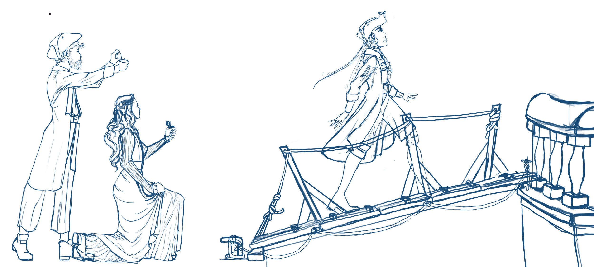
29-30: Here I like the warping of the railing as The Captain runs towards The Sea, it makes it feel like she is bending the world with her passion and I like the contrast it creates with the right side of the image which is a tender embrace.
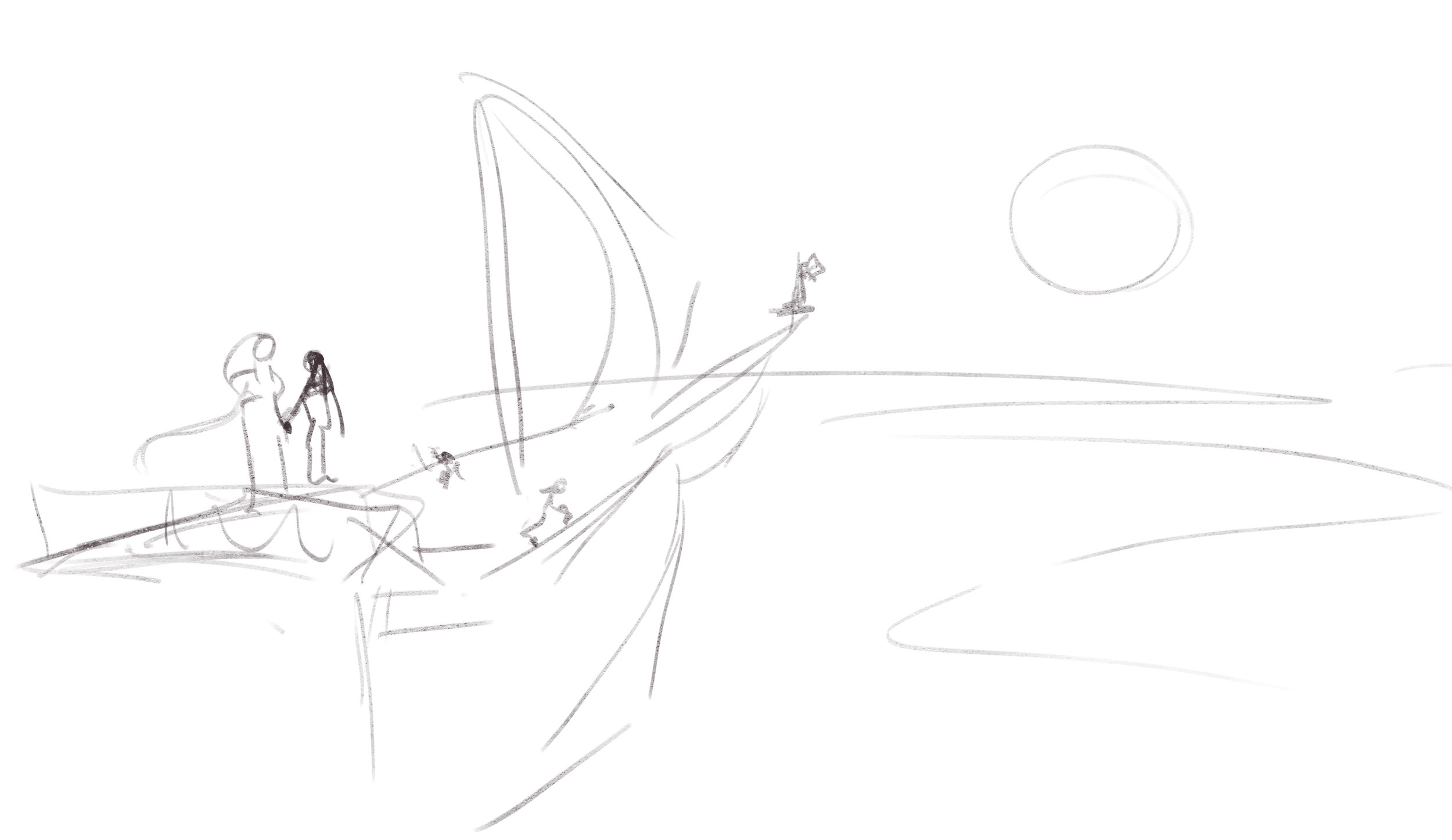
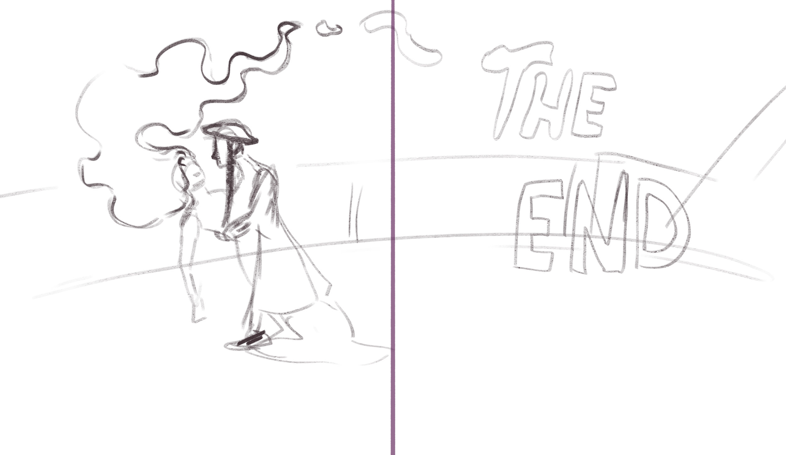
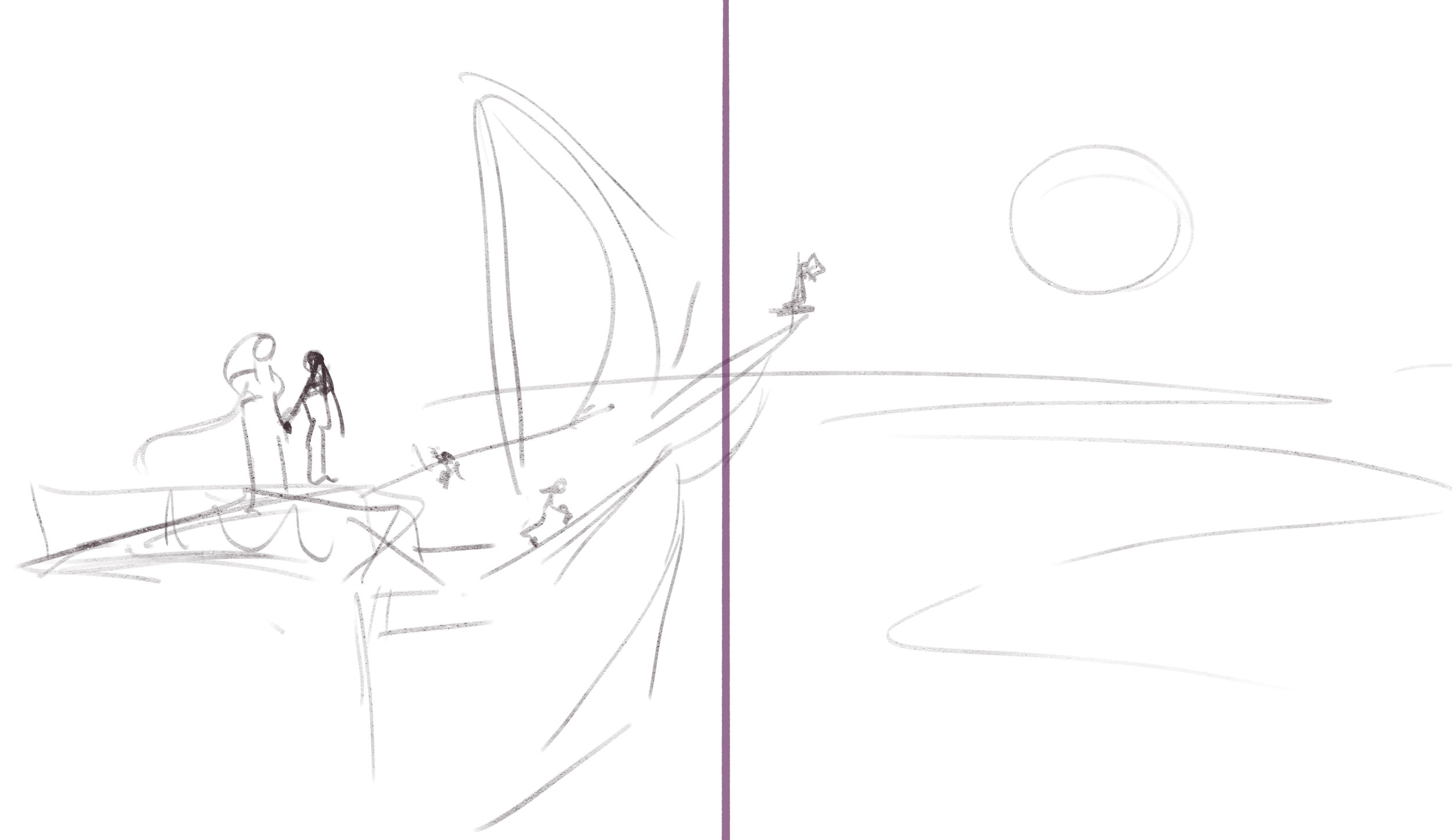
Endpaper (end): This is an idea I had as I was drawing. I thought of having the endpaper have two different illustrations. So at the beginning it is the same drawing, but of only the Captain sailing on her own, but then at the end of the story it is this illustration of the two of them sailing together. I also wanted the first drawing to have a high noon sun and the last on have a setting or rising sun.
As you can see on the picture on the right, the endpaper is the paper that mask the binding of the book, it isn’t an official part of the story, but it helps set the stage for the book and makes it feel more thought through.

Page Draft 2
As the script is now at a presentable point I decided to update the page draft. With this I essentially just reworked the original draft, adding more detail to make sure the pages were legible for more people than just me. Because at this point I want to start getting more outside feedback as I feel i have worked at it to a point where I don’t know how to significantly improve it anymore. I also wanted to block out the colours to get a sense of the palette I am working with. There are still a lot of pages that need a complete reworked, they feel very lackluster and I want every page to stand out. Additionally, this draft doesn’t have the right page size or format, so for the next draft I will redraw it from scratch in the right format. This will give me a better idea of the framing of each page and exactly where the middle of the page is and how to make sure I don’t place anything in the seam between the pages.
As far as the colours go I realize that I will be working with a lot of different blues. So I need to make sure I have a strict colour palette. I need to make sure that the blues don’t feel boring or feel like the dominate the page too much, I also want to make sure that there is a consistent use of blues. So that the water and the sky feel different and don’t bleed into each other (unless I want them to) and that the character, The Sea, stands out from the background. I will be able to work more on this when I have the final character design sorted out.
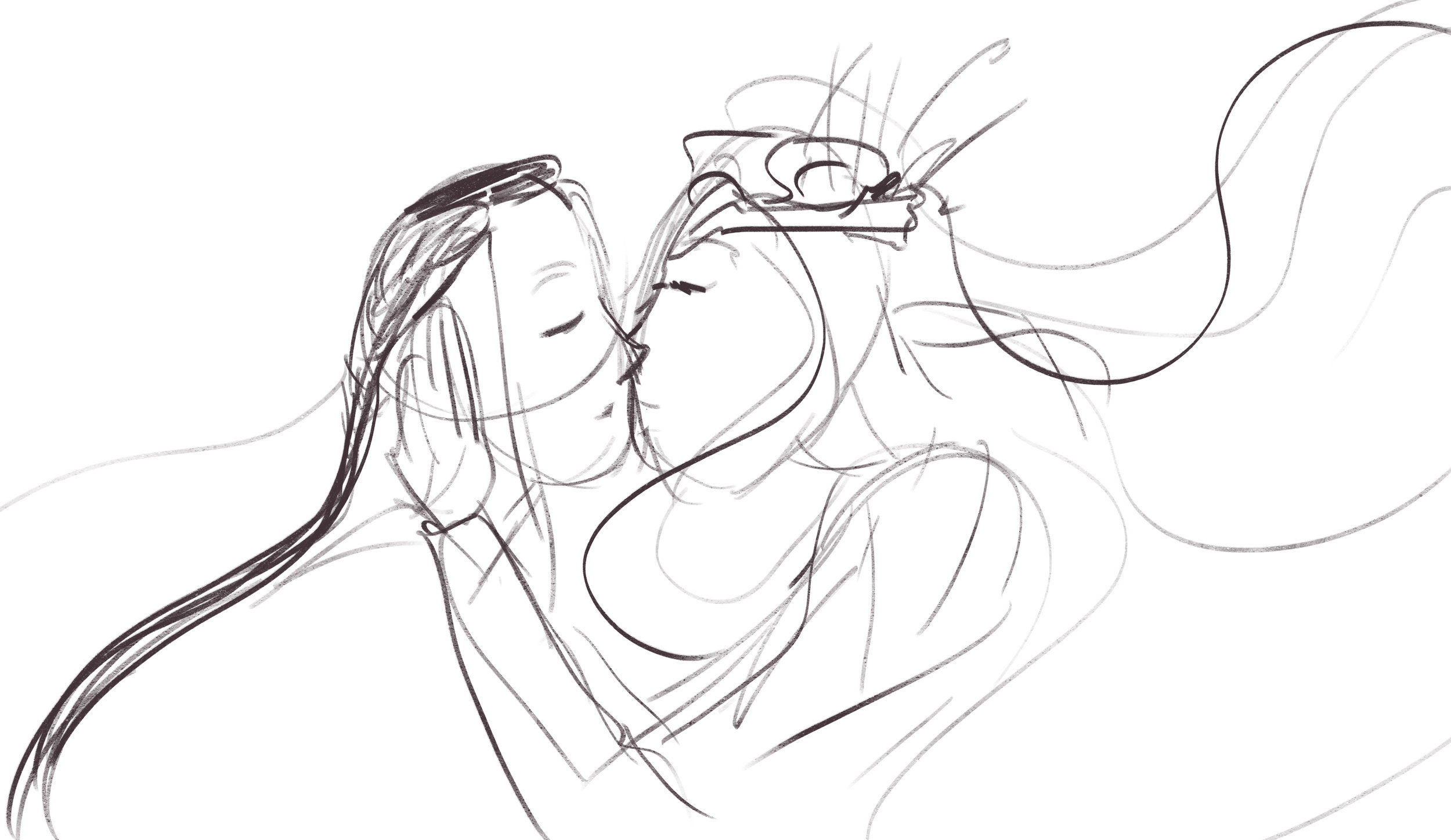
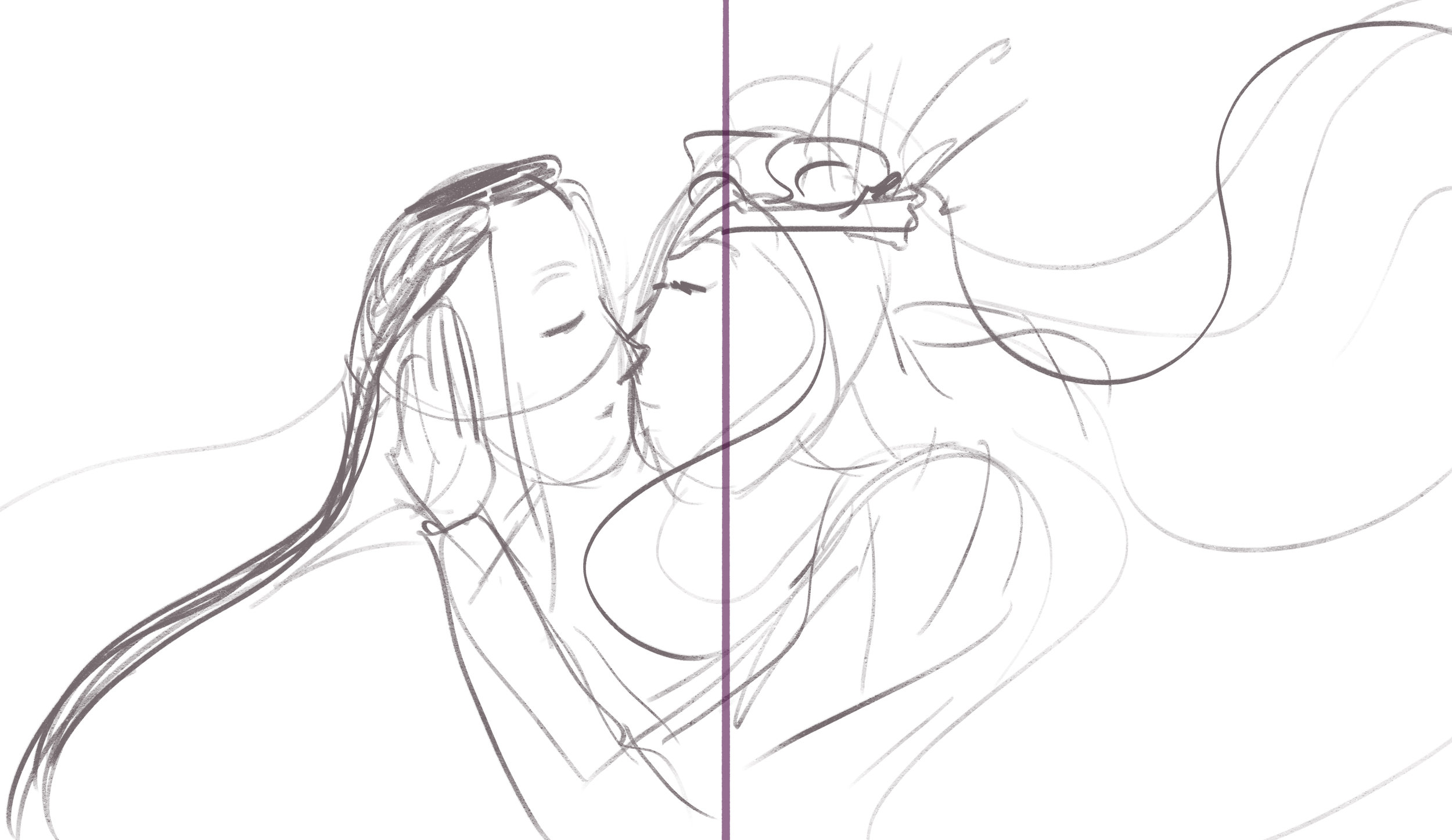
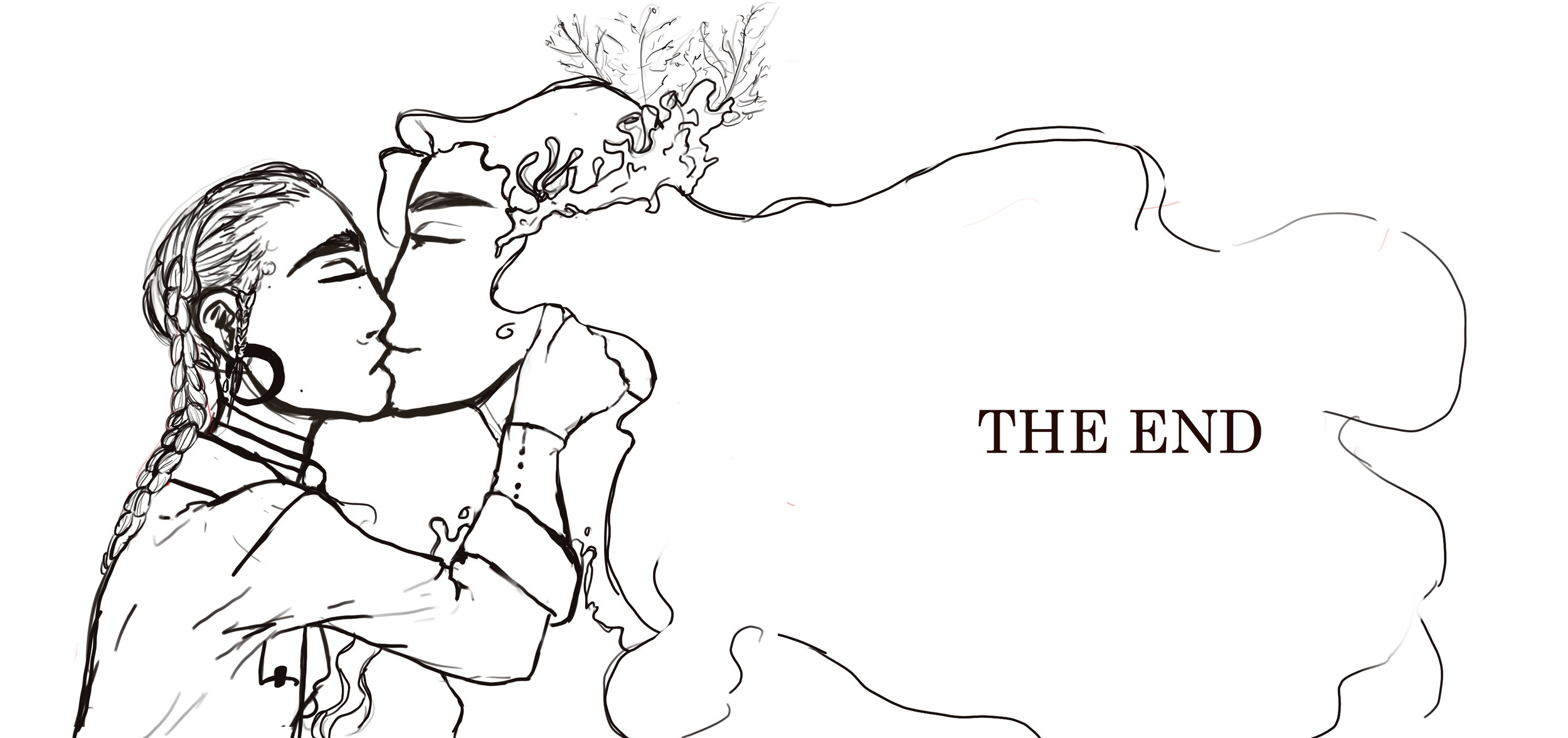
I am also a little unsure about the ending, of I should have them kiss or not. That is why there are two variations of the ending in the draft below. But based on the feedback I have been getting and my personal hunch, I will likely have them kiss.
Page Draft 3
Below is the third iteration of the pages. Here my focus was to CUT DOWN, I wanted to cut down on as much as possible and really strip down the pages to the bare narrative minimum. Looking at my previous drafts I knew I was way too ambitious with the amount I would be able to do. Whilst, what you see below is still detailed it just doesn’t have as much background detail. I have used more blank spaces of white to save on illustration, but to also have a natural space to put the text.
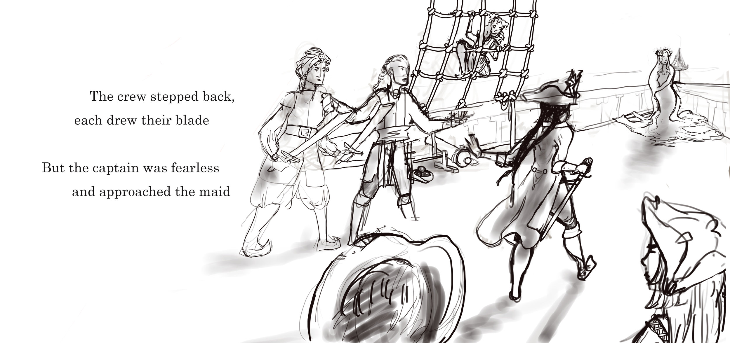
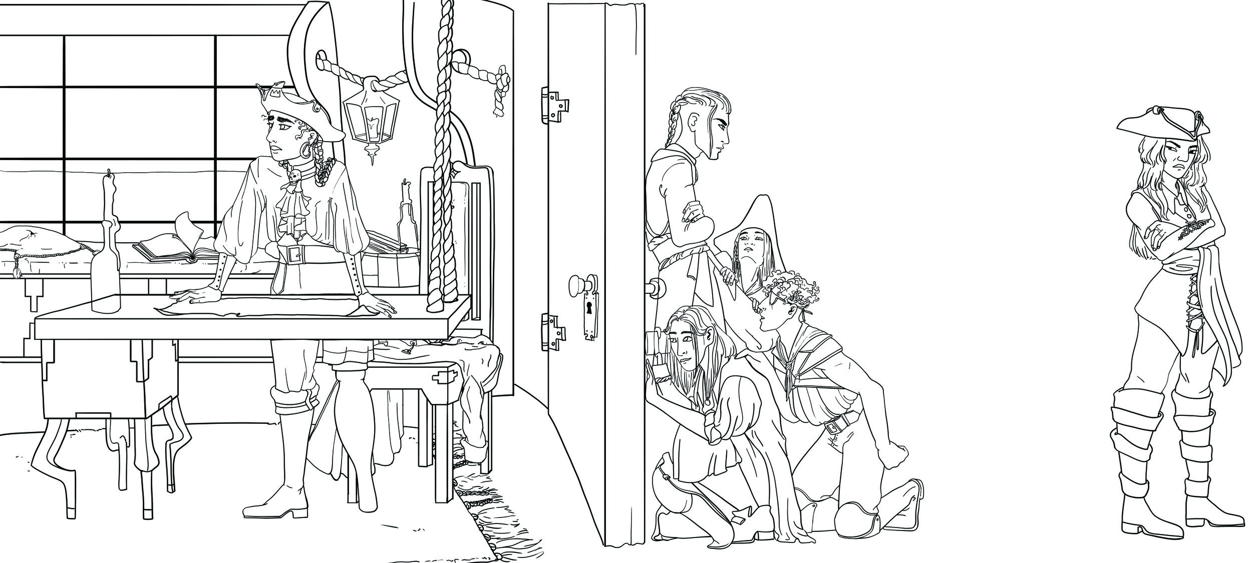
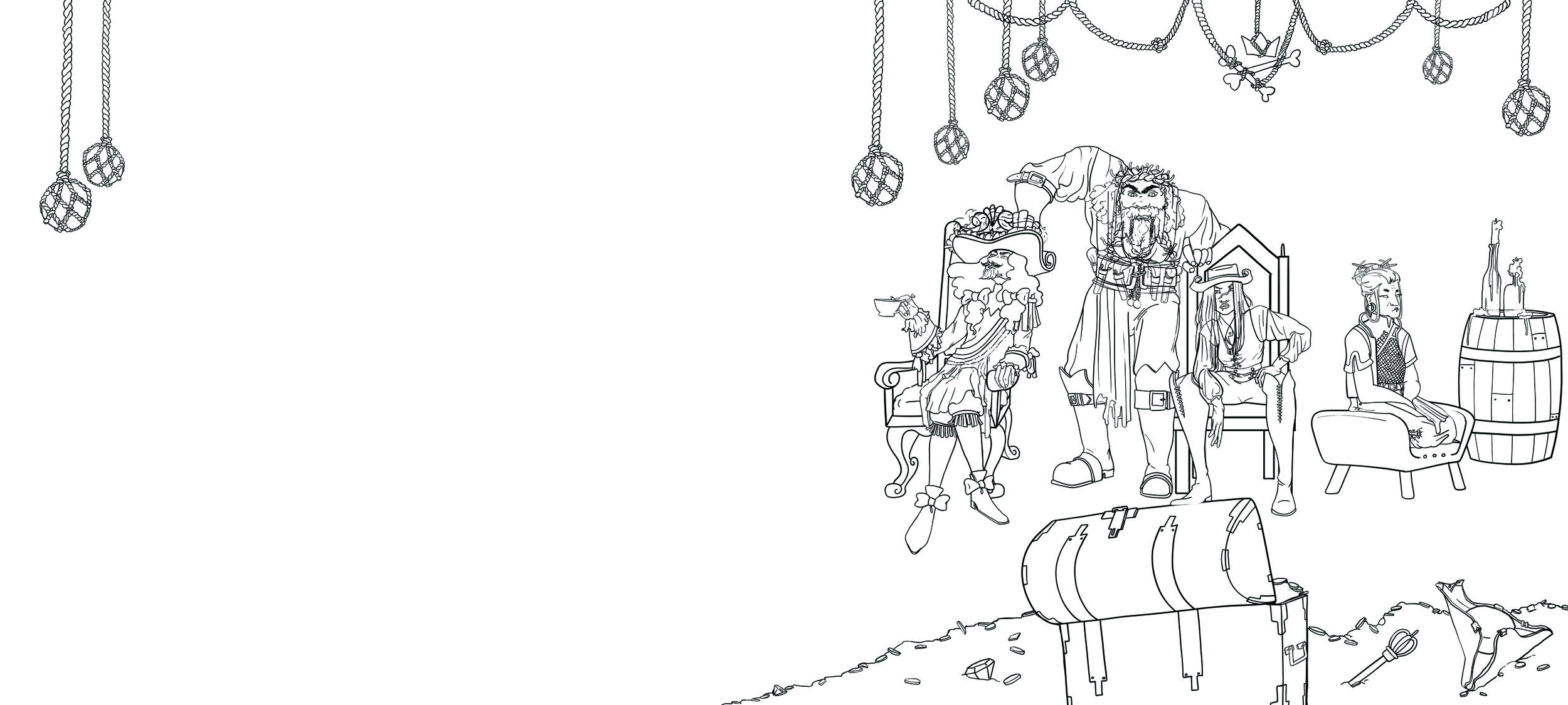
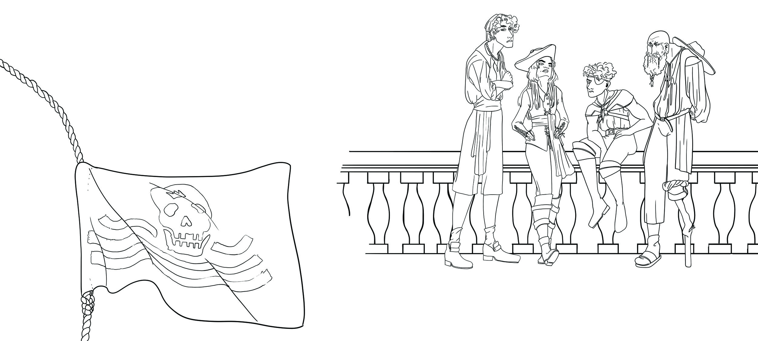
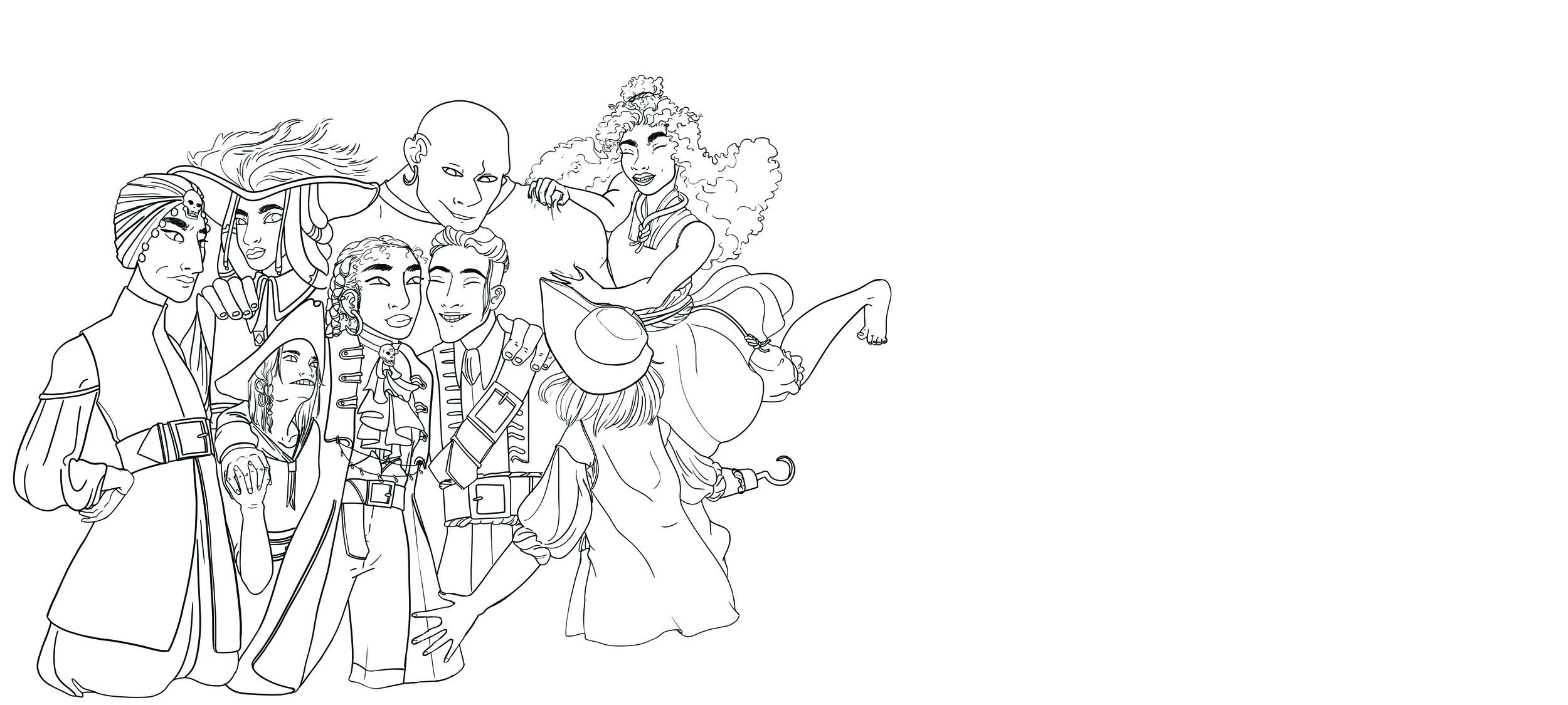
The best part of this draft iteration is the inclusion of the crew. The crew are much more visible throughout which I think is great because it makes the emotional impact of some of the crew’s betrayal feel much more significant. It also means I get the chance to showcase the characters which I spent time designing and have grown quite fond of. You can see the crew’s concept art on the Design page under the sub title “Crew”.
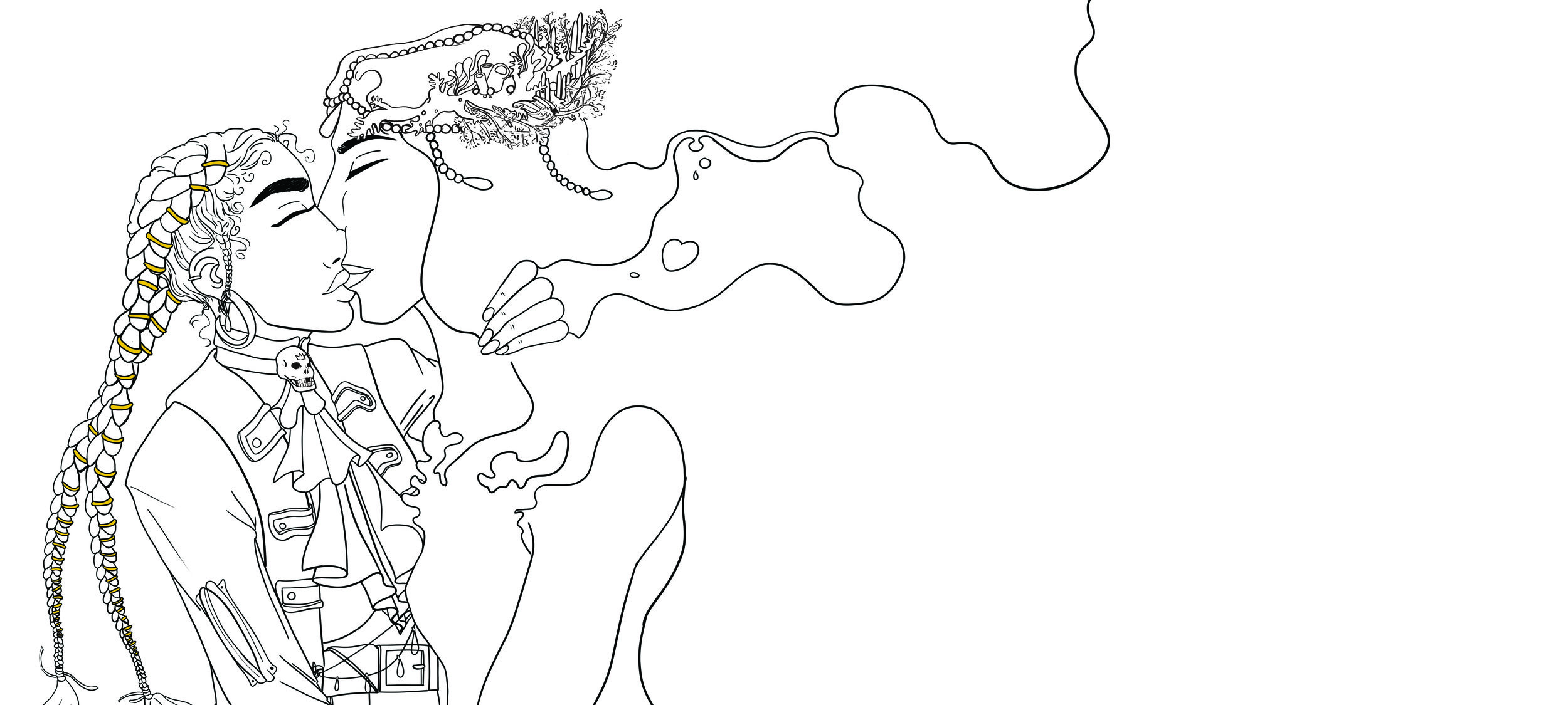
I have also decided to have them kiss at the end, because after watching a lot of animated films aimed at the same age group I saw they would often have the main couple kiss at the end, a “true loves kiss”, thus I felt it only appropriate (or at least not inappropriate) that The Captain and The Sea kiss.
Page Draft 4
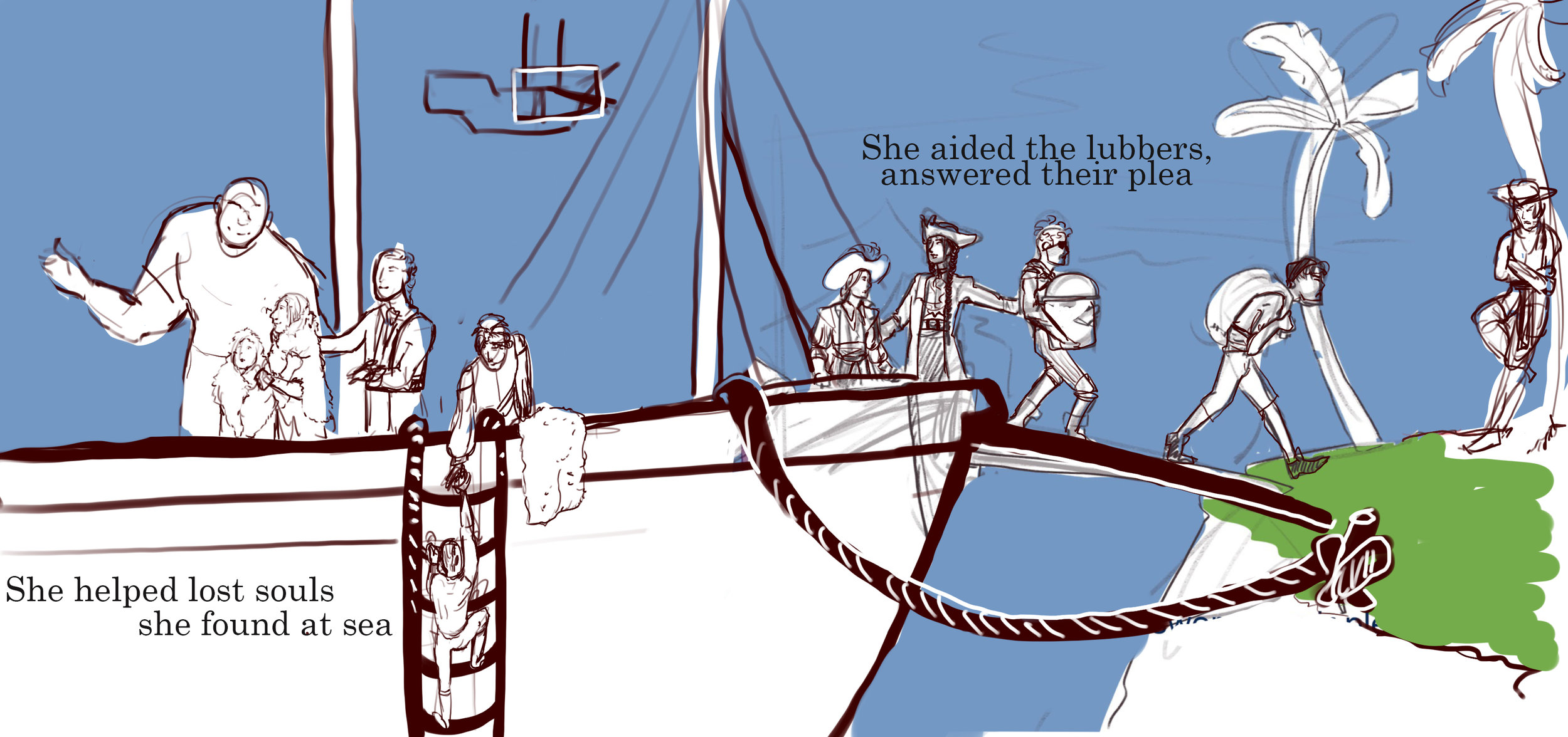
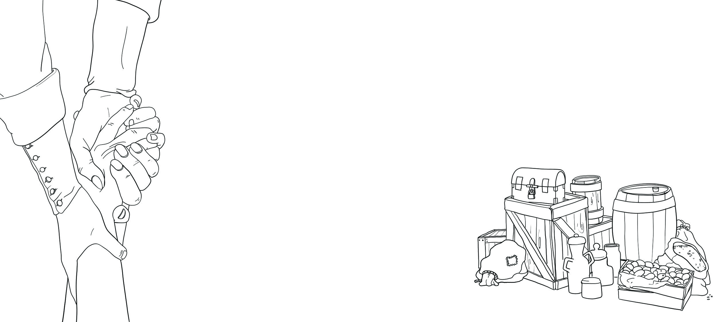
This is the line art version of the 3rd draft. Originally I drew each page from start to finish, but now I adopted a new workflow where I draw all the line art for every page and the do the flat colours and shading and so on and so forth. This gives me the security of knowing that I will have something for each page and not run into a crisis situation where I have some really nice pages and some ugly ones due to running out of time. Here you see the final line art for all the pages, including the cover. You will notice that the one page that in the previous draft had the entire crew on the ship together, “Helping the lubbers, answering their plea”, now has been cut down to being a simple hand and some provisions. I did this because the original page was the most demanding page in the entire book and at this point I am facing the serious threat of not being able to finish on time so I had to force myself to make sacrifices for the benefit of being able to finish the product.
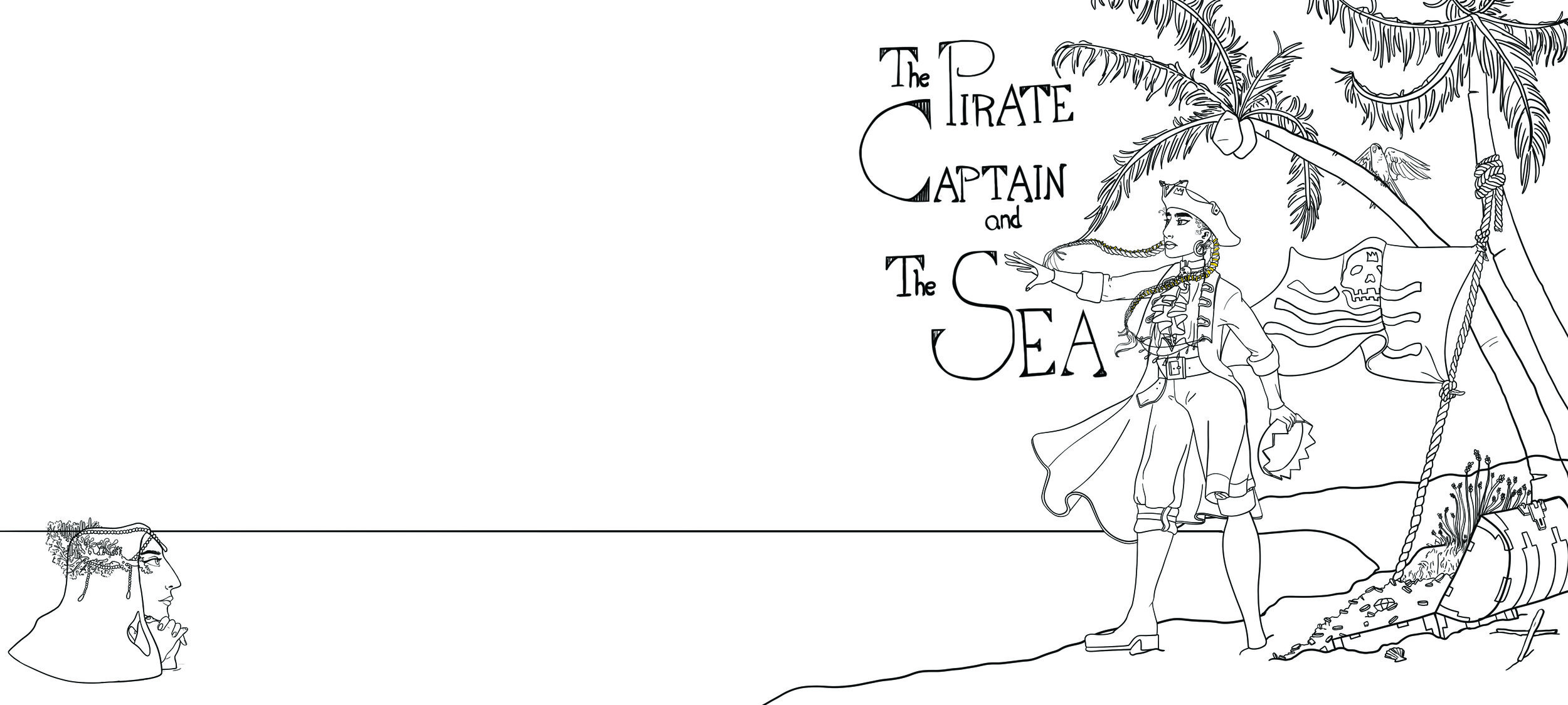

Cover
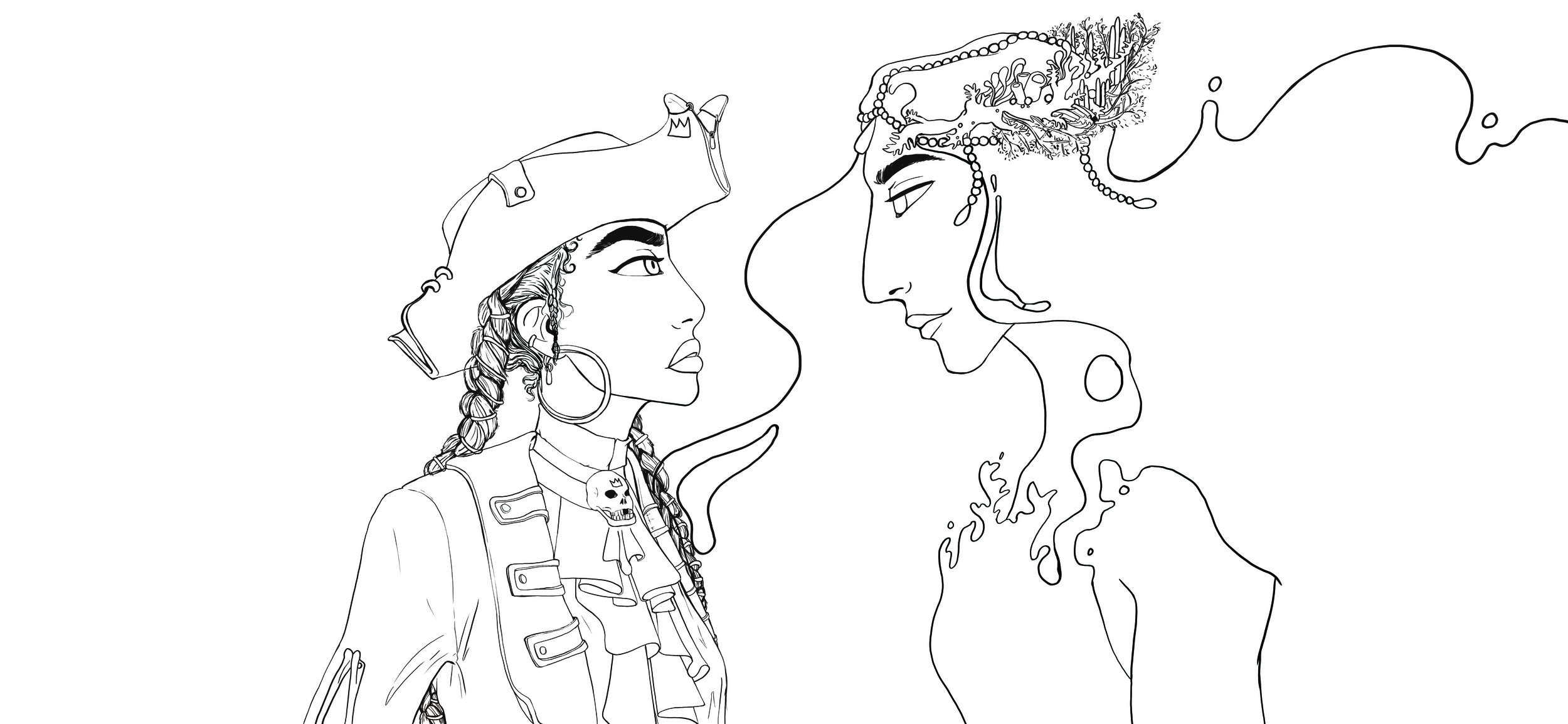
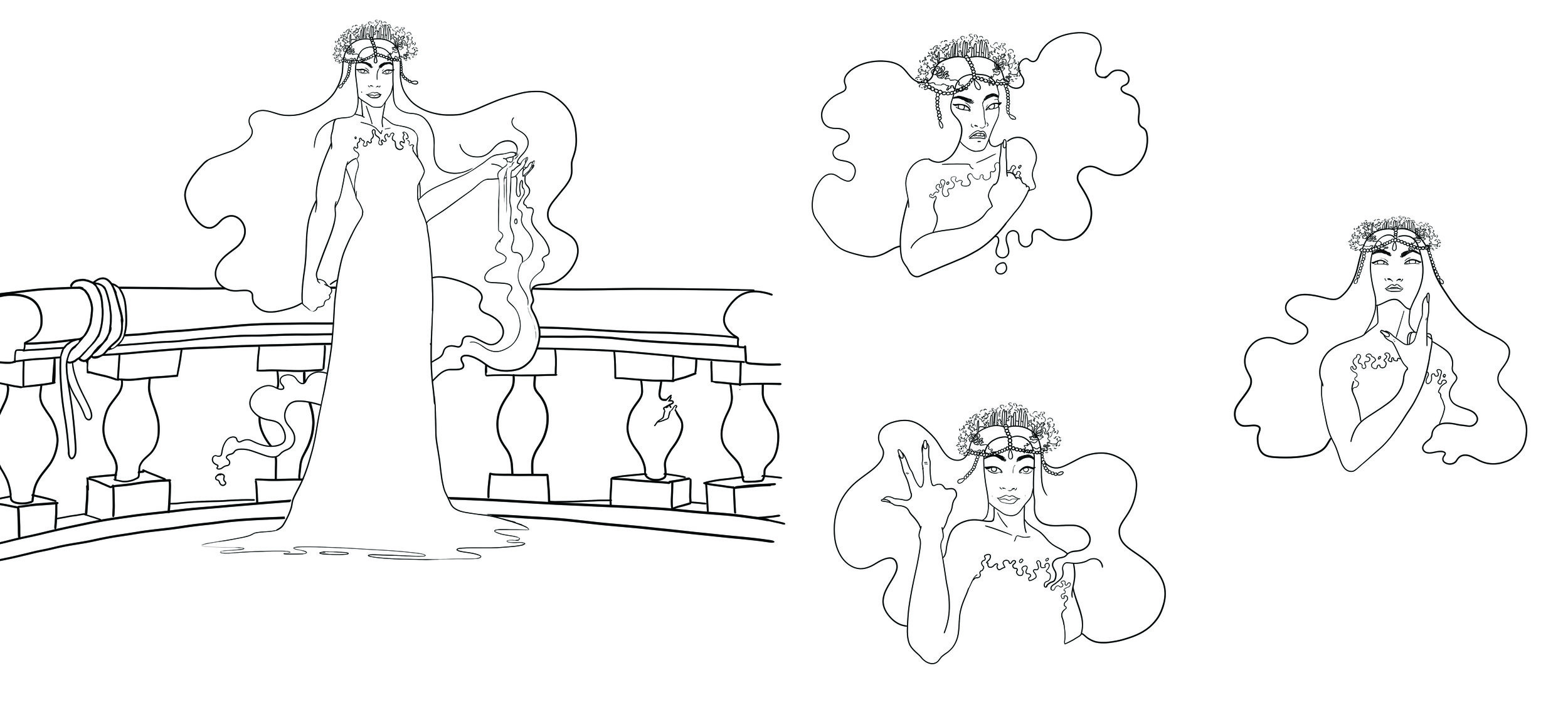
I postponed the creatio of the cover for as long as I possibly could. I felt very intimidated by creating the cover because it is such an important part of the visual identity of the book. I was unsure if I wanted to have The Sea on the cover or not. Some felt it would be a “spoiler” whilst others felt it was important to show both the charcters as that is what will sell the story. For the cover I wanted to represent the Captains battle with her feelings, piracy versus love. I decided to have the sea be present on the cover, but on the back so that you would have to fold the book out flat to see both of them. I debated how visibale she should be, in the beginning I through maybe only her crown should be visible, but people struggled to understand what it was, then I landed on having her full head above water looking lovingly towards the Captain.


I didn’t like any of the options below as they didn’t seem to fit the changable and whimsical personality that I feel The Sea has. I had tried to create a pose that did not reveal too many of her features, however, since this hadn’t worked I decided to try something else. I tried a profile angle. I liked this more. I tried three differnt poses, as you can see below. I enjoyed the ones where she rests her chin on her hands because it gives the feeling of loving admiration towards The Captain. There was also a question of how to best “angle” the hair, I chose the last one because I felt that one looked more like she blended in with the water, which was my intention.


The first image above is the flat coloured version of the cover. Here I had placed The Sea far in to the corner to make her less prominent in the page. However, I did a print test and felt it was too cramped into the corner. You can see this print test as a part of the physical submission attached to this work. It is the 3rd print test. I then revised the placement which is the second image you see above. But as I sent it to the printers they made me aware that the cover needs a 2.5 cm buffer that will wrap around the hard cover. What you see below to the right is the grid template they sent me. I overlayed this onto my image and trimmed and cropped it to fit apropiately. This process involved a lot of extra drawing thus it delayed the time it took before the work was print ready. Below you see the final version. Here you see The Sea is placed much more toward the middle of the page to not make her too close to any of the borders.
Colour Script
As I mentioned earlier, it became clear to me that I need to have a very strict colour palette, especially for the blues (water, sky, The Sea). I decided to approach this as a colour script. A colour script is an overview of the colour progression in a story, to get a sense of the mood and how the visual impression develops throughout the story. Doing it this way gives me a better overview of the story as a whole instead of just tackling each page spread individually. Whilst a colour script can be quite vague and more about the impression of the scene and not actually a template for what colours to use, I will use it more as a palette. Meaning that I will put together the colour script with a focus on how it fits together with the whole story, but then structure each page/scene so that I have easy access to the specific colours. It will be both a colour script and a colour palette. This will save me some time when it comes to producing each spread because I will already have the colours decided, meaning I don’t have to spend time on figuring out what colours to use.

Finding Nemo
This colour script from “Finding Nemo” is more about visually representing the mood for each scene and how they contrast eachother instead of actually providing a colour palette. This is great inspiration for how to produce contrast in your script and work with the colour as a narrative feature, but If I were to create my script in this amount of detail I would essentially be drawing my book. Which wouldn’t save me much time. This is of course a script for animation so it works great for that purpose, but for me it just functions as a great source of inspiration.

Sunset Boulevard
This script is a mix between “Nemo” and “Journey”, they have the more detailed drawings of each shot, but also have the colours blocked out below. This could work very well for what I need. However, since I am doing fewer and larger illustrations for my pages, rather than many shorter shots, the script that they have doesn’t have enough colour detail to supply a whole spread. Which could make the illustrations feel flat and boring. Whilst it works great for a film or animation, it becomes a bit scarce for a picture book. When you have too few colours you risk filling in the gaps with colours that don’t support the page’s palette and thus you can muddle your colour story. Therefore it is beneficial to me to have a more detailed colour script so that I can both save time and keep a consistent colour palette.

Journey
Out of all the colour script examples here this is the one I like the most. It has a lot of colour detail and using a gradient as your colour palette gives you the ability to eyedrop the blending colours giving you more options for transition colours, whilst still keeping the palette consistent. “Journey” had a very clear transition between colours so it is a great example of how to push the colour script to higher extremes. “Journey” also focused a lot on the time of day and how that affected the colours, which is something I also want to look at. Whilst I have a lot of blue water/sky, “Journey” had a lot of beige sand, which could quickly have become boring, but they found a way to make it incredibly vibrant and beautiful. “Journey’s” masterful approach to colour is something I want to try to achieve as well.
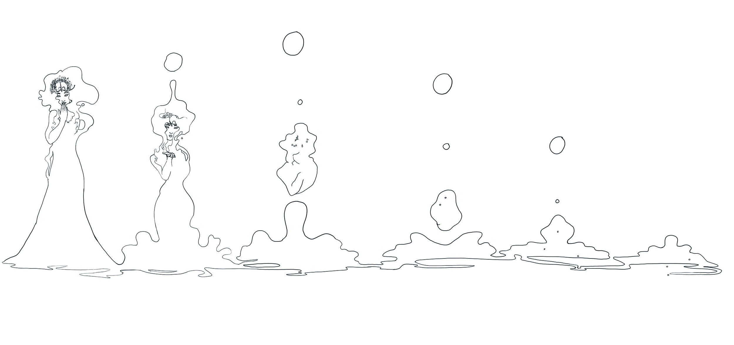
Colour Outline
I drew this colour outline of over the page drafts (version 3), to get a sense of the colour progression throughout the book. It is not as detailed as I had wanted it to be and I the colours aren’t accurate enough to be used as drop references. However, it did give a good sense of what parts are “blank” (white) and what are coloured. It is also a good guideline of the time of day an weather condition for each page. Doing this I also noticed there wasn’t really a clear overarching colour story to the book. It would be interesting to redo the colour story and make an actual colour script, however, due to lack of time this was not important enough for me to prioritize.
Workflow
In the first example of my workflow, I drew everything on Photoshop using my Cintiq. I found this quite time consuming, especially concerning the line art. The sketches I did weren’t detailed enough, meaning the line art takes longer to get right. Thus, after that I adopted a new pipeline, where I sketched very detailed drafts of all the different elements on the page in Procreate on my iPad. This meant that when I needed to draw the lineart I didn’t have to do much other than just trace my sketches. I found this to be a very nice way of working and I could pump out a lot of material quickly. It also let me work probably, not having to always sit at my desk. This might sound insignificant, but this was really the biggest appeal of this approach. Not having to constantly be bound to working by my desk when I am just sketching the pages, but rather being able to sit comfortably in a couch or a cafe had great effect on my energy and mood, making the whole process less strenuous on my mind and body. However, this approach led to some issues with perspective. Where some characters and scene elements would not line up perfectly. However, with some use of “skew” tools and other techniques, these issues were mostly remedied. Although I would have wanted to be able to focus more on getting the perspective right, the health and time benefit outweighed the other issues.
NB! The colours seem off on the pictures below because the drawings are drawn in CMYK so on some screens the colours looks wildly different from the actual colour scheme. Please keep that in mind. Please refer to the physical copies provided with the submission to get an accurate representation of the colours.
Below is the first approach I had to drawing the pages.


Here is the updated approach I had to the page creation using the iPad and Procreate instead of just Photoshop.
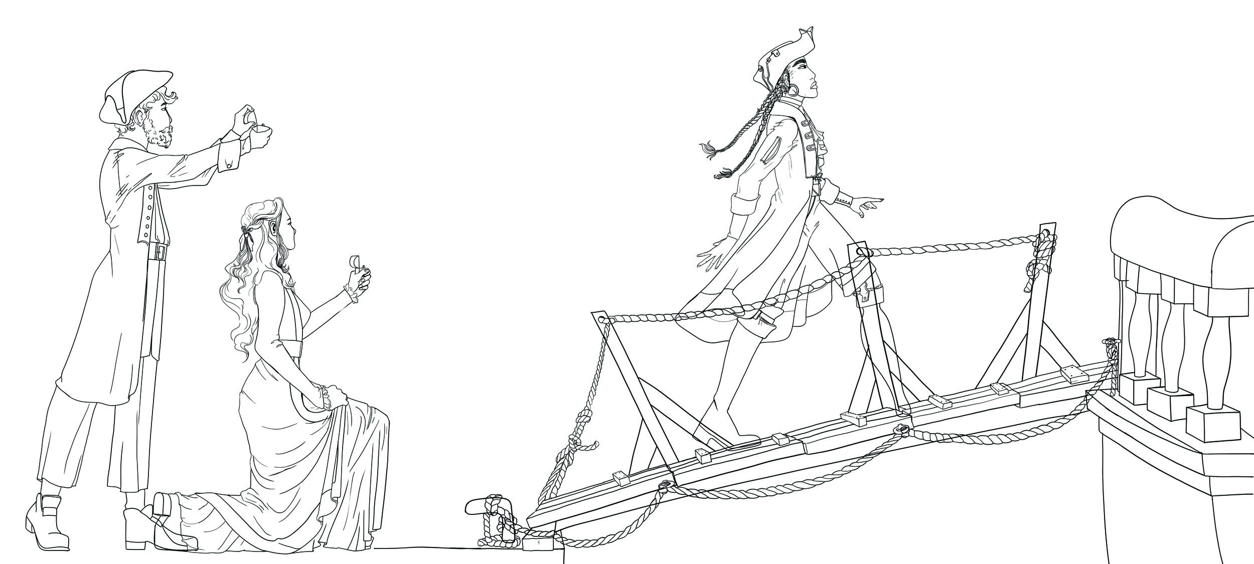
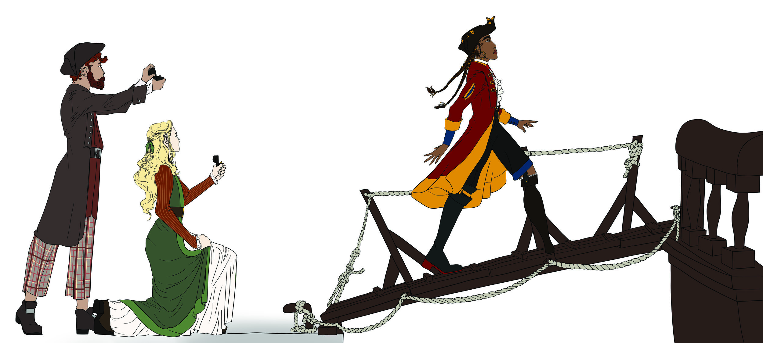
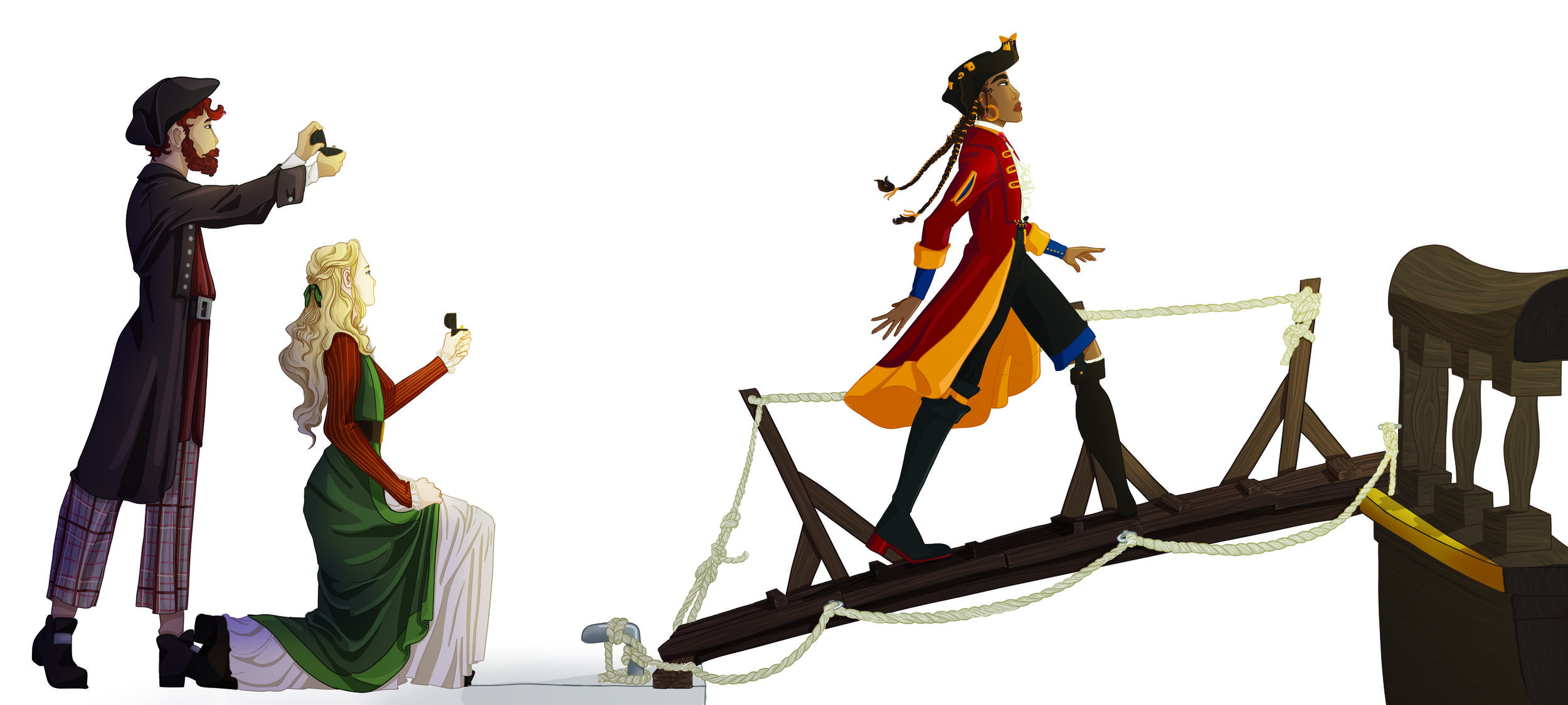
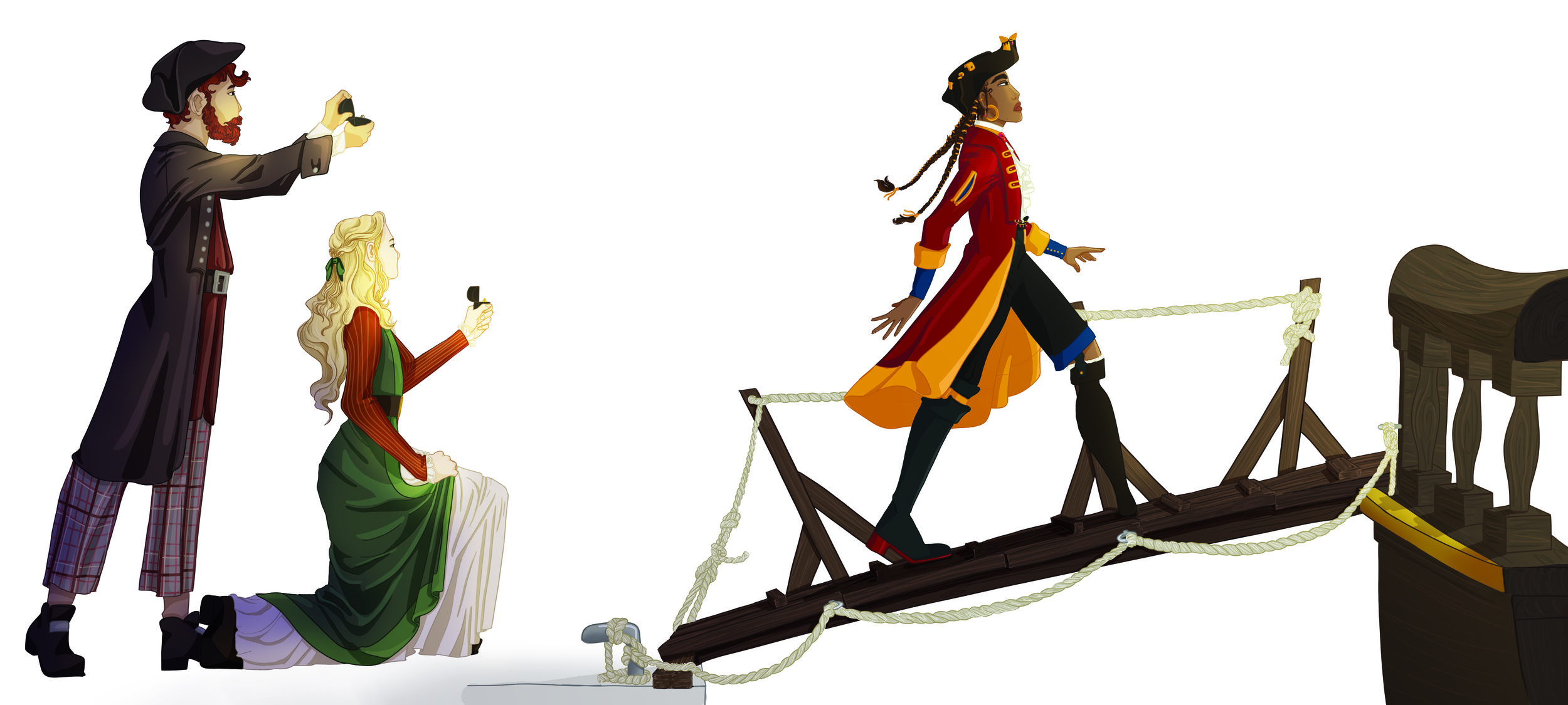
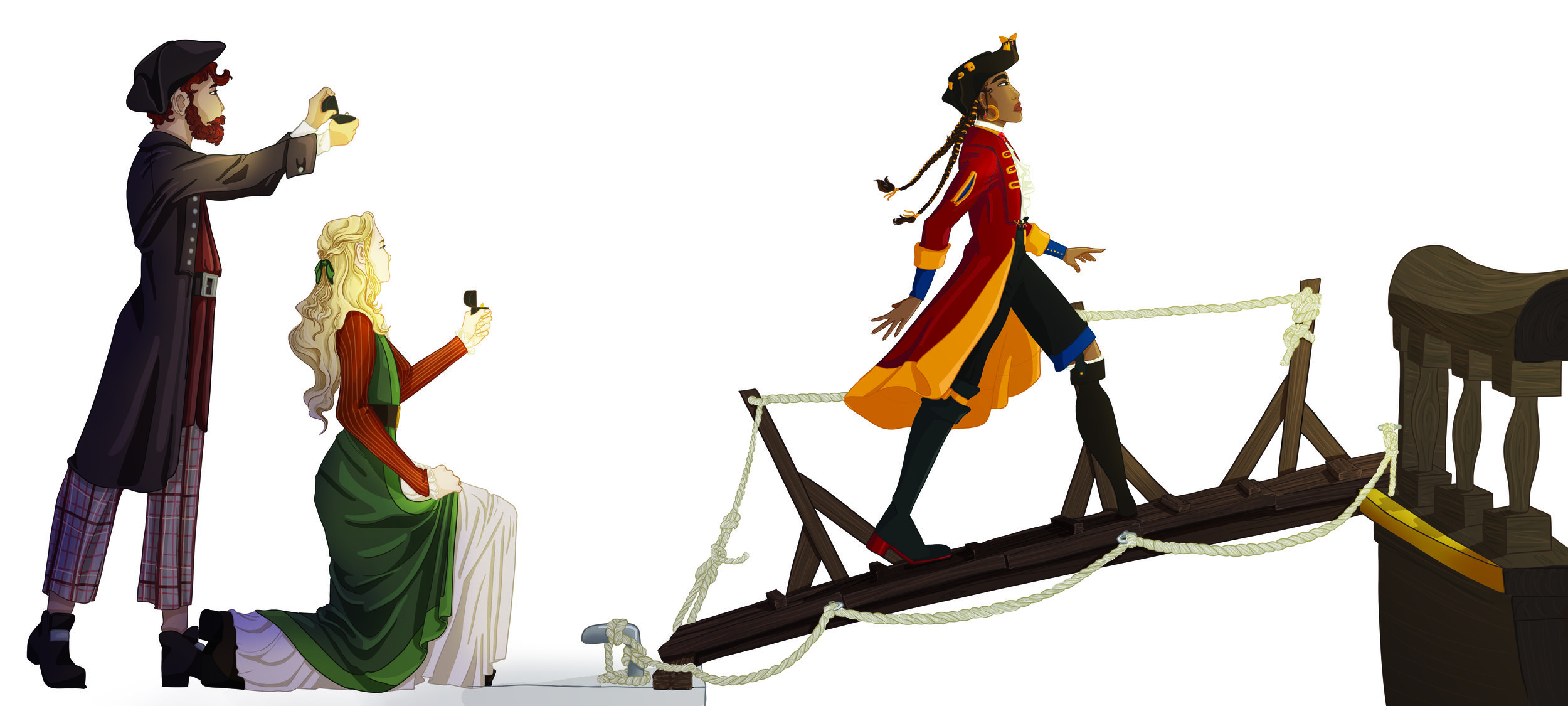
The first three images are different sketches from the page as a whole. Then they are “puzzled” together in Photoshop and drawn over. The last three images are different ways of solving the perspective issue that arose on this page. The “proposer” line of sight don’t line up with where The Captain is standing, so to solve this I tried skewing them and scaling them. I ended up using the last option as it felt like the “proposers” where more in the foreground looking at The Captain walking away. It is not perfect, but it is sufficient.

Fonts
I explored some different font options, mostly serifed fonts as they have a more traditional feel to them. They are the conventional choice for children’s book. I want to create a book that feels like a classic children’s book, thus using a serif font will help create those associations. There was also a suggestion of making my own handwritten font, however I chose to not pursue this. I felt it would hinder the legibility, thus making the book less accessible for children learning to read and tired parents reading late at night. In the end I chose to use Perpetua as it is smaller, has a tigther kern and fits better on the pages with my illustrations.

